| Image |
Comment |
| 12/07/2005 09:49:37 PM |
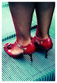
Going Upby ChezComment: My favorite in the challenge thus far. It's fun, it's different, it's quite stylish and perhaps a bit sexy even.
I really like how you've brought out the contrast in the picture by using the complementary color hues, green for the eselator and then red for the shoes and skin. It's also fun how you have only straight and horizontal lines in the escelator but the legs and shoes are more of irregular forms and vertical to boot so together with the color difference you have quite a contrast between the legs and the escelator.
I Hope you do well in the challenge!
PS. Can't help but to think about the possibility that the shoes will get stuck in the escalator. ;-) |
 Photographer found comment helpful. Photographer found comment helpful. |
| 12/01/2005 12:37:05 AM |
Right in the actionby BradComment: Fun picture. Like the two guys to the left in the background - those two and the players to the right make it seem like there is a plenty of action going on. Quite a funny face on the player to the right in the foreground.
If only we could also see the ball ... |
| Photographer found comment helpful. |
| 11/30/2005 05:36:19 AM |
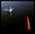
Identity Crisis by aznymComment: An extremely funny and creative photo and my favorite in the challenge.
I love how the swan seems to be 'communicating' or dancing for the cone.
I'm also fond of the gradient which emphasises the difference between the swan and the cone. It's also illustrative how you've placed the cone and the bird at distance in the frame to emphasise that these two will always be apart despite the obvious affection between them!
All in all, a truly neat picture and it's funny how cone seems to be smirking because of the swan's misunderstanding (it looks like the cone has a mouth).
Nitpicking, I find the cone to be overexposed in the red channel. Perhaps it would be wise to tone down the red slightly to get more detail out of it.
And congratulations on the ribbon! |
| Photographer found comment helpful. |
| 11/15/2005 10:31:55 PM |
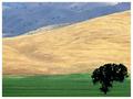
Aloneby bernmayComment: One of my favorite in the challenge so far. I really like the lines in this picture. Quite fun composition. Pity that we don't see more shadow detail in the tree in the foreground.
It also seems a bit over-compressed or cropped. |
| Photographer found comment helpful. |
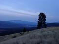
| 11/09/2005 12:29:57 PM |
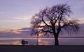
Twilightby gotrondComment: First of all, the horizon isn't quite level.
It's quite a peaceful image with the tree to the right and the person sitting on the bench to the left. However, I feel the power-lines and the sign in the middle almost ruin that peaceful feeling. I also somewhat feel that slightly more space is needed on the left side. I think I would have moved slightly back (or zoomed out) to give the tree and bench some more space and then cropped the bottom off the picture.
One other thing, there seems to be a bench or something in the foreground to the right. It's somewhat distracting. |
| Photographer found comment helpful. |
| 11/09/2005 12:24:48 PM |
soliloquyby ZoomdakComment: I really like the upper half of this picture but I feel the lower half is somewhat lacking. I think it would be better to crop the lowermost quarter or so off the image. Slightly above the lowest black bush/rock. |
| Photographer found comment helpful. |
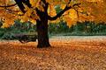
| 11/09/2005 11:56:23 AM |
Used Many Timesby popdeepopComment: One of my favorite in the challenge so far. Love the composition and the colors. Perhaps it would have been nice if you could have recovered some shadow detail in the tree.
Good luck in the challenge! |
| Photographer found comment helpful. |
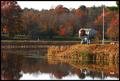
| 11/09/2005 05:21:12 AM |
last coorby byoungComment: What jumps at me first here is that I find the flag to be a bit irritating. Either I'd like to see more of it, e.g. if there had been a slight wind or the flagpole didn't partially conceal the flag, or I'd like to see the flagpole without a flag.
In fact, I think I'd crop the flagpole out of the image as it is, even though I realize that the flagpole is somewhat the main subject here.
Other than that, I like the fall-colors. I do think I would have zoomed slightly in though to frame the shot from slightly to the left of the person on the left and slightly to the right of the people on the right.
I also find the shot to only marginally fit the challenge. |
| Photographer found comment helpful. |
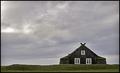
| 09/22/2005 05:41:56 AM |
Little House on the Prairieby NazgulComment: I don't like the halo where the horizon meets the sky - very distracting. Caused by too high radius using unsharp mask or the shadow/highlight tool perhaps?
Other than that it's not too bad. It's perhaps a bit distracting how you've tilted the camera upwards to include more of the sky. |
| Photographer found comment helpful. |
| 09/21/2005 11:31:06 PM |
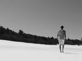
Walk Onby MulderComment: In my opinion there's too much of the sky in this shot. Try to crop circa 1/4 of it away and see if it looks any better. I also find the contrast between the white beach and the dark growth to be a bit too much for my taste here. |
| Photographer found comment helpful. |
Home -
Challenges -
Community -
League -
Photos -
Cameras -
Lenses -
Learn -
Prints! -
Help -
Terms of Use -
Privacy -
Top ^
DPChallenge, and website content and design, Copyright © 2001-2024 Challenging Technologies, LLC.
All digital photo copyrights belong to the photographers and may not be used without permission.
Current Server Time: 04/19/2024 06:19:39 PM EDT.