| Author | Thread |
|
|
02/16/2008 04:10:40 PM |
|
The different layers of light and shadow create wonderful drama - great shot! |
|
 Photographer found comment helpful. Photographer found comment helpful. |
|
|
08/01/2005 08:36:38 PM |
|
Beautiful scene! I agree with crop'g out the left side trees. Great job! |
|
| Photographer found comment helpful. |
|
|
08/01/2005 07:49:47 PM |
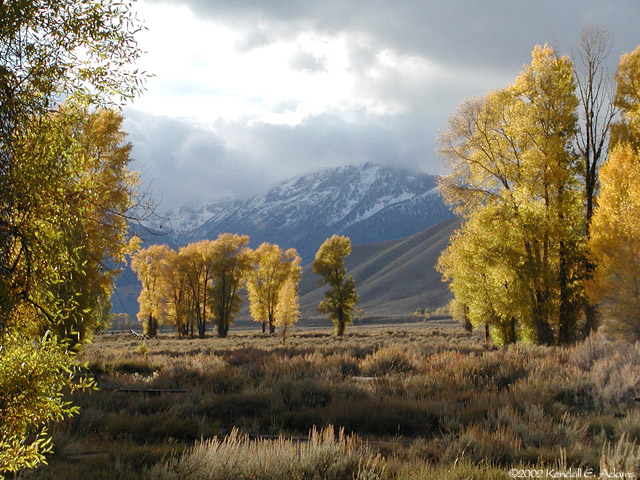
Very nice tonal range. I love the browns and yellows in the foreground and the blues and gray in the background. DOF is good but I feel the tree on the left is a bit distracting. Other than that a great photograph.
-SDW |
|
| Photographer found comment helpful. |
|
|
07/31/2005 03:16:45 PM |
|
I like the picture but I agree that I would have probably removed the trees to the left. Otherwise it's a nice shot. |
|
| Photographer found comment helpful. |
|
|
07/31/2005 11:52:16 AM |
I have a feeling that it would have looked nicer to skip those trees to the left and right in the foreground and instead focuson the small group of trees in the back. What I would have done would have to be a bit closer to those trees and shoot at bit wider angle (stitching would be an option if this was you widest setting - check out autostitch). If possibly it would have been nice to make the rightmost tree in the background more prominent than the others (as it stand apart and has a slightly different color).
I would have placed those trees to the left in the frame and the mountaintop slightly to the right of the trees.
Now, my view of the scene is most certainly not more 'coorect' than yours, however I find that it always fun to see others interpretion of the scene.
However, if we only look at the image you captured instead, the blown out sky is quite distracting here and in my opinion the shadow in the foreground is also a distraction - either it should not be there at all or at least to be a bit darker.
As for nitpicking, I would like the snow on the mountaintop to be slightly brighter and the 'blue' and grey mountains a bit darker to increase contrast. This can be achieved by using dodge and burn (dodge the highlights [snow} and burn the shadows and perhaps the midrange (the mountains).
I think a slightly more sharpening would be in order here, I tried to use 0.2 in radius and 90% using smart sharpening in Photoshop CS2 and felt that was a slight improvement.
A slight S-curve would also be nice to increase the contrast in the image.
I also feel that you should use the sponge tool to increase the saturation in selective arease. In particular the bush under the tree to the right is a bit too desaturated for my taste. Perhaps also the lower dark portion of the rightmost tree?
I think you should have moved one step to the right when taking this photo so the tree to the left in the foreground wouldn't 'blend' with the leftmost tree in the background. A distraction as it is, in my opinion.
I find the signature in the bottom right corner to be quite irritating. At first I thought this white small pattern was a pattern of the picture so I think you either need to make the signature more prominent (and so one can read your name) or forego it.
EDIT: Perhaps being closer to the ground would have been nice?
Here's a quick editing job in Photoshop. (I know the tree to the left is too sharpened in this version.)
Message edited by author 2005-07-31 12:10:51. |
|
| Photographer found comment helpful. |
|
|
07/31/2005 11:22:52 AM |
|
Wow, this is beautiful! It almost comes alive to me..I can almost smell the cold folage and feel the cool air on my skin. I wish I was there. I love the mountains. |
|
| Photographer found comment helpful. |
|
|
07/31/2005 10:29:26 AM |
I like the brown tones here (was it fall?). The bright area of the sky is blown out and that detracts from the image since it really dominates and draws the eye. Masking it off before processing might help? Just a thought. The DOF is fabulous!
|
|
| Photographer found comment helpful. |
|
|
07/31/2005 03:02:23 AM |
|
This is a gorgeous picture, I love the colours. Just beautiful. |
|
| Photographer found comment helpful. |
|
|
07/31/2005 12:50:24 AM |
|
The colors are just beautiful here! This picture is amazing, really good work. I am not a fan of landscapes at all, but I really like this. |
|
| Photographer found comment helpful. |
|
|
07/30/2005 11:37:18 PM |
|
I like the way you have framed the mountains with the trees, nice composition. |
|
| Photographer found comment helpful. |
|
|
06/16/2005 05:08:35 PM |
|
This is breathtaking. No bright vibrant colors, yet it is a powerful image. Bravo. |
|
| Photographer found comment helpful. |
|
|
06/16/2005 01:21:48 PM |
|
| Photographer found comment helpful. |
Home -
Challenges -
Community -
League -
Photos -
Cameras -
Lenses -
Learn -
Help -
Terms of Use -
Privacy -
Top ^
DPChallenge, and website content and design, Copyright © 2001-2026 Challenging Technologies, LLC.
All digital photo copyrights belong to the photographers and may not be used without permission.
Current Server Time: 06/27/2026 04:00:05 PM EDT.