| Image |
Comment |
| 09/21/2005 01:02:01 PM |
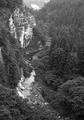
Ravine & Riverby KoriyamaComment: Such a nice photograph but I find it to be slightly weakened because of the low-contrast B&W effect.
Other than that it does seem to be slightly soft, especially when looking at the cliff and some portions of the cliff and the riverbank seem to be overexposed.
But I quite like the composition.
I took the liberty to do a quick edit in Photoshop:
//www.andri.org/temp/dpc-skogur-fikt.jpg
(Let me know if you want the image removed.) |
 Photographer found comment helpful. Photographer found comment helpful. |
| 09/21/2005 06:58:50 AM |
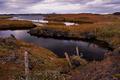
The lonely bridgeby LalliSigComment: The main fault I see with this image is that the foreground is much too dark and muted for my taste. Perhaps a slight shadow/highlight might have helped here or even a curve.
It also seems a bit soft in places and one can notice sharpening artifacts at the horizon.
There is also a quite distracting red color-cast to the image. |
| Photographer found comment helpful. |
| 09/21/2005 06:53:18 AM |
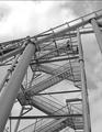
upstairsby redpandaComment: Could have been nice had this not been such an overexposed shot (the sky is particularly distracting) and if you had increased the contrast so the structure would have been in a much much darker shade of grey.
Also, it would most surely have been better had the person in the staircase been located one or two levels lower. |
| Photographer found comment helpful. |
| 09/21/2005 02:53:27 AM |
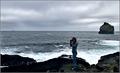
By the seasideby ingibComment: Noh, það er bara aldeilis; bara önnur mynd frá sama stað og ég tók mína. :)
Kannski eitt, ég held að þessi mynd væri mun betri í svarthvítu en í lit. Ennfremur mætti keyra smá Image->Adjustment->Shadow/Highlight á hana í Photoshop til að fá fram teikningu í dökku svæðin í grjótinu vinstra megin.
Annars finnst mér einhvern veginn að myndin hefði verið skemmtilegri ef stelpan væri að horfa á eyjuna/skerið þarna útá í stað þess að vera að taka mynd. Bara leiðinlegt hvernig andlitið á henni er hulið af myndavélinni.
Myndin er kannski fulldökk líka fyrir minn smekk ... |
| Photographer found comment helpful. |
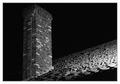
| 09/21/2005 02:45:38 AM |
In the Shadowsby BradComment: It's a bit distracting how there is almost no empty space above the chimney and how the lowest part of the chimney isn't included in it's interity.
Zooming away slightly or simply backing off would have been nice here.
Aside from these minor points I must say it's not really an interesting photograph to look at. Yes, we have those rooftiles forming a sort of a texture and various bricks in the chimney but those things alone most surely don't add up to a good photograph.
The obvious thing to add to this picture would of course be a person, either climbing the chimney or looking at it in from the roof. Of course it would have been a bit tricky setting this up but my point here is that it's not interesting enough photo as it currently is.
Or perhaps I should ask you, do you find it to be an interesting photograph? And if so, why? And if not, how would you improve it?
(It's not that it matters terribly much whether you like your photograph or not but what really matters is WHY you like it or dislike it.)
(I'm terribly sorry if I'm stating the obvious truth or if it sounds like I'm patronizing. Most surely not my intention.) |
| Photographer found comment helpful. |
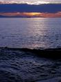
| 09/21/2005 02:34:57 AM |
Pacificby pixelyComment: First of all, the tiny portion of the beach seen in the lower right corner does not serve any purpose in this image and should be cropped out. In fact you should have tilted the camera slightly upwards when taking the picture so a bit more of the would've been included. As it is, the sky doesn't really fulfil the rule of thirds reqs. set out in the challenge description.
Also, you should have pointed the camera slightly more to the right (or left?) so the two small islands would sit where the lines dividing the frame into thirds intersect.
Other than that I find these standard sunset photographs to be a bit boring (but that's just me) and I feel that you should have tried to include something to make the picture slightly more interesting.
Perhaps some rocks or a growing on the beach below or a person looking at the sunset?
Another trick would have been to mount the camera on a tripod and use a long exposure (1/2 second or more) to get a smooth texture of the sea.
But as it is, it's just another sunset picture as I see it. No disrespect here though, it's not like I don't have my fair share of those. ;) |
| Photographer found comment helpful. |
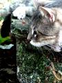
| 09/21/2005 02:25:14 AM |
Rhonaby buddybuddy1226Comment: Quite an intense cat, eh - eying a bird or a mouse perhaps? :)
As for the image, it's badly overexposed! Other than that, rule of thirds withstanding, you should have tilted the camera slightly upwards to include Rhona's ear. What's in the lower portion of the frame isn't exactly an picturesque element and would most surely not be missed had it not been included in the frame. In fact, I think you should crop out a part of the lower portion of the frame as it is.
Also, I think this picture would be much more effective in black and white than color. |
| Photographer found comment helpful. |
| 09/21/2005 02:13:05 AM |
Bubble Bathby aimee_skittlesComment: Now, I can understand that the model doesn't want to be nude in the photo but wearing a bikini in the bath is a bit, what shall we call it, strange, don't ya think?
As it is her position in the bath is very very bizarre and I think it would have looked much better to have her body submerged in the water.
Another thing, what is she looking at?? Why isn't she instead looking at the camera or frankly just anything else than what is to her left.
It's also quite irritating to not have the entire right hand in the frame and you leave a bit too much space above her head.
Now, if the point here was to create a strange looking picture, with the bubble-gum and the woman's uncomfortable position, I'd say you've failed in your quest. As it is the picture isn't strange enough to serve that purpose. Perhaps with a bit more exotic lightning or framing or Photoshop-work or just a bit more creative hairdo it would have worked to that purpose but not as it.
Sorry if I'm a bit harsh but I feel the original idea, a bubble-gum in a bubble-bath was quite neat but you've flunked on implementation. Better luck next time, I guess. :) |
| Photographer found comment helpful. |
| 09/21/2005 12:23:27 AM |
3 to the power of Thirdsby KiwiShotzComment: Ooooh, if only this dark forest hadn't been in the foreground this would have been a quite nice photograph. :(
Other than that forest, I like it. Wasn't it possible for you to take this from a slightly different angle, e.g. more to the left, so you would have been able to leave that forest out of the picture? Or perhaps taking this photo from a higher vantage point?
Or maybe even reshoot the picture at a later time with the sun at a different angle so the forest wouldn't be so dark?
As it is, it's too much of a 'almost' picture for my taste. But there is so little missing for it too look really nice. |
| Photographer found comment helpful. |
| 09/21/2005 12:17:17 AM |
What does the future hold?by RiponladyComment: What I don't like about this picture is the following:
a) It's too dark. Try to brighten it a bit using levels or curves.
b) It's too red/yellow. You should either shoot in RAW or adjust the whitebalance. However, it is possible to fix in Photoshop by creating a curve adjustment layer and using the 'Se Grey Point' eyedropper (in the middle) to set the grey/neutral point. The shoeboxes would ideal candidates for this.
c) think you should have fixed the blemish to the left of her mouth or at least made it a bit less pronounced. (People may not want their blemishes removed with fakery but making it less pronounced shoud still have been possible.)
d) The background is awful, a curtain to the left and some shoeboxes to the right. Try to use larger aperture the next time you have such a background in order to make it go out of focus as much as possible.
e) I would also have liked you to use a bit of fill-flash here, both to lighten up her face and also to get some catchlights in her eyes.
f) It also seems like the picture has gone through some extensive editing as her skin looks a bit strange - posterized probably.
g) Oh, and it's a bit soft too boot. A slight unsharp mask might be helpful perhaps? |
| Photographer found comment helpful. |
Home -
Challenges -
Community -
League -
Photos -
Cameras -
Lenses -
Learn -
Prints! -
Help -
Terms of Use -
Privacy -
Top ^
DPChallenge, and website content and design, Copyright © 2001-2024 Challenging Technologies, LLC.
All digital photo copyrights belong to the photographers and may not be used without permission.
Current Server Time: 04/19/2024 10:43:26 PM EDT.