|
|
|
Showing 3881 - 3890 of ~4217 |
| Image |
Comment |
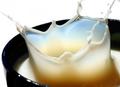
| 08/25/2005 05:40:50 PM | Milk Splashby smartypantsComment: 7 - Good light capture and I like colors. This shot has much more potential though, in my opinion. Centering, angle, 'height', etc. I like the focal point though. |  Photographer found comment helpful. Photographer found comment helpful. |
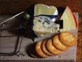
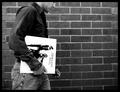
| 08/25/2005 05:38:33 PM | How to catch a gourmet mouseby burtctComment: 7 - Good idea. Criticism; More impact by less 'menu' would have made this a better shot in my opinion, Also perhaps a slightly 'sharper' angle. More attention also paid to the 'minor' details like the bit of cheese on top of the 'catch cheese (blue vein?) and the bit of cracker (?) bottom left, would have helped. Also the background detracts somewhat in my opinion. | | Photographer found comment helpful. |
| 08/25/2005 05:33:47 PM | Milk ambush!by LalliSigComment: 7 - Definite 'impact' shot. Criticism; I just wish the background was a single, or just a few colors, and more 'blurred'. Sure plenty have said this. That has to be like a bucket of milk(?) there. Good potential and creativity. Just if the background, clothes (minus wristband) were all 'neutral' would have made this an amazing shot, in my opinion. | | Photographer found comment helpful. |
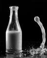
| 08/25/2005 05:29:40 PM | Looking to get back in. by graphicfunkComment: 8 - Good shot. Criticism; no clue how you did this, but if the start of the 'flow' were a little higher, would have made this an even better shot in my opinion. Perhaps a slightly different angle too. Maybe 'zoomed out' slightly too. Not sure what the 'base background' is but it is a little distracting when looking hard at this shot, mainly because of what I think is the texture of it. That said, dependent what color that was, though this shot looks good in b/w, I am interested whether this shot would have looked better (for the Challenge) in color. | | Photographer found comment helpful. |
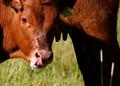
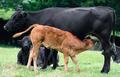
| 08/25/2005 05:24:13 PM | Got Milk!!by SammieComment: 7 - One of 2 7's I have given for 'cows with milk'. Criticism; I do like how you have 'zoomed in' on mostly just the calf and teats but would like to see a slightly different angle. The shadow hides the teats. I like the way the calf is 'licking'. If the shadow were not covering the teats, no tag 'visible' on the ear (difficult I know) and a little more 'vivid' green in the grass, would have made it a better shot in my opinion. | | Photographer found comment helpful. |
| 08/25/2005 05:19:49 PM | From the Sourceby MatthewComment: 7 - One of 2 7's I gave for 'milk coming from cows'. Criticism; really would like to see this a lot closer, or else without those other two girls behind. Camera/closeness dependent, a close up of that calf suckling, especially with the milk 'spilling', would have made a great shot. The grass seems a little 'light', but perhaps it is hard to do something about that with the blackness of the 'mother', which you have captured well. | | Photographer found comment helpful. |
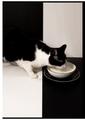
| 08/25/2005 05:16:54 PM | Tastefulby fotodudeComment: 8 - Like this, like the frame, like the colors, like the 'style'. For me, even though the first thing I see is not 'milk/etc', my eye gets drawn there fast enough. Criticism; maybe, (though likely impossible seeing as the left top black background is likely 'wall') would like to see how this would have looked with the cat 'symmetried' over the top left black 'corner' (ie; diagonal). Otherwise, somehow more definition on the 'lapping' of the milk, and also on the white whiskers that are against the black right foreground. | | Photographer found comment helpful. |
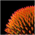
| 08/19/2005 07:40:40 PM | Spikeby RikkiComment: I am 95% sure this is an Echinacea (Coneflower)with the petals (pulled?) off. Perhaps a more horizontal type of crop may have made this a little different, just the 'symmetry' is a little off (bottom left of flower) in my opinion. The focus is good and the lighting has created a 'glow' like appearance, but, for me, I would like more light. I would also like to see the colors more vivid, especially the underlying green. Just for something different (with this subject) perhaps a different colored background, may have made it a better shot in my opinion. Also, I would like to see (especially for a macro) those maroon stamens(?), emphasized somehow, this is rarely seen in Echinacea shots. I liked flower02web too, but similar 'opinion' as above for that re symmetry etc. Flower01web has potential, but needs zooming out and better focus and just one stem, if any. The other, in my opinion didn't work, or at least the style doesn't suit this type/shape of flower, in my opinion.
PS just saw your post - I do not think it is Proteaceae (but if you want to know how to pronounce it click here.). Might be wrong, but still looks like an Echinacea to me. You can decide. | | Photographer found comment helpful. |
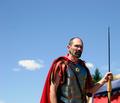
| 08/16/2005 11:53:59 PM | 35 B.C.by ShamanComment: 7 - Met the Challenge (a photo of this in a time capsule for said year would depict it well for future generations). Criticism; whilst I do like this shot and the 'era', I would like to have seen more character incorporated. You rarely see a color photo of a legionnaire so if you had (were able) to incorporate more of their 'finery' it would have been much more dramatic in my opinion. I also like how you didn't 'explain' or elaborate on the year, it does say it all if you know a little of history. Original. Up to 6 from 5--- Up to 7 last minute look. | | Photographer found comment helpful. |
| 08/16/2005 11:52:25 PM | 1977by kmbr2001Comment: 5 - Ok, I have to comment on this shot for the potential that I see in it (in my opinion). Each time I look at it I think the same thing, so I will convey it - though it might be totally against what you were going for. As far as meeting the Challenge, I think in the sense thtat a shot of this put into a time capsule would not depict this era well for future generations, in my opinion. The album itself (a classic especially for this year) put into a time capsule, would more so than the photo, just my opinion. Ok, criticism; I really 'wish' that the album was 'Saturday Night Fever' and the guy was dressed up in a 'sharp suit', doing the 'strut' style as he walked. I think that would have made an excellent shot and depicted this era/year very well 'for future generations'. As it is, I try to 'relate' the album (Rumours) with the 'set' you have and the only connection I can make is the slightly ruffled shirt. Just had to comment on the potential I think this shot had, but it is just my opinion. | | Photographer found comment helpful. |
|
Showing 3881 - 3890 of ~4217 |
Home -
Challenges -
Community -
League -
Photos -
Cameras -
Lenses -
Learn -
Help -
Terms of Use -
Privacy -
Top ^
DPChallenge, and website content and design, Copyright © 2001-2025 Challenging Technologies, LLC.
All digital photo copyrights belong to the photographers and may not be used without permission.
Current Server Time: 06/19/2025 08:35:22 PM EDT.
|