|
|
|
Showing 3871 - 3880 of ~4217 |
| Image |
Comment |
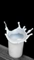
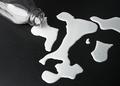
| 08/27/2005 06:51:32 PM | Milk explosionby janskuComment: 6 - Like the effect you have captured here and the toning. Criticism; not sure about the crop/framing. Whether horizontal would have been best, given the 'ledge'/base(?), but I do like the height you have. Perhaps just more 'space' on the right hand side, more 'black', may have made this a better shot in my opinion. Minor, but the patterns on the glass detract slightly, and the edge of the 'ledge'/base, I'd like to see cropped out or 'used' more, if there is potential there. Also like the way you can see the rim of the glass too. Focus I am not sure on as, as I said, I do like how the rim is clearly shown, but a little sharper on the 'flying flow' would be good, perhaps that is just an angle issue, not sure. |  Photographer found comment helpful. Photographer found comment helpful. |
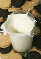
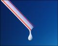
| 08/27/2005 06:37:47 PM | Dunk it... Dont drop it...by idezineComment: 7 - Nice and clean, good concept and colors. Criticism; personally I would like to have seen this as a more horizontal type of shot, ie; the glass of milk on the right of frame (need more cookies I know). I like how you have captured the drops and 'flow' but would like to see more of it, ie; not cropped. Perhaps a different colored 'base' (think you have white under the cookies?), may have made this a better photograph in my opinion, not sure. Just to contradict that, the white 'brings out' the 'cream' in the coolies as well, so not sure. | | Photographer found comment helpful. |
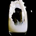
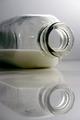
| 08/25/2005 07:10:08 PM | Pouring milkby timluComment: 7 - Nice shot. Criticism; different crop, perhaps more 'space' to the left (and a little more height, not sure), cropping out that 'blurry' drop, would have made this a better shot in my opinion. | | Photographer found comment helpful. |
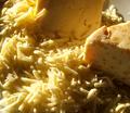
| 08/25/2005 07:06:29 PM | Cheese Pleaseby horsemadgirlComment: 7 - Nice shot of cheese. Nice lighting. Criticism; like to see a sharper angle, or just different. Perhaps even a slightly different crop might have made this a better shot in my opinion. | | Photographer found comment helpful. |
| 08/25/2005 07:05:24 PM | Milk Moneyby CutterComment: 7 - Good shot. Like the title/concept. Criticism; either a different colored dish(?) or a different cropping, just the outer edge detracts in my opinion. If the 'dish edge' were a similar color to the coin, or even just a bigger dish (thus no 'edge' just milk) would have made this a better shot in my opinion. | | Photographer found comment helpful. |
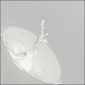
| 08/25/2005 06:52:07 PM | Spilled Milkby jasm8Comment: 7 - Like this shot. Criticism; would like to see the focus on the drop. Also, possibly a little 'pool of milk', may have made this a better shot in my opinion. | | Photographer found comment helpful. |
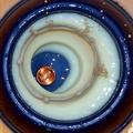
| 08/25/2005 06:49:41 PM | Milk Madeby scalvertComment: 7 - I like this shot and the 'clean' and 'sharp feel' and the style. Either my eyes can't see an 'abstract picture' here (maid/cow) or there isn't one (apologies if there is), so, Criticism; if you have used a dropper or something to create that pattern, if you could have made something looking like a cow (not easy), would have made this a real stand-out shot, in my opinion. | | Photographer found comment helpful. |
| 08/25/2005 06:45:43 PM | Just Milkby Prime_TimeComment: 7 - Nice simple shot. Criticism; just needs some 'oomph' in my opinion, not sure what, perhaps the background, perhaps the lighting, not sure. I like the crop and the angle. Perhaps more 'height' might have helped make this a better shot, not sure. The frame doesn't suit this in my opinion, especially with the DP 'blue' page color, could have used it more effectively with your coloring in this shot without a frame. | | Photographer found comment helpful. |
| 08/25/2005 05:47:15 PM | Chocolate Rain Dropsby ShaneBlakeComment: 7 - Like this, but the title actually detracts in my opinion. Look more like 'eggs' (well especially that back one) than chocolate to me. Criticism; larger, maybe (if possible) rotate and then crop, if you could still have included that far right 'indent drop', not sure, also to include the left 'rim' of the main 'indent drop', would have made this a better shot in my opinion. | | Photographer found comment helpful. |
| 08/25/2005 05:42:02 PM | Good to the Last Dropby soupComment: 7 - Like the concept, colors work well. Criticism; wish the drop were nice and sharp, rather than the straw. An even closer zoom/crop, slightly different 'centering' would also have made this a better shot in my opinion. | | Photographer found comment helpful. |
|
Showing 3871 - 3880 of ~4217 |
Home -
Challenges -
Community -
League -
Photos -
Cameras -
Lenses -
Learn -
Help -
Terms of Use -
Privacy -
Top ^
DPChallenge, and website content and design, Copyright © 2001-2025 Challenging Technologies, LLC.
All digital photo copyrights belong to the photographers and may not be used without permission.
Current Server Time: 06/19/2025 09:36:18 PM EDT.
|