| Image |
Comment |
| 06/21/2006 12:29:15 AM |
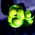
Neon Limesby mambaComment: Hi from the Critique Club!
The first thing that stands out here is that vibrant neon green and yellow. It's really 'in your face'. However your burnt out highlights have harmed the image, causing a 'blobbing' of colour effect and and a loss of detail, so that you loose those lovely textures on the limes. The window reflections are also destracting.Defusing the window light with some tracing paper or some sheer fabric would give you more control over the lighting. In fact looking closer - it looks like you had a curtain and lifted up one side?
Your composition has suffered due to your harsh cropping of the original image. Your main subject is centralised which often creates a static image. You have also 'chopped' off some of the glass stem, some of the shadow and the smaller glass looks like it's being squeezed out of the picture;) The shadows are competing with the glasses and together with the crop this gives a feeling of not enough space, or too much cramped into one small image. It feels claustrophobic.
I would have liked to have seen a greater depth of field too, a smaller aperture would have created more depth in the image, from front to back. The second glass just seems to meld with the edge of the larger one.
I love the distortion of the limes created by the water, it really creates interest.
A great idea, so good luck for next time;)
|
 Photographer found comment helpful. Photographer found comment helpful. |
| 06/19/2006 11:25:12 AM |
|
| Photographer found comment helpful. |
| 06/18/2006 07:48:12 AM |
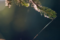
Sunshine and Laceby mpreslarComment: Hi from the Critique Club!
Having read your comments (which voters cannot see when voting) I can see clearly what you were aiming for here, but without your comments I think many were confused as to the point of your image. Voters tend not to want to work too hard when they are ploughing their way through 300+ images. If they cannot immediately 'get it' they vote low.
I can see why you picked this subject. It's always quite breath-taking seeing a spider's web glistening in the sun. However, it's difficult to get the camera to capture that perfect moment.
Your focus is centred on the right hand side of the branch. Because your aperture is at 2.8, you have a really shallow depth of field, causing everything else in your image to be out of focus, again making it difficult for the voters to see the story of your image. The wide open aperture has also caused some overexposure of the web on the branch, so that you loose a lot of the detail, again making it hard to see the very thing you wanted to highlight. A smaller aperture would have created focus through out the image.
As it's hard to see the web, the voters might have wondered why you placed the branch at the top of your image, leaving so much empty space, again that makes sense ONCE you know it was a spider's web floating in the breeze that you were trying to capture;)
This was a good idea, but a really hard one to capture;) |
| Photographer found comment helpful. |
| 06/18/2006 07:25:14 AM |
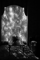
The Santa Maria Revisitedby timfythetooComment: Hi from the Critique Club!
What a great image!
This image has an unreal quality to it, it's almost too perfect:)) Those wonderful glass like reflections are almost as though you slipped a mirror below the boat, as the water is so smooth and flawless.
The lighting too, gives an unreal feeling; it's as if you picked up the boat and put it in a studio, so that you could have complete control of the lighting and colour:)) There is a gorgeous balance to the intensity of the lighting - with the brightest light being on the boat in the middle of the image, and then it gradually fades in intensity as you move away from the middle, at both the top and bottom of the composition. The lighting on the upper masts and sails looks as though it has been painted in oils;)
The whole image creates a feeling of calm and serenity, and as others have said, it's practically flawless, so there is little more I can add;) |
| Photographer found comment helpful. |
| 06/14/2006 08:32:36 AM |
|
| Photographer found comment helpful. |
| 06/14/2006 08:31:35 AM |
|
| Photographer found comment helpful. |
| 06/14/2006 08:13:31 AM |
|
| Photographer found comment helpful. |
| 06/14/2006 08:07:31 AM |
|
| Photographer found comment helpful. |
| 06/14/2006 08:04:21 AM |
|
| Photographer found comment helpful. |
| 06/14/2006 08:01:15 AM |
|
| Photographer found comment helpful. |
Home -
Challenges -
Community -
League -
Photos -
Cameras -
Lenses -
Learn -
Help -
Terms of Use -
Privacy -
Top ^
DPChallenge, and website content and design, Copyright © 2001-2025 Challenging Technologies, LLC.
All digital photo copyrights belong to the photographers and may not be used without permission.
Current Server Time: 08/04/2025 11:02:22 PM EDT.