| Image |
Comment |
| 01/20/2003 10:37:50 AM |
|
 Photographer found comment helpful. Photographer found comment helpful. |
| 01/20/2003 10:34:13 AM |
Stopby rj324Comment: focus seems soft and would have liked to have seen the red stand out a bit more (increased saturation in post processing) |
| Photographer found comment helpful. |
| 01/20/2003 10:30:09 AM |
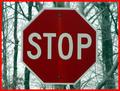
Total Eclipseby bil99Comment: too bad the sun is behind the sign. i like all the wires in the background, to me that was the most interesting thing in the photo. |
| Photographer found comment helpful. |
| 01/20/2003 10:25:23 AM |
International Roadsignby David EyComment: might have included more space above the subject to capture more 'nature' in the photo - to contrast that permanence and strength against the fleeting presence of man demonstrated by the cross. |
| Photographer found comment helpful. |
| 01/20/2003 10:21:22 AM |
Go Away!by myqylComment: looks like a chasity belt protecting the garden of eden. would have liked to see the red and greens seem a little sharper (increase the saturation in post processing) |
| Photographer found comment helpful. |
| 01/20/2003 10:19:59 AM |
Red Rock, Red Stopby YomiComment: the sign looks like a giant poster hung from the cliff (like nature is saying to mankind: stop polluting my environment). great photo. |
| Photographer found comment helpful. |
| 01/20/2003 10:18:32 AM |
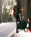
Seventeenby emorgan49Comment: i assume this tree was the sight of a fatal car accident, but it almost looks like this tree was the sight of some miracle and pilgrims have come and left religious artifacts at the sight of the sacred event. b&w might have added a somber effect that might have made the photo more powerful, also maybe a little more empty space to the left (if possible) to create a void and also add to the image of loss. |
| Photographer found comment helpful. |
| 01/20/2003 10:05:37 AM |
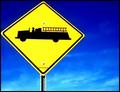
The Fire Engine Signby AnnidaComment: i like how the detail is so strong that i can read the city in the small type, but at least on my screen there seems to be some contrast problems along the edge of the sign vs. the sky, esp. on the upper side. |
| Photographer found comment helpful. |
| 01/20/2003 09:49:08 AM |
|
| Photographer found comment helpful. |
| 01/20/2003 09:48:19 AM |
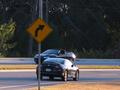
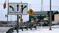
Street Signby STEINRComment: seems a little off angle but i like the 'busy-ness' of the photo. tuxedo ave. is looking pretty casual these days . . . |
| Photographer found comment helpful. |
Home -
Challenges -
Community -
League -
Photos -
Cameras -
Lenses -
Learn -
Help -
Terms of Use -
Privacy -
Top ^
DPChallenge, and website content and design, Copyright © 2001-2025 Challenging Technologies, LLC.
All digital photo copyrights belong to the photographers and may not be used without permission.
Current Server Time: 08/02/2025 06:19:34 AM EDT.