| Author | Thread |
|
|
01/27/2003 01:28:13 PM |
CRITIQUE CLUB CRITIQUE
by karmat
COMPOSITION
I think overall the composition of this shot is effective and strong. The sign is in a good spot to "anchor" the shot, and the top of the ridge leads from left to right and up to down nicely. My only suggestion would be to frame it so that the edge of the sign and the edge of the formation weren't so nearly in line. It almost makes it feel unbalanced to me.
TECHNIQUE
I love the colors on this. The reds and blues provide a nice complimentary/contrast with each other, and it is really attention grabbing. The focus is awesome, with details showing throughout the picture. One thing to consider might have been a lower aperture number that would cause the formation to be blurry behind a crisply focused sign. Don't know that it would have been better. Just different.
OVERALL EFFECT
Very nicely done. It is the kind of picture that grabs your attention then holds it. |
|
 Photographer found comment helpful. Photographer found comment helpful. |
|
|
01/27/2003 01:53:01 AM |
|
thanks for all the comments on this shot. I was excited to see how well it did, it was the only one I took all week. It was also my first time shooting in the RAW format which I love now. |
|
|
|
01/27/2003 01:12:20 AM |
My favorire road sign pic ... Congrats on a great shot ...
Bob |
|
| Photographer found comment helpful. |
|
|
01/27/2003 12:44:05 AM |
|
congrats on your great finish. i loved this photo and am very happy you did well. spectacular! cheers, tom |
|
| Photographer found comment helpful. |
Comments Made During the Challenge  |
|
|
01/26/2003 10:28:55 PM |
|
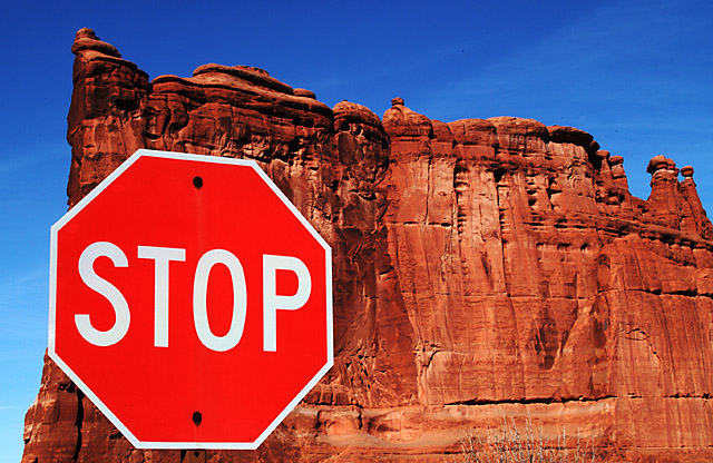
Brilliant colors! Good composition - almost missed the little bit of post beneath the sign. I was just gonna ask how the sign got on the rock! |
|
| Photographer found comment helpful. |
|
|
01/26/2003 09:06:50 PM |
|
There doesn't appear to be a sign post on this sign. I like the rock formation bery much and the coloring is fantastic. But something's not right here. Nice photo but can't figure it out. |
|
| Photographer found comment helpful. |
|
|
01/26/2003 08:53:55 PM |
|
I like your background, but I do not get the point of this sign being here? Im trying to determine what you want to tell me and I am not getting it. For your crisp colours and sharp focus I am giving you a 7 still though. jgillard7 |
|
| Photographer found comment helpful. |
|
|
01/26/2003 05:51:55 PM |
|
after looking through my votes, I upped your score to 10... I think you will win... |
|
| Photographer found comment helpful. |
|
|
01/26/2003 02:30:52 PM |
|
This is wonderful. I like it. Looks to good to be true. One of the top ten. |
|
| Photographer found comment helpful. |
|
|
01/26/2003 07:46:12 AM |
|
Great colours, I like it that the sign almost looks mounted on the rock, great shot. |
|
| Photographer found comment helpful. |
|
|
01/25/2003 02:37:27 PM |
|
You did such a great job of keeping everything in focus! I love the red rocks and the shot is well composed and with great color. Really nice! |
|
| Photographer found comment helpful. |
|
|
01/25/2003 01:12:09 PM |
|
The red sign against the red of the rock and the blue of the sky create a nice effect. The colors seem a tad oversaturated for my liking, but still very attractive. Positioning of the sign seems a bit off - maybe higher and to the right just a bit might have helped. Very nice how the sign post gets lost against the rock - makes it seem as if it is floating. Nice photo, good job. 7 md |
|
| Photographer found comment helpful. |
|
|
01/24/2003 09:33:41 PM |
|
Super shot I just love the colours. Great saturation of the sign and the sky. Where is the post? Good luck. My first 10. Jacko. |
|
| Photographer found comment helpful. |
|
|
01/24/2003 09:18:28 PM |
|
I bet this is doing well. Great colors and clarity here. Congratulations! |
|
| Photographer found comment helpful. |
|
|
01/24/2003 01:47:34 PM |
|
nice vibrant colours, good composition |
|
| Photographer found comment helpful. |
|
|
01/24/2003 02:47:45 AM |
|
Excellent photo. Nice strong vivid colours. Nice composition. |
|
| Photographer found comment helpful. |
|
|
01/24/2003 12:31:57 AM |
|
i think (not sure) why you did the close up shot, but for me it kind of ruins the picture |
|
|
|
01/22/2003 11:38:16 PM |
|
What did you do? Put two pictures together? Nice and sharp, but not natural to find. . . |
|
|
|
01/22/2003 12:12:03 PM |
|
absolutely beautiful...how come that sign post is so red? lots of saturation, but that didn't take away from the quality of the photo |
|
| Photographer found comment helpful. |
|
|
01/22/2003 11:28:14 AM |
|
Total lack of perspective here, almost if the sign is bolted on the cliff. Great! |
|
| Photographer found comment helpful. |
|
|
01/22/2003 07:57:22 AM |
|
WOW! My 10 of the week!!Crisp sharp colors. The Stop seems to be floating. Rule of 3rds works well here. Good job! |
|
| Photographer found comment helpful. |
|
|
01/21/2003 11:47:53 PM |
|
Wow - that's certainly an interesting place to find a STOP sign. Your colouring and focus is brilliant - so much detail. The sign is also "crispy clear". My only (possibly) negative comment would be the alignment of the left edge of the rock and stop sign - perhaps more or less overlap between the two would be better? |
|
| Photographer found comment helpful. |
|
|
01/21/2003 05:17:48 PM |
|
Great colors and perspective. One of my faves from this challenge. |
|
| Photographer found comment helpful. |
|
|
01/21/2003 03:23:29 PM |
|
Stunning...bit too saturated for me.......but then I guess it wouldn't of caught my eye as much. This is a good job. |
|
| Photographer found comment helpful. |
|
|
01/21/2003 11:22:50 AM |
I hope you took a picture of the rock without the stop sign...
|
|
| Photographer found comment helpful. |
|
|
01/21/2003 06:53:41 AM |
|
Great capture.I love the colors. 7 from me. |
|
| Photographer found comment helpful. |
|
|
01/20/2003 10:27:10 PM |
|
| Photographer found comment helpful. |
|
|
01/20/2003 11:54:46 AM |
|
Great idea and flawless execution. I know your subject was red, but I do wonder what a black and white would have done here to help in contrast. The sign "pops" but not huge due to the same hue. At first I didn't like the inclusion of the sky on the left hand side, but now, I think that is what makes the picture work. I like the placement of the sign it is pleasing to the eye, your focus was just excellent everything is just sooo crisp. THere is a small bush in the lower right hand side, but due to the colors it really does not stand out. In fact I didn't notice it till about the tenth time staring at the shot. Great job.10. |
|
| Photographer found comment helpful. |
|
|
01/20/2003 10:41:52 AM |
|
Very nice!!! I like the stop sign appearing on the red rock - great colors!! |
|
| Photographer found comment helpful. |
|
|
01/20/2003 10:19:59 AM |
|
the sign looks like a giant poster hung from the cliff (like nature is saying to mankind: stop polluting my environment). great photo. |
|
| Photographer found comment helpful. |
|
|
01/20/2003 03:54:51 AM |
|
| Photographer found comment helpful. |
Home -
Challenges -
Community -
League -
Photos -
Cameras -
Lenses -
Learn -
Help -
Terms of Use -
Privacy -
Top ^
DPChallenge, and website content and design, Copyright © 2001-2026 Challenging Technologies, LLC.
All digital photo copyrights belong to the photographers and may not be used without permission.
Current Server Time: 06/29/2026 04:46:49 AM EDT.