|
|
| Image |
Comment |
| 12/04/2009 06:20:25 AM | Chill Hillby aliquiComment: Hey there from the Critique Club
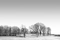
My thoughts on the image: This entry immediately brought a smile to my face as soon as it loaded. The simplicity and minimalism of the capture make it a pleasure to view. Your perpendicular lines you captured between the intersecting land and tress give my eyes a great guide to wander the frame.
My ideas for improvement: I think that the sky is just a bit overexposed and that the details look just a bit over-processed. Outside of that, there are very few things that I would have chosen to change here.
Where I would have/did score this entry: I think that the voters missed this one. I did not vote on this particular challenge, but this one would have fallen in the 6 or 7 range for me. I really, really like the minimalistic approach you took to the challenge. Well seen and well presented.
Thank you for the opportunity to provide a critique on your entry,
Eric
|  Photographer found comment helpful. Photographer found comment helpful. |
| 12/04/2009 06:10:05 AM | Dawn on the 4thby TerComment: Hey there from the Critique Club
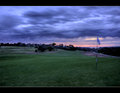
My thoughts on the image: I am not a fan of the post-processing here. It looks like the images you used for the sky were not aligned fully, leaving a repetitive, blurry feeling to the overall image.Even with that, I do like the strength in the colors and the approaching storm you captured.
My ideas for improvement: I'd like to see the golf course area a bit more exposed and brighter. While I am not 100% sure that the overlay is off up top, I think it was. If so, it needs to be properly aligned. If am am mistaken, please accept my apology.
Where I would have/did score this entry: I did not vote on this particular challenge, but this entry would have pulled a 3 or a 4 from me. The relative darkness of the landscape itself leaves room for vast improvements.
Thank you for the opportunity to provide a critique on your entry,
Eric
| | Photographer found comment helpful. |
| 12/04/2009 05:55:15 AM | primitiveby posthumousComment: I always love the opportunity to spend time with your images. This one is no different. I agree with Steve. There is something very alive in there. It looks more heavenly and angelic to me, especially shining through brighter than the back lighting itself. I see a steamy lake, a nice mountain range, and a beautiful sunrise...all from an abstract of a paper towel. It is always a nice surprise to see how much a creation like this actually speaks to your comment givers. While the overall vote is no surprise give the average voter's expectation of a crystal clear water droplet, light refraction through wine glasses, or the weathered face of a third-world citizen, I still take delight in the fact that there are still many votes of 6 or better. I didn't vote in the challenge, but this one would have been a top pick for me. As always, Mr. Giovanni, it is a pleasure each time I run across a request for a critique from you. Thanks for the opportunity. | | Photographer found comment helpful. |
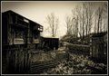
| 12/04/2009 05:46:44 AM | Rural landscape with pigeon shed.by rooumComment: Hey there from the Critique Club
My thoughts on the image: I like it, but I don't think that it fits well into the landscape challenge. The toning is nice and I really love the interest that is contained within the capture. The processing is near-perfect for the subject matter. The various textures you managed to capture truly are amazing if you give your eye time enough to explore the image.
My ideas for improvement: As far as the image as it is, there are not many areas that I would alter the shot. I like the detail you capture, and the various textures paired with the array of leading lines keep my eye moving from one interesting item to the next. I would like to see the sky with more interest and better exposed. As it is, it does compete with my eye attention with the rest of the image.
Where I would have/did score this entry: I did not vote on the entries of this challenge, but my vote would have probably fallen the range of 4. I do see the rural setting well, but I have grown to expect more land in a landscape image.
Thank you for the opportunity to provide a critique on your entry,
Eric
| | Photographer found comment helpful. |
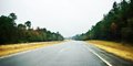
| 12/04/2009 05:28:59 AM | Windshield Watercolor Photo-Paintingby 777STANComment: Hey there from the Critique Club
Originally posted by 777STAN:
It was a five-second impulse. Grab camera! Without visually composing shot point toward windshield! Click! Put down camera! |
My thoughts on the image: Unfortunately, I immediately feel that this is a post-processed snapshot rather than an image that you tool time to compose and enhance with post-processing. Now I do like the watercolor feel that you processed, but over all the image has several flaws that are difficult for the standard voter to overcome.
My ideas for improvement: Clean your sensor. Even without cleaning the sensor, make sure that you remove sensor dust from any challenge entry. Every time. Take time and compose the image. This looks like a typical Georgia fall to me; a scene that I am very fond of. I love the wet asphalt, the golden grass, and the beautiful leading lines you captured. I'd just like to see it with the sky a little less exposed and some time in post-processing to enhance the captured image rather than creating a new image through processing.
Where I would have/did score this entry: I did not vote in this particular challenge, but I surely would have been one of your 3s or 4s. While this is indeed a landscape, I just lose appreciation and interest with images that are over-processed. I do like the foundation of your capture, but I'd like to see it processed more for the image that it was.
Thank you for the opportunity to provide a critique on your entry,
Eric
| | Photographer found comment helpful. |
| 11/18/2009 02:58:24 AM | | | Photographer found comment helpful. |
| 11/09/2009 08:06:37 PM | Best Friends by timfythetooComment: \
ETA: Not sure what that original \ was all about there. Apparently I was hitting backspace to maneuver around the challenge entries. Anyway, I love the emotion you captured here. They both seem very happy with the current situation. Congrats on the blue! Message edited by author 2009-11-12 13:35:48. | | Photographer found comment helpful. |
| 10/27/2009 06:11:46 AM | stoned immaculateby disassociationComment: Hey there from the Critique Club
My thoughts on the image: Very unique. Like you posted, this is your first experiment with light painting. It is a very fun and interesting concept once you get an idea of which light and exposures turn out which images. You now know what you did for this one and which results followed.
My ideas for improvement: Paint more faster and speed up that shutter a bit. Moving the light slowly and randomly produces vast differences in the light and exposure. Start out with an idea of what you want to paint, the experiment until you get a consistent result. The random movement of the light produced some interesting shadows, but it also left you with some very distracting, blow highlights.
Where I would have/did score this entry: I did vote on this particular challenge, and I scored you at 4. With that in mind, I was in agreement with the voters for the most part. However, this is an interesting start to a potentially strong image. You have a strong idea and a great subject. Now go shoot it again. That D100 paired with the 50mm 1.8 can yield you some tremendous images. That is still one of my favorite old cameras to break out here and there.
Thank you for the opportunity to provide a critique on your entry,
Eric
| | Photographer found comment helpful. |
| 10/27/2009 05:30:56 AM | The Fruit Shop Ownerby ankursomaniComment: Hey there from the Critique Club
My thoughts on the image: Your image is full of vibrancy and interesting colors. My eye is immediately drawn to the various fruits and pulled into the image. The colors are terrific and captivating, which, as other voters have mentioned, is also the primary flaw of the image.
My ideas for improvement: This would have scored much better, in my opinion, with the owner cropped out and the image submitted to artificial lighting. DPC voters lover vibrant colors and seem drawn to them like mosquitoes to those bright, purple bug zappers. As mentioned earlier, the owner himself is difficult to find in the image. However, the fruit is lit with nice, even, artificial lighting.
Where I would have/did score this entry: I did vote on this one and it pulled a 5 from me. I like the flow of the image as well as the bug-zapping colors, but the challenge was missed in my opinion. Looking back at it now, I would have probably have hit it with a 4.
Thank you for the opportunity to provide a critique on your entry,
Eric
| | Photographer found comment helpful. |
| 10/27/2009 05:24:04 AM | Onwards!by BazlordComment: Hey there from the Critique Club
My thoughts on the image: You did a fine job meeting both ends of the challenge. You captured the into and out of very nciely. I also like the subject matter as it has a very different interest from images usually presented here. I also like your depth of field use in an attempt to hold the viewer's eye on the primary subject. There are, however, some technical and compositional flaws that I'd like to see addressed to make this a stronger image.
My ideas for improvement: Again, I like the subject matter, but I'd like to see the presentation just a bit different. The object at the bottom right of the frame is terribly distracting to my eye. I definitely need that cropped a bit better. Also, I would personally like to see a just a slight bit more space between the frame and his nose. Cropped as it is feels very tense. I also believe that the composition would have been a great deal stronger with a slight rotation in your point of view. I'd like to see the soldiers at the rear bleed over and off of the frame on the right side. Your lighting is also reversed from what you need it to be. A fill flash would have greatly helped hp;d my eye onto the primary subject rather than the brighter, busier background.
Where I would have/did score this entry: I did vote in this challenge, and this one hit me right in the middle of the road. I was one of your 71 5s for this one. There was a great deal of interest, and you did a fine job meeting the challenge well. There were just too many execution flaws in my mind's eye to pull a much higher vote from me. I think that the image, as it is, was scored fairly appropriatly by the voters.
Thank you for the opportunity to provide a critique on your entry,
Eric
| | Photographer found comment helpful. |
Home -
Challenges -
Community -
League -
Photos -
Cameras -
Lenses -
Learn -
Help -
Terms of Use -
Privacy -
Top ^
DPChallenge, and website content and design, Copyright © 2001-2025 Challenging Technologies, LLC.
All digital photo copyrights belong to the photographers and may not be used without permission.
Current Server Time: 07/30/2025 05:58:43 PM EDT.
|