Hey there from the Critique Club
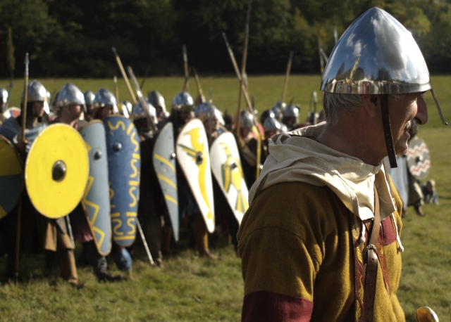
My thoughts on the image: You did a fine job meeting both ends of the challenge. You captured the into and out of very nciely. I also like the subject matter as it has a very different interest from images usually presented here. I also like your depth of field use in an attempt to hold the viewer's eye on the primary subject. There are, however, some technical and compositional flaws that I'd like to see addressed to make this a stronger image.
My ideas for improvement: Again, I like the subject matter, but I'd like to see the presentation just a bit different. The object at the bottom right of the frame is terribly distracting to my eye. I definitely need that cropped a bit better. Also, I would personally like to see a just a slight bit more space between the frame and his nose. Cropped as it is feels very tense. I also believe that the composition would have been a great deal stronger with a slight rotation in your point of view. I'd like to see the soldiers at the rear bleed over and off of the frame on the right side. Your lighting is also reversed from what you need it to be. A fill flash would have greatly helped hp;d my eye onto the primary subject rather than the brighter, busier background.
Where I would have/did score this entry: I did vote in this challenge, and this one hit me right in the middle of the road. I was one of your 71 5s for this one. There was a great deal of interest, and you did a fine job meeting the challenge well. There were just too many execution flaws in my mind's eye to pull a much higher vote from me. I think that the image, as it is, was scored fairly appropriatly by the voters.
Thank you for the opportunity to provide a critique on your entry,
Eric
|