| Image |
Comment |
| 02/06/2003 05:09:08 AM |
Two Classics by JackoComment: A combination of cliches. The idea is great. Well executed and looks like it gives us a little more effect than I would've anticipated with the checkerboard pattern at the top of the drop. Really really well done - Inspzil |
 Photographer found comment helpful. Photographer found comment helpful. |
| 02/06/2003 05:06:09 AM |
Growth Spurt!by KonadorComment: Great idea. I like the boy looking up at "himself" and the boy on the right's head not visible. makes for an intrituging pic - Inspzil |
| Photographer found comment helpful. |
| 02/06/2003 05:04:35 AM |
Coal to Diamondby karmatComment: One of the best ideas of the week. I think there are a few things that would make this picture much better with not much work. Firstly, put the ring where people can really focus on the gem. Show its good side. Secondly, a little more creative lighting to show the gem off would be the icing on the cake,. Again, good shot - Inspzil |
| Photographer found comment helpful. |
| 02/06/2003 04:44:54 AM |
Origamiby mcmurmaComment: This has really good potential. The composition is pretty good. I like the crane and position but I think it should be panned back a little. The other thing is color. My mother's origami paper back when I was a kid was some very wonderful colors and patterns. The black and white thing here doesn't do it for me tho. - Inspzil |
| Photographer found comment helpful. |
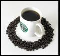
| 02/05/2003 08:10:14 PM |
Dark Roastby JackoComment: I think this picture is too flat. Its not badly arranged or taken but it needs a little something and I believe its the lighting and angle. I would've taken it from slightly over top of the cup level. - Inspzil |
| Photographer found comment helpful. |
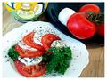
| 02/04/2003 02:18:07 PM |
Insalata Capreseby GraciousComment: Great colors. It doesn't look all that appetizing, but its a nice photo. The bright lighting makes it a little flat however but I don't know how to get away from it and keep the colors so vivid. - Inspzil |
| Photographer found comment helpful. |
| 02/04/2003 02:11:15 PM |
|
| Photographer found comment helpful. |
| 02/04/2003 02:08:58 PM |
Self Portrait by jjbeguinComment: Lighting is good, I would like to see it a little brighter. Good use of negative space. Cool Skull - Inspzil |
| Photographer found comment helpful. |
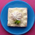
| 02/03/2003 11:33:49 PM |
Shapes, Color, and ... Pie?!by indigo997Comment: Critique Club by Inspzil
Composition - It seems odd to me that the Pie here is square. Maybe that's the appeal of the pic. The pie is good. I like that part with the lime twisty and little whipped topping and all. The plate is okay. I reckon you gotta have a plate. The pink background, which looks like a sweater to me, is one of the things I don't like about this picture. It's probably a personal thing. I'm not fond of pink either, but I can't say anything like, "Well I'm giving you a 5 because I don't like pink." That doesn't fly. But the texture of the sweater is going a little diagonal. The other thing I don't like about this is the tightness of the crop. Maybe there is a reason for being so tight on the plate, I'm not sure but I don't think it lends itself well to this picture. The perspective on this pic is really predictable, very straight and to the point. The pie, no matter what it's sitting on, still looks yummy.
Photography - Good focus, exposure. DOF is not really an issue. Nothing to speak of really here.
Processing - Even less of an issue. If you did anything to this pic, I can't tell. You might have tried to saturate the colors a little more, but its fine the way it is.
Overall - This is a cut below your normal excellent pictures. I would've been happy with a 5.5 on my pic but I'm sure you aren't. The things that keep this pic from doing really well are due to the composition. It just doesn't have the WOW factor Setzler likes to talk about. The angle and crop are just very ordinary, like something I would do. It isn't typical Indigo-type work. Look forward to seeing more from you. I'm sorry this couldn't be more help to you. - BoB |
| Photographer found comment helpful. |
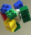
| 02/03/2003 04:30:44 PM |
untitledby kandyjComment: Critique Club by inspzil
Composition - As much as I loved Legos as a kid, I love them now that I have kids. I'm not terribly fond of this shot. I don't like the way this looks photoshopped, even if it isn't. Shooting on mirrors has a tendency to make the background look far away, which is true in this case. They're square all right so it does meet the challenge. I think the colors are great. I wish the reds were more in the forefront though to demonstrate all the colors in the light a little. The crop is in that middle area where I think it should be either a little tighter, or a little further back. Preferably a little further back because I think you could hide the fact that its not perfectly focused a little better.
Photography - The focus issue is huge. I don't get why you needed an 8 second exposure either. I don't know what it adds to this shot. I think the focus issue might stem from this. This is the major problem with this photo above and beyond everything in my opinion.
Processing - Good work with the colors, if you did indeed enhance them. I don't know if the sharpen filter in PS could help this or not, but it would be worth a try.
Overall - I didn't vote on about half the shots the first time around, and this was one of those. I think it would've been more successful if it were crisp. I still don't understand the long exposure time for this shot. It may be something that I might want to know about, so feel free to PM me if there is a good explanation. :) I definitely don't know everything about photography!! Good Luck in future challenges - Bob |
| Photographer found comment helpful. |
Home -
Challenges -
Community -
League -
Photos -
Cameras -
Lenses -
Learn -
Help -
Terms of Use -
Privacy -
Top ^
DPChallenge, and website content and design, Copyright © 2001-2025 Challenging Technologies, LLC.
All digital photo copyrights belong to the photographers and may not be used without permission.
Current Server Time: 08/13/2025 07:52:12 AM EDT.