| Image |
Comment |
| 01/13/2003 11:05:39 AM |
|
 Photographer found comment helpful. Photographer found comment helpful. |
| 01/13/2003 11:02:10 AM |
The Burnoutby alanfreedComment: Aawk - what went wrong? I meant to return and change my nine to a ten but I got busy. Maybe everyoone else forgot too. I thought this was a real winner. |
| Photographer found comment helpful. |
| 01/13/2003 10:57:21 AM |
|
| Photographer found comment helpful. |
| 01/06/2003 12:56:29 PM |
|
| Photographer found comment helpful. |
| 01/06/2003 12:41:39 PM |
Nowhere to goby GinaRothfelsComment: Hello from the critique club -
This is a nice photo - I gave it a 6. It is well executed but doesn't have anything to make it stand out from the pack except for humor. The votes would agree, no great scores, few terrible scores.
This is what I like: First of all the humor, it really is pretty funny to see a car in a cage from the American perspective. I have never seen such a thing. we lock our cars up in dark garages. It gives the car a personality to see it in a cage, It seems to be looking out, pining to get going. And the landscape works just right for that impression. In front of the car is a lovely green field and maybe an intersting town in the distance. I like the colors of the photo, the stone and metal are all pinkish brown, contrasting with the green outside. The silver car stands out nicely. The focus is good from the forground all the way to the background. Lighting and exposure are excellent and probably were difficult to get right.
What doesn't work so well is the composition. It is too centered and then not quite straight at the same time. With the car so exactly in the center and the cage around it having such rigid lines, the barrel distortion from the lens is very apparent. The detailed design on the cage door cuts right across the tail lights, creating a conflict between the most visually interesting parts of each. There aren't any compositional lines that lead the viewers eyes into, out of, or around the picture. My eyes keep coming back to the circles on the gates being in the way of the tail lights and number plate.
There is a story here, the car and it's driver are not going anywhere today, even though it is a lovely day. But then what? The story isn't quite interesting enough and the photo isn't quite appealing enough. As Grocho Marx would say, "Close but no cigar". |
| Photographer found comment helpful. |
| 01/06/2003 11:27:24 AM |
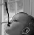
Goo Goo Dollby GraciousComment: Just me I guess - I was that nine, I should have given it a ten, I love it! |
| Photographer found comment helpful. |
| 01/06/2003 11:13:19 AM |
|
| Photographer found comment helpful. |
| 12/30/2002 06:10:30 PM |
|
| Photographer found comment helpful. |
| 12/18/2002 03:43:34 PM |
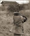
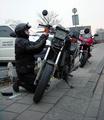
Roadside Repairs (Portrait of a friend)by AzrifelComment: I like this photo. I gave it a seven which seems to be the best it got. Looking over the coments it seems like people either didn't like the weather or didn't like motercycles. I'm not so fond of this gloomy weather either but it makes a great picture and certainly adds to the mood of the day and the roadside repair. He keeps his coat on and his helmet- it must have been raw and the metal looks cold. Nor am I much interested in motorcycles but do Love portraits and pictures that tell a story. This is a real story teller. He's riding with a group, or at least a partner, something has gone wrong, he has to fix t himself, there isn't a garage or a warm place. He looks toatlly intensly absorbed, maybe stubborn even? That face is central to the picture.
I do agree with the commenter who said it looks tilted and should be rotated a bit. But that will be my only negative comment.
I like the colors, almost a monochrome except for the red cycle, the yellow warning lights and the guys face. It emphasizes the three most important things. I like the conflicting diagonal lines of the sidewalk and the leaning bikes. I like the way the broken bike looks black and dirty while the red bike (whos riders is presumably in a warm pub) looks shiney new. I like the writing on the car, on his helmet and on the red bike make a triangle. The picture as a whole is self contained, the lines bring the viewer back to the central theme. Good use of the rule of thirds, his face is at one intersect and NOTHING is at the opposite intersect which makes the face the real focus.
I really like this picture, a lot can be read into it.
Comment from the critique club - remember this is only one amateurs opinion (mine). Message edited by author 2002-12-20 16:35:18. |
| Photographer found comment helpful. |
| 12/17/2002 03:53:29 PM |
Motion and motion stopper.by wingyComment: This is an interesting photograph and the more I look at it the more I like it. I even like the things I initially didn't like. Here is what I like:
The format (is that the word for the size ratio?) is very effective, the oblong being drawn out feels like the doplar effect where the image is actually being dragged/stretched out by the train.
The sepia color works well. It is night and night should be monochrome. ANy color, like a red light or green grass, would have been distracting to the image. I like the sepia better than B+W - it makes the scene a bit unreal.
I love the gradation of light from too dark on one side and too light (overexposed) on the other. It adds alot to the sense of motion - To me is is going from the dark into the light. Same for you? I definately FEEL the motion and I disagree with the commenters who thought it looked like a wall. Although they did get the sense of MASS that the motion carries with it. It feels powerful, like you better get out of the way.
I like the RR crossing sign and its eerie shadow. It never occurred to me that the shadow as well as the sign would be static in relation to the moving train and this is very well done. The sign itself almost looks like a person with those two big lights being the eyes and this person says STOP and holds out his arm. But the train can't stop. But the shadow is such a distortion of the sign that it looks like a gallows, or cross or something sinister. The two lights have become dangling arms.
This is a visually compelling image and there is something dark and disturbing about it too. The dynamic force of that train in the dark is sort of creepy and dangerous.
I can't think of anything that you should change because that would change the feeling behind the image. I think if people looked carefully at why they scored it low they would find that they were disturbed by the image. Good job.
from the critique club - remember that I am just an amateur and this is only one persons opinion (mine). |
| Photographer found comment helpful. |
Home -
Challenges -
Community -
League -
Photos -
Cameras -
Lenses -
Learn -
Help -
Terms of Use -
Privacy -
Top ^
DPChallenge, and website content and design, Copyright © 2001-2025 Challenging Technologies, LLC.
All digital photo copyrights belong to the photographers and may not be used without permission.
Current Server Time: 08/05/2025 03:05:54 AM EDT.