| Author | Thread |
|
|
01/09/2003 01:01:20 PM |
|
I love it.. I think it is a great shot and great post processing. Very Andy. |
|
 Photographer found comment helpful. Photographer found comment helpful. |
|
|
01/06/2003 11:27:24 AM |
|
Just me I guess - I was that nine, I should have given it a ten, I love it! |
|
| Photographer found comment helpful. |
Comments Made During the Challenge  |
|
|
01/04/2003 08:25:33 PM |
|
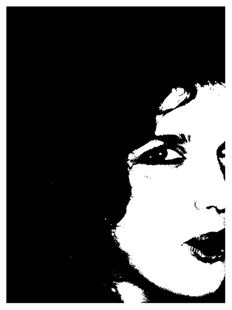
I like the effect you are going for here, but I wish there was less black on the left and a bit more of her face on the right. |
|
|
|
01/04/2003 07:15:45 PM |
|
Daring.. I'm not sure about the crop though. I think it'd have been better to either show the second eye entirely or not show any of it.. 6 |
|
|
|
01/02/2003 05:43:14 PM |
|
seems more like digital art than photography |
|
|
|
01/01/2003 12:07:16 PM |
|
contrast is too high, intentionally or not |
|
|
|
01/01/2003 09:58:52 AM |
|
Nice abstract, and it sure is B/W. Good use of negative space. good work. |
|
|
|
12/31/2002 05:54:25 PM |
|
I don't like this much at all. There is really no detail to honor this person with. She looks like a lovely girl, why not show that off? I can't comment on technical aspects like focus or lighting, cause there really isn't any due to so much post processing. The angle and framing/cropping needs some work though, in my opinion. You cut her nose right off. Sorry if I don't see this the way you do. Good luck in the challenge. |
|
|
|
12/31/2002 02:56:09 PM |
|
You have a nice composition here, but for my tastes, you went too far with the post processing. I can see the value in it, but it just doesn't work for me... |
|
|
|
12/31/2002 05:10:20 AM |
|
Very interesting "art type" portrait, that does manage to capture some expressiveness. The composition feels a little unbalanced to me, with just a little too much negative space for my taste. Overall though, I like the photo. |
|
|
|
12/30/2002 05:52:34 PM |
|
|
|
12/30/2002 05:46:58 PM |
|
Looks too doctored for my taste, however I like the composition and placement of the face. Jacko 7 |
|
|
|
12/30/2002 10:16:46 AM |
|
I really like this. IT has a very classy look to it. NICE ! Shiiizzzam |
|
|
|
12/30/2002 01:07:43 AM |
|
I REALLY like this, but I wish you wouldnt have cropped off the tip of her nose. |
|
Home -
Challenges -
Community -
League -
Photos -
Cameras -
Lenses -
Learn -
Help -
Terms of Use -
Privacy -
Top ^
DPChallenge, and website content and design, Copyright © 2001-2026 Challenging Technologies, LLC.
All digital photo copyrights belong to the photographers and may not be used without permission.
Current Server Time: 06/28/2026 09:45:20 AM EDT.