Hello from the critique club -
This is a nice photo - I gave it a 6. It is well executed but doesn't have anything to make it stand out from the pack except for humor. The votes would agree, no great scores, few terrible scores.
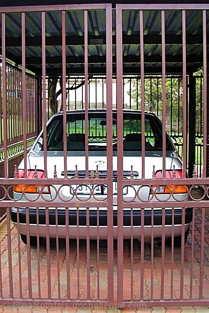
This is what I like: First of all the humor, it really is pretty funny to see a car in a cage from the American perspective. I have never seen such a thing. we lock our cars up in dark garages. It gives the car a personality to see it in a cage, It seems to be looking out, pining to get going. And the landscape works just right for that impression. In front of the car is a lovely green field and maybe an intersting town in the distance. I like the colors of the photo, the stone and metal are all pinkish brown, contrasting with the green outside. The silver car stands out nicely. The focus is good from the forground all the way to the background. Lighting and exposure are excellent and probably were difficult to get right.
What doesn't work so well is the composition. It is too centered and then not quite straight at the same time. With the car so exactly in the center and the cage around it having such rigid lines, the barrel distortion from the lens is very apparent. The detailed design on the cage door cuts right across the tail lights, creating a conflict between the most visually interesting parts of each. There aren't any compositional lines that lead the viewers eyes into, out of, or around the picture. My eyes keep coming back to the circles on the gates being in the way of the tail lights and number plate.
There is a story here, the car and it's driver are not going anywhere today, even though it is a lovely day. But then what? The story isn't quite interesting enough and the photo isn't quite appealing enough. As Grocho Marx would say, "Close but no cigar". |