| Image |
Comment |
| 06/28/2004 08:45:44 PM |
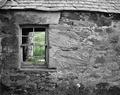
Tamaraby PhilosComment: A very haunting look. I would have prefered less saturation on the lips. yet the image remains strong. |
 Photographer found comment helpful. Photographer found comment helpful. |
| 06/28/2004 08:43:01 PM |
|
| Photographer found comment helpful. |
| 06/28/2004 08:40:18 PM |
|
| Photographer found comment helpful. |
| 06/28/2004 08:38:42 PM |
|
| Photographer found comment helpful. |
| 06/28/2004 07:38:04 PM |
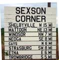
Where do you want to go??by mmccoyComment: from the Critique Club:
In this picture you presented a few ideas but failed to realize their full fruition. Of course, it is very easy for me to sit back with coffee cup in hand and make these observation. First, the sign ate up too much of the visible image. Of course, a sign can be the sole purpose of an image but in such case great care is given so that the background area compliments it. Smaller would have been better in this case. Second, there is an interesting interplay regarding image and canvas. This effect was left hanging. Again, we are left with a sign and as the eye moves around is distracted by the tilt and a yellow item whose identity is beyond the viewers comprehension.
I think you had a very good idea here, but you did not give it enough thought. The sign robbed the earth and sky completely and the tilt added more question. My suggestion is to rethink this picture all over again. Re-do it, if only to prove that you did have a concept and perhaps because of time pressure or whatever, you failed to realize
your goal. dan Message edited by author 2004-06-29 09:30:01. |
| Photographer found comment helpful. |
| 06/28/2004 01:09:53 AM |
|
| Photographer found comment helpful. |
| 06/28/2004 01:08:09 AM |
|
| Photographer found comment helpful. |
| 06/28/2004 01:07:05 AM |
|
| Photographer found comment helpful. |
| 06/26/2004 07:44:38 PM |
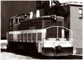
Retiring #12by bobdaveantComment: From the critique club;
Very nice conposition and the sepia gives it that vintage flavor. The tone and the comp are 7-8. I am a sucker for sepia so I'll give you an 8. The focus point is not the front of the subject and although this is not serious, it shows me very nice detail in the brick wall and the sides of the subject but it leaves the detail in the front a little ambiguous. The eye then follows the white and suddenly drops to what may appear like a picture within a picture. I look and look and can not decipher that lower left rectangle. I can surmize that I am looking underneath the back wall.
Although the above seems hyper critical, the picture does invite the eye and the overall feel is the important chemistry. It is very difficult to find a perfect picture, but here you took great care to keep lines perpendicular to the horizontal plane and it is a rather neat image with impressive contrast. |
| Photographer found comment helpful. |
| 06/25/2004 03:35:43 PM |
|
| Photographer found comment helpful. |
Home -
Challenges -
Community -
League -
Photos -
Cameras -
Lenses -
Learn -
Help -
Terms of Use -
Privacy -
Top ^
DPChallenge, and website content and design, Copyright © 2001-2025 Challenging Technologies, LLC.
All digital photo copyrights belong to the photographers and may not be used without permission.
Current Server Time: 08/25/2025 08:12:57 PM EDT.