| Image |
Comment |
| 07/07/2005 03:02:59 AM |
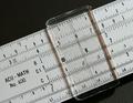
Slide Ruleby janrussComment: A good shot of a great subject for the challenge. What I believe hindered your score on this shot and I don't see mentioned by commentors is the fall off of your DOF. It is a minimalistic shot with complex details (there isn't such a thing I just made that up) plenty of detail from all the lines on the rule.
Beings how the rule nearly fills the frame the slide becomes the major subject and the eye is drawn to the slide, I immediatly notice all the tack sharp lines beneath and around that area. As I study it more my periphial vision quicky spots the softness of the lines at both ends of the rule.
As close as you are to the subject this is a tough shot to pull off with Sharpness throughout. It appears that you have plenty of light, stopping down the aperture possibly as much as f/11 might have prevented the fall off the DOF.
And then the other approach might be to take the shot from an angle to deliberatly have a shallow dof on one end of the rule or other. Message edited by author 2005-07-07 03:08:19. |
 Photographer found comment helpful. Photographer found comment helpful. |
| 07/07/2005 02:32:51 AM |
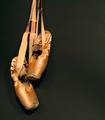
Dead Pointe Shoesby pidgeComment: Excellent concept and a nice composition. IMO there are several things that may have brought your score up.
The first noticable (and I have been bitten by this before I started calibrating my monitor regularly) is the background. I believe it to be black velvet but it has been lightened to an almost dark gray. The negative space is fine but it really needed to be a lot darker to insure that there was nothing but the shoes to look at in the shot. The dull gray along with (another thing I have been bitten by which is lint/specks/cat hair) white specks on the backdrop tend to pop out when one really studies the shot. Both could be remedied by adjusting Luminosity upwards (darker) on the Histogram just to the point where the specks disappear. The other thing I learned is to have a lint brush handy as I have cats and they love black velvet.
The other thing that I would have done and this is even nit pickier...is that if the shoes are to appear dangling (and they do), I would have straightened the shot so that the shoes hung straight down...whether or not was straight as you took it, the human eye sees what it perceives to be right and in this case the shoes seem to be hanging to the left as I view it. Sometimes we need to adjust for the way eyes perceive things.
Subject matter is great and worked well here. The artsy side of me says this would have done exceptional with the same composition but done in a contrasty b/w to add even more age to the shoes.
Just my thoughts. Message edited by author 2005-07-07 02:44:33. |
| Photographer found comment helpful. |
| 06/16/2005 01:57:13 AM |
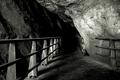
Treacherous Pathby LevTComment: I like it a lot...gives one the feeling they are about to decend into the bowels of the earth. Great crop/composition. Excellent Shot. One of my picks. |
| Photographer found comment helpful. |
| 06/16/2005 01:50:10 AM |
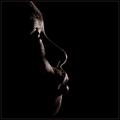
Profileby yeouaComment: Great expression. The Lighting is marvelous. I am not a big fan of square crops but seems to work well here. Execellent shot. One of my top picks. |
| Photographer found comment helpful. |
| 06/16/2005 01:47:59 AM |
Noirby nico_blueComment: Very nice...Well executed. Billboard or Advertising Material. Great use of lighting and a just right crop. Great Shot. |
| Photographer found comment helpful. |
| 06/16/2005 01:46:05 AM |
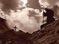
Death by asijComment: Very nice well executed shoot...can't think of anything that I would have done different except straigthening the cross...but that is the virgo in me. Excellent shot. |
| Photographer found comment helpful. |
| 06/16/2005 01:29:25 AM |
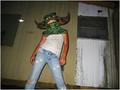
unfounded fearsby cheleComment: Lighting and Setting seem to be holding you back here. On Camera flash or vehicle lights will always leave a harsh shadow. The setting really takes away from the subject. I might have taken the shot in a different location that would have centered focus on the mask... You know what would be fun (mask as prop)is to have the person with the mask in a bed with hand reaching out giving the view the idea that he/she is going to get in bed with that...or worse monster masked person with a cigarette giving the viewer the impression he/she just...well you know.
Anyways I think Lighting and Location could be a bit better, I like the angle as it makes the monster person look bigger than life. |
| Photographer found comment helpful. |
| 06/16/2005 01:18:20 AM |
The Sorceressby H R VerryComment: Very cool image, but I think the tint detracts from the over all shot. I might have had the model powder her face to an eerie white and then lit it from underneath with a soft white light as you did with the green. Very nice composition and set up but for me the green seems to take away from what would be a soft but serious photo. |
| Photographer found comment helpful. |
| 06/16/2005 01:12:51 AM |
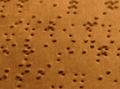
Brailleby manuraoComment: Cool concept and good way of expressing what darkness is to you. To the viewer without the title this might be confusing. The shot as it is (crop) may have worked better with a longer DOF to where we could see all the bumps and pits in the frame in focus.
I may have used a person eyes closed (blind or someone pretending) sitting at a table in a dimly lit area, running their finger across the braille page as if they were reading.
I think your idea blindness = darkness could have been a top placer if executed differently. The shot as it is (shallow dof) makes it difficult to visualize that this is braille. A good thought provoking attempt. |
| Photographer found comment helpful. |
| 06/15/2005 09:46:31 AM |
Lo! Now the darkness will loom large!by doctabrezComment: Just a couple thoughts on this one. Horizion tilt and quite a bit of noise. Whenever you have a waterline it is more times than not a good Idea to straighten on that line. In this case straightening on that line would also correct the vertical lines of the buildings putting them straight up and down instead of leaning to right as they do here.
Noise or pixelation beyond grain, there is quite a bit of it here...somewhat distracting. If your camera does this quite often and use an editor that uses PS filters PS, PaintShop or Digital Image Pro etc...you may want to try the (free) supersmooth filter from //www.xero-graphics.co.uk/ set 2 of the filters packages from the plug-ins page... It cleans up photos quite nicely without over doing it like a neatimage or the likes... It is legal in basic challenges as it works on the whole image. I tilted the horizon and applied that filter to you pick and it becomes and very nice soft and warm photograph. This is a very nice shot. |
| Photographer found comment helpful. |
Home -
Challenges -
Community -
League -
Photos -
Cameras -
Lenses -
Learn -
Help -
Terms of Use -
Privacy -
Top ^
DPChallenge, and website content and design, Copyright © 2001-2025 Challenging Technologies, LLC.
All digital photo copyrights belong to the photographers and may not be used without permission.
Current Server Time: 08/05/2025 03:00:30 PM EDT.