| Image |
Comment |
| 06/22/2004 01:00:52 AM |
Whats on ?by StagoleeComment: Another addictave choice! Seems a bit hot and not much "wow" - but a great example of choices. |
 Photographer found comment helpful. Photographer found comment helpful. |
| 06/22/2004 12:58:32 AM |
|
| Photographer found comment helpful. |
| 06/22/2004 12:35:29 AM |
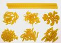
Pasta: which ones?by GabrielComment: This is one one my highest scores - but I'm having difficulty justifying it. I like it a lot, but just can't quite put my finger on why.
1) Graphically it's very strong - but I don't like the horizonatl pasta at the top.
2) The colors are great - but don't seem "photographically real.
3) Evidence of lighting is non-existant - no shadows anywhere.
But as I said - it's in my top ten - and that's what's important if you are looking for scores!
|
| Photographer found comment helpful. |
| 06/22/2004 12:28:07 AM |
Somewhere in the middleby BrennanOBComment: Great idea and execution! Lighting is exceptionally well done. Model and the captured expression is absolutely PERFECT for your idea.
Other very minor points. 1) I do think the angel needs to be toned down a bit. 2) The white light "leaking" onto your model's right lip (left as we look at it) and right shoulder detract ever so slightly.
Overall - you are headed for ribbonville IMO. |
| Photographer found comment helpful. |
| 06/22/2004 12:21:41 AM |
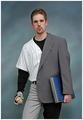
Dreams vs. Career by aaronb532Comment: Since this is one of my very top scores - I thought I'd try to give you my best shot at constructive comments.
First - let's talk technical: Exposure = perfect, composition = classic but effective, DoF = perfect.
On the artistic side: Idea = stunning, model = wonderful, background = a bit "commercial" for me, border = un-needed
Make it better by: 1) A logo on the baseball shirt (doesn't matter what it is - just something for the added impact) 2) No glove on the baseball hand - they don't use them.
Overall: I will be extremely surprised if you don't end up with a ribbon.
|
| Photographer found comment helpful. |
| 06/19/2004 12:58:29 AM |
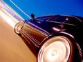
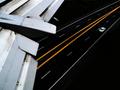
Midnight Runby C-town driverComment: Very graphic! Looks like your camera may have been in danger here - mounted outboard as the car was moving/turning. Extremely strong! |
| Photographer found comment helpful. |
| 06/19/2004 12:56:54 AM |
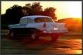
Classic sunsetby pitsamanComment: Perfect time of day - lighting really works. Sun rays add a nice touch. Car looks pristine. I would suggest you re-think the need for this border. |
| Photographer found comment helpful. |
| 06/19/2004 12:55:13 AM |
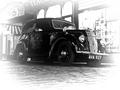
Vintage Snapshotby TallblokeComment: Nostalgia. Excellent back and white work with bright whites, black blacks and a reasonable tonal range in between. Your feathered edges are OK but become too much quickly if you went any further. |
| Photographer found comment helpful. |
| 06/19/2004 12:51:14 AM |
Final Approachby Kha0SComment: Stunning image. The street and the car below are exceptionally graphic and well done. But, the wing flaps (I know you were going for bith airplanes and autos) take up too much of the image. I hope you tried the same shot with less wing.
Even with the wing flaps as is, it's a very strong and graphic submission. |
| Photographer found comment helpful. |
| 06/19/2004 12:43:13 AM |
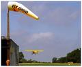
Fly Ohioby MarjoComment: Nice rural capture. Good composition (except that the wind sock is a bit close to the top of the frame.) Exposure spot on. |
| Photographer found comment helpful. |
Home -
Challenges -
Community -
League -
Photos -
Cameras -
Lenses -
Learn -
Help -
Terms of Use -
Privacy -
Top ^
DPChallenge, and website content and design, Copyright © 2001-2025 Challenging Technologies, LLC.
All digital photo copyrights belong to the photographers and may not be used without permission.
Current Server Time: 08/28/2025 07:25:31 PM EDT.