| Image |
Comment |
| 05/14/2004 02:07:09 AM |
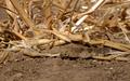
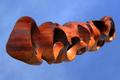
Natural Camoflaugeby autoolComment: Nicely camoflauged, but I wish the straw was not so disorderly. Yeah I know, It's dried grass, what are you going to do, but it would still be nice if it added to the composition instead of taking from it. |
 Photographer found comment helpful. Photographer found comment helpful. |
| 05/14/2004 02:00:21 AM |
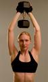
In the Gymby magnusComment: Nice idea, but she looks too posed. But I think if you had her actually lift that weight 10 times or so, and snap the shot on the first lift she strained on you would have a better expression. Other than that, the earrings just do not seem to go with the whole gym subject. |
| Photographer found comment helpful. |
| 05/14/2004 01:56:50 AM |
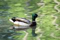
Lucky Duckby candycornComment: Nice reflection, nice detail, incredible contrast with the reflection of the trees (?) on the water. The only thing I would wish for would be for the duck to be swimming with more sun on it's face. |
| Photographer found comment helpful. |
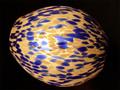
| 05/14/2004 01:54:52 AM |
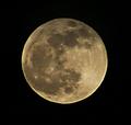
Is it cheese?by toddheadComment: It seems too soft to me. More contrast and some sharpening would help I think.
I was actually planning to enter a moon shot in this challenge (see portfolio), but changed my mind. I probably would not have changed it if I had managed to get a shot of the full moon like you did. |
| Photographer found comment helpful. |
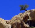
| 05/10/2004 02:25:18 AM |
Aloneby cimarron98Comment: I think it would have worked better with the tree in sharp focus and a gradient in the blue of the sky. |
| Photographer found comment helpful. |
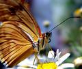
| 05/10/2004 02:23:33 AM |
Come Fly with Me!by ArtifactsComment: It is a shame the DOF was not large enough to get the wings in focus, or at least in the frame. |
| Photographer found comment helpful. |
| 05/10/2004 02:08:14 AM |
Lampby oksamitComment: The DOF seems to be extremely tight on this. |
| Photographer found comment helpful. |
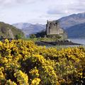
| 05/10/2004 02:01:07 AM |
Eilan Donanby GordonComment: Lovely landscape. The Keep seems a bit flat to me; a bit more contrast (maybe sharpening) on jus the keep would have made its presence more prominent. |
| Photographer found comment helpful. |
| 05/09/2004 06:06:10 AM |
Gnarledby orussellComment: Wonderful separation of the subject from the background. I would have preferred a DOF just large enough to include the entire subject. |
| Photographer found comment helpful. |
| 05/07/2004 02:14:39 PM |
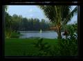
Look out any windowby soccerdadComment: Originally posted by bill_hk2002:
One note: The tree on the right third line is slightly blurred. This is due to wind combined with the long exposure. I couldn't figure out how to get that sharp and still get the light on the inside of the window frame. Hopefully, a little help will come out in the comments. |
Since it was not mentioned in the comments, I will take a shot at it. Since you had the window up, moving a lamp a bit closer would have provided the light the frame needs to really stand out and not look so much like a border. Might have needed to set the exposure to the outside first, then turn the lamp on to keep the outside exposed properly. With some lamps something to drape over it (or bounce the light toward the frame) would be needed to keep the frame from blowing out.
Looking back at this shot makes me wish I was not so busy that week (I missed even looking through it, let alone voting).
David
/edit: fixed tags. Message edited by author 2004-05-07 14:16:47. |
| Photographer found comment helpful. |
Home -
Challenges -
Community -
League -
Photos -
Cameras -
Lenses -
Learn -
Help -
Terms of Use -
Privacy -
Top ^
DPChallenge, and website content and design, Copyright © 2001-2025 Challenging Technologies, LLC.
All digital photo copyrights belong to the photographers and may not be used without permission.
Current Server Time: 08/04/2025 07:33:28 PM EDT.