| Image |
Comment |
| 05/01/2007 06:39:01 PM |
Office.jpgby weegi70Comment: I love the angle, but I think this would be uber fantastic if it had a lot more dramatic contrastiness with it. |
 Photographer found comment helpful. Photographer found comment helpful. |
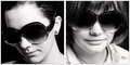
| 05/01/2007 06:38:14 PM |
one.by xantangummiComment: Hmm, I think the left is a bit blown out, not too contrasty, as is the right. Not really sure what to say, neither really stirs me one way or another. it also appears to be two different models... which I think it would have been better effect if there was only a single model for both sides in the different look. |
| Photographer found comment helpful. |
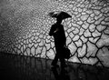
| 05/01/2007 06:30:01 PM |
Day 1 - Phone Callby meneleComment: I love the concept here and you did good with positioning, just wish someone was in the other side, very nice image. |
| Photographer found comment helpful. |
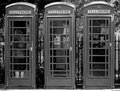
| 05/01/2007 06:28:53 PM |
crisisby boysetsfireComment: nothing at all bad to say, this shot is just... perfect. |
| Photographer found comment helpful. |
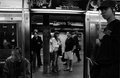
| 05/01/2007 06:24:38 PM |
1by sevilduvarciComment: Not really sure about this image, I think I find the gentleman sitting down on our left to have the most character, and may perhaps a better shot of him would be fantastic. Maybe what it is, is this shot is straight out the doors... I think a sharp angle to out the doors with the open doors not being center frame but to the side would make this a much stronger image. |
| Photographer found comment helpful. |
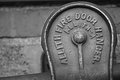
| 05/01/2007 06:22:32 PM |
Fire Doorby jackal9Comment: I like this idea for the shot, it is a touched oversharped, or least that halow around it is a bit of a distraction. Also I would have liked to see this more vertical or a harsher angle, here for me it just doesn't look like the slight tilt is on purpose. Something looks a touch off on the bg as well... just odd. |
| Photographer found comment helpful. |
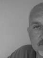
| 05/01/2007 06:20:19 PM |
Day 1 - Evby jonfrommkComment: It is a fantastic shot of your friend, I really enjoy the half capture. But for my preference I would enjoy a bit more contrastiness in the image. It just really seems a bit flat. |
| Photographer found comment helpful. |
| 05/01/2007 06:18:43 PM |
DAY 1. B&W. full moon ..by rozComment: Shots like this... when seen in person will blow you away. However, even I have been guilty of coming back and finding out I didn't get exactly what I was seeing. I like and don't like the post in the front, what I don't like is the position it is in, but I do like the large object there. And unless you could move the cross post, not much you can do about that. I like the down angle on the cross post, but would have liked to see the main post vertical. The fade of the sky is just unreal I really enjoy this setup... but, I really also wish the moon wasn't just a bright spot. Personally I might have just cloned out the moon and left the sky it is fantastic. |
| Photographer found comment helpful. |
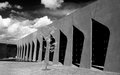
| 05/01/2007 06:13:01 PM |
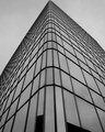
Strongby RetroesqueComment: The lines of the building are very nice, but I am wondering about maybe a stronger angle (you closer to the building) and a different part of day, so the gradulant of the light on the building is gone. For me it just doesn't balance the image very well. Personally I also think the sky is a bit dark. However I find that tree marvelous beyond compare. |
| Photographer found comment helpful. |
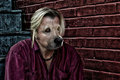
| 04/29/2007 12:58:02 AM |
Men Are Dogs II - XVIby SJCarterComment: I really like the post processing here, the colours are just fantastic as are the textures.
The Composite itself I believe you did a fantastic job of combining the two images, yet, the perspective seems a bit off in my opinion. It looks good, but something about the positioning of the snout just looks off a touch. Maybe Im wrong, but it takes away from the overall feel of the image.
As I continue to look at the image, I am starting to believe that white highlight on the snout is throwing off the lighting continuity for the image and that is what was bothering me so much. To me the main light source seems to be coming from behind your right shoulder (left side of image) and the extremely bright highlight on the snout is out of place. There is no other highlight in the image that matches that intensity. |
| Photographer found comment helpful. |
Home -
Challenges -
Community -
League -
Photos -
Cameras -
Lenses -
Learn -
Help -
Terms of Use -
Privacy -
Top ^
DPChallenge, and website content and design, Copyright © 2001-2025 Challenging Technologies, LLC.
All digital photo copyrights belong to the photographers and may not be used without permission.
Current Server Time: 06/26/2025 02:32:07 AM EDT.