| Image |
Comment |
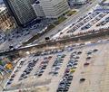
| 01/04/2006 05:14:45 PM |
CityLife_Torontoby laindComment: Nice shot but the size plays a very important part. Its a little on the small side. If you need help with resizing and saving PM me and I will walk you thru the steps to get a larger size photo for the challenge for the viewers. |
 Photographer found comment helpful. Photographer found comment helpful. |
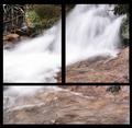
| 11/26/2005 05:09:20 AM |
Flowing Waterby brens29Comment: ** Critique Club **
As one photo I think its would look good but in my opinion it looks like you spilt 1 photo into 3 parts which really does fit into the triptych challenge. riolobo has said it just right in regards to this picture and this challenge. I do like that way the water flows thru all 3 parts and no hot spots off the water which is nice in itself to see. The clarity of the leaves in the background is IMO a little OoF but that could be due to the resize of the photo. |
| Photographer found comment helpful. |
| 11/25/2005 09:34:21 AM |
Bad Santaby beautyqn25Comment: ** Critique Club **
Nicely done as far as selective desaturation goes. I like the way the background goes from light grey in the first to black in the last(right side). If people don't have their monitors calibrated right your gonna lose some points from them not being able to see the difference. I think its subtle enough like that to not include boarders which is always my preference anyway.
There is something about either the brightness or the contrast from the boys body that throws the photo out of balance and I quite can't put my finger on what it is (altho it could be this monitor). It's almost like its throwing the focus off a tad but again that could be because of the resize or this monitor.
The facial expressions fit the photo well and I can't help but think of how well this fits for christmas time. Well done and I look forward to seeing more of your work. |
| Photographer found comment helpful. |
| 11/25/2005 08:30:45 AM |
Yellow points of viewby srugoloComment: ** Critique Club **
For starters I like to say wow the bright yellow is outstanding and vibrant. I'm going to split this photo into 3 pieces working from left(panel 1) to right (panel 3).
Left Side (panel 1)
I like the profile look of the shot but the DoF Leave a bit of blurr on the pedals that I feel takes away from the photo more then it adds. I really like the lighting and how it shows the details of pedals themselves and works very well against the black background. It appears to be higher placed in that panel rather then centered which would have made for a flow into the next panel. Its not off by much but noticable.
Middle (panel 2)
This is the make it or break it for the flow of the photo. Since I'm looking at a profile shot in the first photo I expected to see this one a little more centered to represent a portrait of the daisy. While the composition of this is great for a stand alone photo in my opinon it takes that much away from the photo rather then adds anything. The flow could have worked having the flower that high if it were centered at that level rather then having it justified left. Again, exceptional clarity and excellent details in this section. The lighting is just incredible. The background in this panel is a little distracting as it is not black/dark enough to coinside with the backgrounds of the other panels.
Right Side (Panel 3)
This panel matches/lines up with the panel 1 to achieve the flow. Unfortunately its lower then the first panel and disrupts the flow but works very well justified right like that. This panel has the DoF I would have expected to see in panel 1. I really think that shadows and highlights in this panel adds to overall characteristics of the photo tho and works very well with panel 1.
When I refer to the flow I am talking about drawing my eyes thru the photo without having a jagged line of sight. All in all I think the photo is very well done and probably would have scored an 8 or a 9 from me (but I didn't vote or enter). Keep up the good work and I look forward to seeing some more. |
| Photographer found comment helpful. |
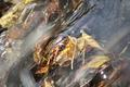
| 11/12/2005 05:01:28 AM |
Leaves in the Streamby brens29Comment: *critique club*
A lot can be achieved by filing out the photographers comments. I helps us know or understand what you were trying to achieve when shooting this photo.
On first glance I was not fond of the angle of the composition as I find it to be a little to fast for the serenity of the subject. A polarizer would have done wonders for this photo as well and would have taken down some of the highlights or blowouts in the water from the overhead flash or sun. I would have like to seen this photo taken with a faster shutter speed to eliminate the milky look in the water as I find it takes away from the transparency. I also think you'll find it should make the photo more crisp/clear and not loss/lacking details as it is right now. I do however like the leaves bunched like that as that is the way I see it in nature and it gives a natural appeal to this photo. I think the photo may have had greater appeal if the water flowed from the right side top (instead of top right) to the left side bottom. It would have slowed the photo down and drawn the viewers eyes thru the photo slower creating a more pleasing feeling as it crosses the photo from right to left instead of top to bottom as it does now.
Good luck and keep shooting. |
| Photographer found comment helpful. |
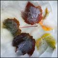
| 11/12/2005 04:38:12 AM |
Autumn On Iceby rwouthuisComment: *Critique Club*
The arangments of the leaves looks almost unnatural. I would suggest using fewer leaves to decrease the image size and the business of the image. It has a nice feel to it, just not enough to suggest frozen in time but perhaps thats due to the image size verses the viewers screen size. The white from the ice is also very distracting and I find it takes away from the color of the leaves. To get the water/ice a little more clear try using warm or hot water. I find this tends to get the white out of the ice. The frozen bubbles on the leaves very well done, not to mention crisp and this gives a sense of waiting for them to surface which draws the eyes deeper into the photo IMO. Altho I'm not fond of the image grain, in this photo it adds to the feelings or sense of being cold/frozen and is a nice touch. I really like the cracks in the ice that crosses the leaves. I think it adds a natural aspect to the ice that may not otherwise have been there. Well done and keep up the good work. |
| Photographer found comment helpful. |
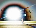
| 11/07/2005 09:05:01 AM |
Football Starby Man_Called_HorseComment: Not from the critique club**
My first thoughts on this photo is "wow way to over edited". As I read what you did and how this shot was achieved I took a second look at it and thought "wow what a unique capture". I think the photo made for an interesting entry for the "what" challenge but not really a photo that could be captured again if you tried to. On that note it probably would have scored a 6 or 7 depending on what other stuff I had voted on first and if I was annoyed at viewing them. I like the composition of the shot and think it would have been a nice shot without the flash. I do like the way the flash had a negative impact on the background of the photo and other photographers as I find it to be an interesting and unique feature to this capture. I would have like to see the player more in focus but I have a feeling thats due to the flash again. Editing wise the only thing I might suggest is playing with the brightness and contrast a bit to tone it down a slight bit. Anyway as I said above its a unique capture for a photograph but IMO just not an appealing one because ofthe flash. Hope this helps. |
| Photographer found comment helpful. |
| 11/06/2005 06:44:10 AM |
Busy Shore - Lineby olddjComment: A nice play on words with the title but the photo itself doesn't convey busy to me. It has a more serenity feeling to it and is rather peaceful to look at when you take into everyday life (in the city that is). The birds being in the center make it more storey like rather then leading into the photo. Perhaps following the RoT's would have added a little sometihng to this photo. I also find the focus to be a little soft on the birds and the grass in the forground to be a lot more crisper. A polariler here would have taken the glare off the water a little bit and added a little more character to it as well. By this I mean the photo wouldn't have looked so washed because of the water (white glare against the white birds). I also think I would prefered to see the bird on the left cropped out which could have also added a slightly nicer shore line as the grass would have lead you into the birds and conveyed your message a little more clearly. It also would have allowed you to expand or at least change your dimentions for a slightly taller photo without changing the actual photo size. Increasing the photo size without altering the photo (is legal in basic editing, altering the photo by stretching it is not) would have made the photo more cosmetically pleasing and filled the screen a little more. I bet your gonna lose marks (score/points) by having an almost panaramic look to. Anyways to sum it up I tihnk it is an interesting photo and probably given it a score between 4 or 5 depending on where or when during my voting I saw it. Good luck in this challenge. <5> |
| Photographer found comment helpful. |
| 10/27/2005 07:26:29 AM |
Penetrating Energyby airdanceComment: I like the backdrop being an off color compared to the lemon as it brings out the highlights in the lemon. I probably would have removed some or all of the seeds as I find them a tad distracting. I also have to agree with Makka that the focus is soft. Nicely done and very creative. |
| Photographer found comment helpful. |
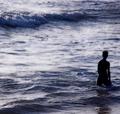
| 09/05/2005 07:06:21 PM |
Breaking The Wavesby willow_zzenComment: IMO the photo lacks subject or interest. Perhaps if the whole body of the guy in the water were a silohouette would have made for a more appealing shot in my opinion. Good luck in this challenge. <5> |
| Photographer found comment helpful. |
Home -
Challenges -
Community -
League -
Photos -
Cameras -
Lenses -
Learn -
Help -
Terms of Use -
Privacy -
Top ^
DPChallenge, and website content and design, Copyright © 2001-2025 Challenging Technologies, LLC.
All digital photo copyrights belong to the photographers and may not be used without permission.
Current Server Time: 08/01/2025 05:02:26 AM EDT.