| Image |
Comment |
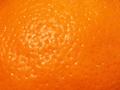
| 02/18/2004 07:24:29 PM |
d'orangeby BurgyBoyComment: such a great idea... I'd like to see a lower light level to bring out more of the texture |
 Photographer found comment helpful. Photographer found comment helpful. |
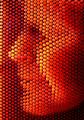
| 02/18/2004 07:22:40 PM |
3D Study in Orangeby kayceeComment: nice twist on the pin thing (right?) to make this solid image stronger I'd like to see it on a bit of an angle (instead of face on) to get a feel of the bumps |
| Photographer found comment helpful. |
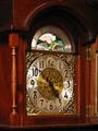
| 02/18/2004 07:21:01 PM |
Timeby frateComment: I'd like to be closer to the clock face (your main subject, I assume) to get a better feel for the texture I sense is there |
| Photographer found comment helpful. |
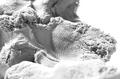
| 02/18/2004 07:18:46 PM |
Eraserby yeouaComment: Like the gummy, rough texture you've got here. To make this shot better (imho) crop out the blurry foreground (as it doesn't add texture) and use a backdrop other than white to add depth to the crevises. |
| Photographer found comment helpful. |
| 02/18/2004 07:08:52 PM |
Leafby paynekjComment: Yes, lots of texture here. Solid image. To make it a bit better: closer crop to fill more of the frame with the leaf (even at the risk of chopping off parts of it) |
| Photographer found comment helpful. |
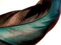
| 02/18/2004 07:05:20 PM |
feather texture and colorby neenee1999Comment: such great texture - solid image. To make it better - some pixel drop out (I know you can't spot edit), a flater background (right now it's so bright it detracts fromthe image) |
| Photographer found comment helpful. |
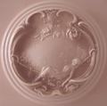
| 02/18/2004 07:03:56 PM |
Vintage Powder Boxby SamaraComment: Like the square framing, colors are calming and fit the image, solid image - to make it better -- lessen the crop on top/bottom (cut off part of the design) and play around with lighting to add more drama to the carved image. |
| Photographer found comment helpful. |
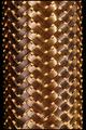
| 02/18/2004 07:01:33 PM |
Metal Hoseby hopperComment: oh I like this -- abstract impact and, upon study, I like the bit of black space on either side (perhaps even more would be good?) |
| Photographer found comment helpful. |
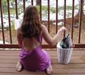
| 02/17/2004 08:06:44 AM |
Letting Go of it Allby SolaireFluxComment: Your subject's pose lets me fill in the blanks. To make the shot better in my opinion, I'd like to see less of everything else. Cropping tighter on her, blurring the railing (as is it's fighting with her for my attention) The stuff in the basket is too small to let me know what you put in there but too busy to be a metaphor for stuff she's throwing away. |
| Photographer found comment helpful. |
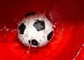
| 02/17/2004 08:02:32 AM |
Butterfingersby johnmComment: Like your idea of letting us see the result of letting go. I could be the angle but I don't get the sense of motion (looking in from the side might give me more of the splash). The colors contrast nicely with each other but the lighting on the water and the ball could be used to direct my attention to what you saw in the shot. As it is it's more of a 50/50 cut across the image. |
| Photographer found comment helpful. |
Home -
Challenges -
Community -
League -
Photos -
Cameras -
Lenses -
Learn -
Help -
Terms of Use -
Privacy -
Top ^
DPChallenge, and website content and design, Copyright © 2001-2025 Challenging Technologies, LLC.
All digital photo copyrights belong to the photographers and may not be used without permission.
Current Server Time: 08/15/2025 02:43:20 AM EDT.