| Author | Thread |
Comments Made During the Challenge  |
|
|
02/24/2004 12:21:09 AM |
|
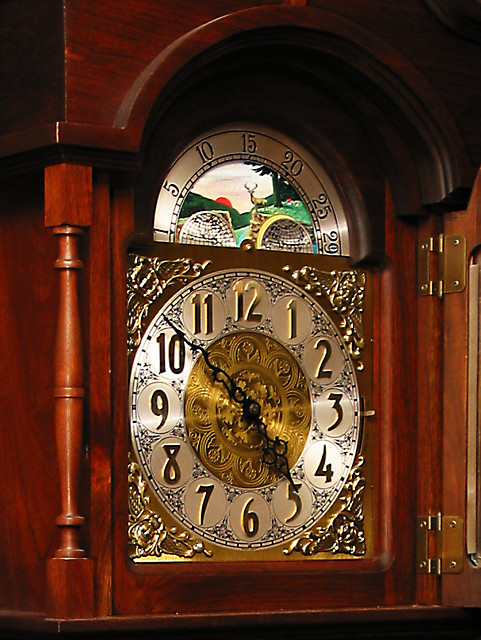
Great texture subject, nice texture contrasts. Beautiful shot. |
|
|
|
02/22/2004 05:09:35 AM |
|
Wow, that is a beautiful clock! Pretty good job with the texture. |
|
|
|
02/21/2004 06:11:32 AM |
|
Nice exposure, but the hands of the clock could be at a more intresting angle. :) |
|
 Photographer found comment helpful. Photographer found comment helpful. |
|
|
02/20/2004 04:07:20 PM |
|
A bit closer would show off the relief around the clock face better. |
|
| Photographer found comment helpful. |
|
|
02/20/2004 11:17:29 AM |
|
Why not a shot of just the clock, without so much of the surrounding cabinet? I think it would have more visual impact. |
|
| Photographer found comment helpful. |
|
|
02/20/2004 09:49:54 AM |
|
Some impression of the quality of these surfaces, though really quite an ordinary illustration of the clock face. Lacks that dynamic that comes from good lighting, from a less straightforward approach. Good exposure, and accurate colours and sense of the object itself, but the shot hasn't placed the emphasis on the textures really - would need more careful consideration of the affect of light on a surface in that area. |
|
| Photographer found comment helpful. |
|
|
02/20/2004 07:42:34 AM |
|
a bit snap shotty to me, like composition hasn't been though of much. |
|
|
|
02/20/2004 12:33:47 AM |
|
Too much to look at. Get in closer and choose a main subject to focus on would really improve this shot. A famous photographer's theory was that if his pictures looked too static, it was because he wasn't close enough. |
|
| Photographer found comment helpful. |
|
|
02/19/2004 11:11:32 PM |
|
perhaps a tighter shot would have captured the textures better |
|
| Photographer found comment helpful. |
|
|
02/18/2004 07:40:55 PM |
|
I like the textures on the clock and I think it's photographed well. Wish you'd have tightened the crop to leave out the hinged door. |
|
| Photographer found comment helpful. |
|
|
02/18/2004 07:21:01 PM |
|
I'd like to be closer to the clock face (your main subject, I assume) to get a better feel for the texture I sense is there |
|
| Photographer found comment helpful. |
|
|
02/18/2004 11:53:48 AM |
Love the lighting in this image.
Good work |
|
| Photographer found comment helpful. |
|
|
02/18/2004 05:00:22 AM |
[World Record Attempt]
+ Lovely wooden colours and great textures in this clock.
- Too much sharpening is noticable and distracting.
|
|
| Photographer found comment helpful. |
Home -
Challenges -
Community -
League -
Photos -
Cameras -
Lenses -
Learn -
Help -
Terms of Use -
Privacy -
Top ^
DPChallenge, and website content and design, Copyright © 2001-2026 Challenging Technologies, LLC.
All digital photo copyrights belong to the photographers and may not be used without permission.
Current Server Time: 06/29/2026 01:42:31 AM EDT.