| Image |
Comment |
| 09/21/2005 10:43:22 PM |
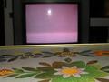
tv dinnerby art-ineptComment: hey...i gave this a 7 when i voted on it, which is fairly high for me. I think the techique is excellent and it said 70's to me, eventhough i now see how modern the tv is. i felt the point of light was necessary to add interest and keep the eye moving about the pic. the pink in the flower matching the tv screen is super strong and adds to the ease of viewing this pic. i think the ceter split composition not only works but is the only way to go with this type of image. please keep up the good work |
 Photographer found comment helpful. Photographer found comment helpful. |
| 09/10/2005 10:40:29 PM |
Swinginby barndogComment: though obviously voted down by most...i do genuinely like the feeling you've created. i wish i could have had an initial reaction before i saw the title, because it definitely influenced my interpretation of the image. |
| Photographer found comment helpful. |
| 09/10/2005 10:34:13 PM |
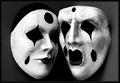
Expressionsby reemasComment: i like what you have done with already created art to add interest to it. I would have titled it "fear of commitment", but perhaps that wasn't your intent. |
| Photographer found comment helpful. |
| 09/10/2005 10:29:27 PM |
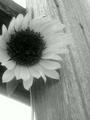
Desoto Flowerby cowcollectComment: i like the softness of the flower against the sharpness of the wood. i think it's a great contrast though most will probably be looking for the subject to be contrasty, not the overall pic, at which point you could be in trouble. |
| Photographer found comment helpful. |
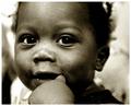
| 09/10/2005 09:14:47 PM |
A Summer Afternoonby jenesisComment: the light, especially on the left childern is very intriguing. everyone's body language is very interesting. the shot would have been raised to a level of fantastic for me if a few things occurred(that were obviously out of your control, but could potentially have happened): the boy on the right was standing in the light, there was only 1 boy on the left as their double position seems awkward, and the people in the background didn't exist. also the tower or light post isn't far enough above the fountain so it would be better hidden. hope my strange commentary helps in some way. |
| Photographer found comment helpful. |
| 09/10/2005 09:03:41 PM |
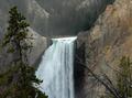
Mistyby GallatinComment: great scene. thumbnail looks almost 3d. wish you could have placed the branch a bit further from the waterfall. |
| Photographer found comment helpful. |
| 09/10/2005 08:02:25 PM |
Orchideaby LevTComment: nice high contrast. i'm not sure about your space to the left. shot overall is a bit dark and perhaps cropping down on the more interesting lighter areas might have created a composition that was more appealing to me. |
| Photographer found comment helpful. |
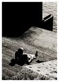
| 09/10/2005 07:58:40 PM |
City Sunby e301Comment: good contrast shot. i really like how the man's shadow is a mini version of the black wall. i'm uncomfortable with the shot not really leading down to anything, because i easily find myself drawn past the subject due to your angle |
| Photographer found comment helpful. |
| 09/10/2005 12:21:43 AM |
Synergistby L1Comment: i wish i understood your intent. your use of noise in this case makes the image very uncomfortable for me. her hand feels awkward as it is. nice contrast though. there's a marking to the right of her ear that drew my attention, because it looks smudged funny. i'm very interested to find out the details of this shot. |
| Photographer found comment helpful. |
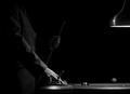
| 09/10/2005 12:15:03 AM |
The Hustlerby HokaheyComment: great composition. i would have upped the contrast...especially for this challenge, as the image just has an overall greyish feel to it. looks like you did some post processing to darken the background, that could have gotten closer to the subject. i would have done an overall level adjustment , then either masked out the subject or used the doge tool to bring him back in. anyway, nice lines and lighting. |
| Photographer found comment helpful. |
Home -
Challenges -
Community -
League -
Photos -
Cameras -
Lenses -
Learn -
Help -
Terms of Use -
Privacy -
Top ^
DPChallenge, and website content and design, Copyright © 2001-2025 Challenging Technologies, LLC.
All digital photo copyrights belong to the photographers and may not be used without permission.
Current Server Time: 08/06/2025 12:11:53 AM EDT.