|
|
|
Showing 371 - 380 of ~983 |
| Image |
Comment |
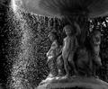
| 09/10/2005 06:59:20 PM | Underneath our Fountainby APComment: I think this has an excellent idea behind it. There are multiple points of interest to be seen and the composition, in general, is very nice. I love the perspective, and I like your choice of black & white. There are a few areas that I think take away from the image a bit. First, it seems as though there's too MUCH sharpening, especially where the water droplets are, I'm not sure if this is the case or just the way the light hits them that makes it seem that way or not. Secondly is light. There isn't enough balance, in my opinion, of light in this photograph. The left side seems to nearly have too much - but if this was done by using natural sunlight, there might not have been much you could do about it. That said, I think the image would've been boosted if you had used some fill light on the left side to help bring out more of the details of the figures under the fountain. This might also help the softer focus on that area and tighten the image up. I also think this type of image would be enhanced with a nice simple border to give it a good finished look. Overall I gave a 6 not for technical aspects but because of the vision behind it and the potential. |  Photographer found comment helpful. Photographer found comment helpful. |
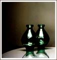
| 09/10/2005 10:02:18 AM | Contrastby sigrun_thComment: Definite contrast. I like the composition in the respects of how the image is laid out. I'm not too keen on the lighting, the glare on the vases is too stark for me - though I suppose it does match the high grain of the image. That said I'm not enthralled with the use of grain in this case either - I'm not against grain in general, it just doesn't seem to serve a purpose in this image. I cannot see what vision you are trying to bring across with its use so it seems out of place in my mind. What I do enjoy is that swathe of light/reflection? across the bottom of both vases below the annoying bar of light. The swathe on the vase closes looks almost like a dancer leaping into the air, I think that abstract flowing look adds a nice interest touch. I gave a 5. | | Photographer found comment helpful. |
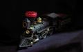
| 09/10/2005 09:56:41 AM | Out of the Darkby thomaspeopleComment: Hm.. well the red against the black does give quite a bit of contrast, colorwise. I like the idea behind the image - the lighting use is very nice and helps tell the photo's story. The focus appears just a little bit soft in areas that I think would be better to have crisp focus. Anywhere that the train is bathed in the strongest of lights should have sharp focus in my opinion. Also, the image seems a bit washed out. The red is vivid, but there is a flatness to the color and entire photo that I'm unable to determine a cause for, so I have no suggestions on how to change it. I think the composition is good and I really like the idea you were going for. I gave a 5. | | Photographer found comment helpful. |
| 09/10/2005 09:53:45 AM | Lift Bridgeby rileyComment: Love the intensity of color and it certainly is a high contrast. All the angles and lines are interesting and the birds give a nice added touch. That said, I still find the image itself just a bit boring. Its hard to explain, especially with the in your face brightness of the colors and complexity of line movement. I'm wondering if the impact in an aesthetic way would be higher if you'd chosen black and white instead. I gave a 5 | | Photographer found comment helpful. |
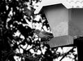
| 09/10/2005 09:51:40 AM | Mommentby Prime_TimeComment: Beautifully crisp, the birds feathered details really come out in this image. I definitely see the contrast with the use of the black and white tones, however I'm not sure this choice necessarily is to the benefit of the image. The bird certainly pops out due to the appropriate focus technique.. but the lack of color on it really still makes it blend just a bit too much into the background and gives it a stony appearance - no life or movement. I have no idea if this would work in color either, as it could just blend into the background that way too. Still I think the details on the bird are magnificent and the use of available light is excellent. I gave a 6 | | Photographer found comment helpful. |
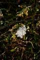
| 09/10/2005 09:48:14 AM | Il Fioreby christie3Comment: The contrast is there. The use of light is good. The focus looks to be okay. I'm not at all able to get interested in the subject however. I think the gnarled background is too dark and its busy-ness takes away from the image. With the busy nature of the background that then makes me think there's too much of it showing, maybe a more judicious crop could help filter out some of that background and keep the focus on the white flower/weed. The whiteness of the flower absolutely grabs my attention, don't get me wrong, but then I find my eyes wandering to try and discern what all those balls off dried up things are on the background stems/leaves as there isn't much for me to be drawn into once the flower has my attention. I gave a 4. | | Photographer found comment helpful. |
| 09/09/2005 01:07:44 AM | Blueby spydrComment: Gorgeous image, the color contrasts are indeed what make this photograph so "wow" inducing. I do wish however that we were so far away from those contrasts. It is a lovely image in its own right but I think having those white (infra-red?) trees more in the foreground so the contrast was more in your face, it would make the image stronger. As it is, it seems very distant and almost as if its being cut off by the top border. Still is wonderful to look at and nicely done with the light usage and focus. I gave a 7. | | Photographer found comment helpful. |
| 09/09/2005 01:05:12 AM | Medival knight and his cellphoneby RUEDISCHMUTZComment: Hehe. Nice contrast. I like the direction you took, going for a historical contrast rather than a visual one (e.g. black & white, etc). I think the portrait is good, lighting is decent and the armor certainly adds quite a bit of interest. Focus looks pretty good too. I do have three areas I'd change. First I would've gone for a neutral background - probably black to emphasize the shine of the armor and get the distracting wood panels in the background out. Second, the title references the cellphone and thus the high contrast - however looking at the picture it is tucked away in the hand too much and isn't quite obvious enough, perhaps a turn of the hand so more of the cell phone was visible might bring it to the attention more. Lastly, the crop of the image makes it feel very cramped, like too much has been squashed in, with a flat one color background, a wider frame might been easier to have because you wouldn't have to worry about cropping out distracting elements and this would give the photo more room too breath and relax just a bit. Very nice idea, interesting subject, I gave a 6. | | Photographer found comment helpful. |
| 09/09/2005 01:00:34 AM | 6845 S Contrast Drby ace flymanComment: Whew, talk about a busy photo. I can, of course, see contrast all over, but I'm not sure it does the image good to have so many focal points. Obviously you can't do a whole lot about the flowerbeds and trees but I think focusing on one aspect of high contrast, either the white against the brilliant color of nature or the white vs the deep blue windows would've made this image stronger. As it is now I keep bouncing my eyes all over the place looking for somewhere to rest them and get drawn in. As a personal preference, if you could've isolated the white vs the blue, I think the contrasts would've been much more pleasing and more interesting. I gave a 5. | | Photographer found comment helpful. |
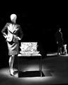
| 09/09/2005 12:57:22 AM | Fashion Displayby banmornComment: Goodness, well there's quite the contrast here all over the place. The faceless figure is a bit disconcerting but nonetheless I think the focus is good, nice use of lights and the two clear yet seperate interest points is a nice change. I think my only gripe is that I can't, for the life of me, figure out what is on the desk next to that main mannequin. It seems very busy and I think a lot of detail about it has been lost, which if the details of it aren't important then the item itself probably isn't important and thus is just clutter. Other than that I like the composition and the use of black & white - which seems to be many people's idea of instant high contrast - actually works here. Nicely done. I gave a 7. | | Photographer found comment helpful. |
|
Showing 371 - 380 of ~983 |
Home -
Challenges -
Community -
League -
Photos -
Cameras -
Lenses -
Learn -
Help -
Terms of Use -
Privacy -
Top ^
DPChallenge, and website content and design, Copyright © 2001-2025 Challenging Technologies, LLC.
All digital photo copyrights belong to the photographers and may not be used without permission.
Current Server Time: 08/08/2025 12:51:02 AM EDT.
|