| Author | Thread |
|
|
09/17/2005 09:35:53 PM |
Greetings from the Critique Club! :)
I will attempt to critique your image on four basic areas. Keep in mind I'm not a trained professional. ;)
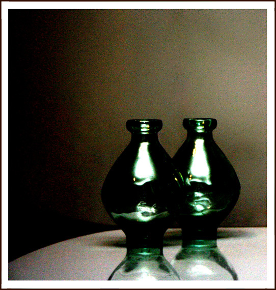
1. Composition: The composition of the image is fine, with the focal point being off center. There are also three different planes of visuals that you can discern, with a foreground, a middle ground, and a background. The image suffers, however, from a lack of interest in the top half of the image, as the subject stops dead center in the vertical sense.
2. Technical Details: Your commenters mentioned the grain/noise issue. I won't go into that other than to say that many at DPC do not like grain or noise of any kind. I'm not like that, because I have a fair amount of shots that are quite noisy and grainy because I like them that way. :) HOWEVER...the grain in this shot doesn't add much in the way of mood or emotion, because the subject itself is rather devoid of mood or emotion. Sometimes it works, sometimes it doesn't. Also, the focus is a bit soft on the subject itself, which DPC voters don't like either.
3. Aesthetics: This is a love-it or hate-it shot. It's rather abstract in nature, which might turn some voters off. It doesn't have the "wow" factor that DPC voters crave, which explains the score and placement.
4. Relationship to Challenge: There is some contrast, but overall the tonal range is rather muddy and the noise really detracted from the contrast in general.
Overall, your image has some strong points and some points in which improvements can be made. Keep shooting and submitting and I look forward to your next entry!
Laurie :) |
|
 Photographer found comment helpful. Photographer found comment helpful. |
Comments Made During the Challenge  |
|
|
09/11/2005 12:52:25 AM |
|
While there are highlights, overall there are many areas which are very similar in tonal value. Also, the photo doesn't have that "wow" factor of other entries in the challenge. I do like how your subject matter is off-centered though. |
|
| Photographer found comment helpful. |
|
|
09/10/2005 10:02:18 AM |
|
Definite contrast. I like the composition in the respects of how the image is laid out. I'm not too keen on the lighting, the glare on the vases is too stark for me - though I suppose it does match the high grain of the image. That said I'm not enthralled with the use of grain in this case either - I'm not against grain in general, it just doesn't seem to serve a purpose in this image. I cannot see what vision you are trying to bring across with its use so it seems out of place in my mind. What I do enjoy is that swathe of light/reflection? across the bottom of both vases below the annoying bar of light. The swathe on the vase closes looks almost like a dancer leaping into the air, I think that abstract flowing look adds a nice interest touch. I gave a 5. |
|
| Photographer found comment helpful. |
|
|
09/09/2005 11:51:47 PM |
|
Interesting shot, I would have voted higher if there was less noise. |
|
| Photographer found comment helpful. |
|
|
09/05/2005 01:26:11 PM |
|
Nice shot. I would be better, imho, if you cut it about one inch from the bottom. 8 |
|
| Photographer found comment helpful. |
|
|
09/05/2005 09:22:22 AM |
|
the grain is killing the shot to me. |
|
| Photographer found comment helpful. |
|
|
09/05/2005 12:44:44 AM |
|
I fear people will not like the added noise, and I'm afraid I find it distracting too. |
|
| Photographer found comment helpful. |
Home -
Challenges -
Community -
League -
Photos -
Cameras -
Lenses -
Learn -
Help -
Terms of Use -
Privacy -
Top ^
DPChallenge, and website content and design, Copyright © 2001-2026 Challenging Technologies, LLC.
All digital photo copyrights belong to the photographers and may not be used without permission.
Current Server Time: 06/29/2026 08:46:45 PM EDT.