| Image |
Comment |
| 05/18/2003 11:27:36 PM |
For Mother's Dayby myqylComment: *Critique Club*
FIRST IMPRESSION: A bit busy in the foreground, and I don't like the font.
CHALLENGE: Meets the challenge.
COMPOSITION: Perhaps the most bothersome items in this image are tha man in the foreground whose feet are cut off, and the abandoned chair and other items. Other than that this is a pretty good shot.
TECHNICAL: Though this could be a trick of perspective the shot does seem tilted slightly counterclockwise. Exposure and color are good, however.
CONCLUSION: A good shot, unfortunately the items that could have made it better were largely out of your control.
Thanks for sharing and good luck in future challenges! |
 Photographer found comment helpful. Photographer found comment helpful. |
| 05/13/2003 11:52:26 PM |
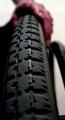
Abledby MarkRobComment: *Critique Club*
FIRST IMPRESSION: THought it was a bicycle tire until I noticed the outside part of the wheel. Once I saw that the hand made sense.
CHALLENGE: Meets the challenge.
COMPOSITION: Composition is excellent. I wonder if shooting from a little bit to the side might have helped the voters realize what this was though. I don't think the voters were able to get enough context in the short time the average voter typically spends on a photograph.
TECHNICAL: Technical aspects are excellent. I like the short depth of field.
CONCLUSION: A very good image, but one that I think would need to be approached slightly differently for the voters to grasp. Remember, most voters spend only a few seconds per image when voting.
Thanks for sharing and good luck in future challenges! |
| Photographer found comment helpful. |
| 05/13/2003 12:26:08 AM |
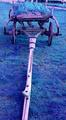
Don't Forget Meby petremiComment: *Critique Club*
FIRST IMPRESSION: Quite unnatural color.
CHALLENGE: Meets the challenge.
COMPOSITION: Composition is reasonably good, though it might have been stronger if you included less of the foreground.
TECHNICAL: The most striking technical issue in this photograph is the unnatural color. It appears the white balance may have been set incorrectly. If it is set to a manual setting, perhaps returning to automatic would have helped; if it is in automatic then perhaps setting a custom white-balance would have strengthened the image. Depth of field, exposure, etc. all appear appropriate for the shot.
CONCLUSION: A good entry. More attention to the color probably would have been the single most effective way to increase your score.
Thanks for sharing and good luck in future challenges! |
| Photographer found comment helpful. |
| 05/12/2003 03:37:30 PM |
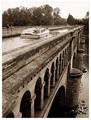
The extravagance of yesterday's commercial waterwaysby jjbeguinComment: *Critique Club*
FIRST IMPRESSION: Beautiful composition and a great subject.
CHALLENGE: Meets the challenge.
COMPOSITION: The composition of this shot is excellent. I can't suggest anything to improve it.
TECHNICAL: Esposure is perfect for this shot. The long depth of field adds a lot to it. Your apparent patience in waiting for just the right moment to take this shot paid off well.
CONCLUSION: Your photographs are consistently outstanding, and this one is no exception. It is a privilege to be assigned one of your photographs to critique.
Thanks for sharing and good luck in future challenges! |
| Photographer found comment helpful. |
| 05/11/2003 11:33:10 PM |
Neo-Classical Monkeysby GeneralEComment: *Critique Club*
FIRST IMPRESSION: Great idea for the challenge, I was hoping someone would do this. Well done, though it's a shot with kids it doesn't come off as a pointless kid shot.
CHALLENGE: Meets the challenge.
COMPOSITION: Composition of the individual images and the triptych is excellent.
TECHNICAL: All technical aspects are good; use of a consistent, non-distracting background helps significantly.
CONCLUSION: Am excellent series of shots. Though some of the comments conflict, I like the repetition added by including Isaac twice.
Thanks for sharing and good luck in future challenges! |
| Photographer found comment helpful. |
| 05/11/2003 11:30:18 PM |
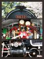
retired, but still attracting peopleby kenboComment: *Critique Club*
FIRST IMPRESSION: Good idea for the challenge. The separation between shots is not as clear as it could be, though.
CHALLENGE: Meets the challenge.
COMPOSITION: As mentioned a more distinct separation between the shots would be helpful here. Perhaps you could have picked up the maroon and gold from the 9632 sign for frame colors. Also, the 2nd and 3rd shots are a little too tight for my taste, in contrast to the first shot which is obvious, the other two leave me wondering what I am looking at.
TECHNICAL: Exposure seems slighly hot, especially on the middle shot.
CONCLUSION: A good idea, better in my opinion if you'd showed us more in the 2nd and 3rd shots and separated the images better.
Thanks for sharing and good luck in future challenges! |
| Photographer found comment helpful. |
| 05/11/2003 11:26:18 PM |
Hurray, spring is finally here!by MorganComment: *Critique Club*
FIRST IMPRESSION: Good framing and combination, great action shots, but the size limitations probably hurt you a bit here.
CHALLENGE: Meets the challenge.
COMPOSITION: Excellent composition in the individual photographs and the overall composition. The individual images are a bit small and you could have given yourself more room to work with by going top to bottom.
TECHNICAL: Given the range you had to work with (probably in excess of 5 stops from tehe black nose to the white fur) you did quite well with the exposure. You may have been able to keep the shutter open for just a touch longer, but this is certainly closer to perfect than I could have gotten it
CONCLUSION: A great series of shts, it's a shame this didn't score higher.
Thanks for sharing and good luck in future challenges! |
| Photographer found comment helpful. |
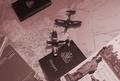
| 05/11/2003 11:22:38 PM |
The Airplane: Making the world smallerby loz1Comment: *Critique Club*
FIRST IMPRESSION: Different take on the challenge than most, but it works.
CHALLENGE: Meets the challenge.
COMPOSITION: The most bothersome item about the composition is the tilt; this might have worked better from straight on, shooting slightly forward rather than from the side. Also, the inclusion of tourism books and a passport conflicts with the use of warplane models.
TECHNICAL: Esposure is good; use of sepia gives this an old-time feel, but the particular tone is a bit more red that most sepia photographs.
CONCLUSION: An interesting take, but some of the items are inconsistent with each other, which probably left voters a bit confused.
Thanks for sharing and good luck in future challenges! |
| Photographer found comment helpful. |
| 05/11/2003 09:03:04 AM |
Where Metal meets Metalby SKatragaddaComment: *Critique Club*
FIRST IMPRESSION: Good abstract, lighting makes this shot difficult.
CHALLENGE: Meets the challenge.
COMPOSITION: Composition within the flarme is good; however, I personally feel that the choice of a wheel that is right at a switching point (and thus the inclusion of the wheel guards and the track for the other direction) adds conflicting lines to the shot.
TECHNICAL: Exposure on the wheel is excellent, ground and track however are a bit washed out. Shooting shooting in different light may improve this a bit. Also, as there is very little color in this image I wonder if you tried converting to black and white. This would help emphasize form over color, which could benefit your shot.
CONCLUSION: A good idea but I feel the execution is not quite there. If you have an opportunity, spending some time reshooting this may be a worthwhile learning experience.
Thanks for sharing and good luck in future challenges! |
| Photographer found comment helpful. |
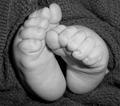
| 05/10/2003 10:22:39 AM |
Tiny Transportationby madison61Comment: *Critique Club*
FIRST IMPRESSION: Good composition, cute twist on the subject!
CHALLENGE: Meets the challenge even if these aren't transportation quite yet. Maybe they're more of a concept vehicle at this point? ;-)
COMPOSITION: Excellent composition, the position of th efeet relative to each other leads the eye in a circle and helps keep the viewer's eye in the shot. The blankets also help with this.
TECHNICAL: Good exposure and lighting. The light is strongest on the toes, which are the most interest aspect of this shot. The black and white helps accentuate shape and lighting over color, which is a good idea here. The disadvantage in this shot is that the black and white also leads the texture of the blanket to compete with your subject for the viewer's attention.
CONCLUSION: A strong entry, unfortunately black and white almost always gets mixed reviews here, especially when it produces both benefits and drawbacks as it did in this case.
Thanks for sharing and good luck in future challenges! |
| Photographer found comment helpful. |
Home -
Challenges -
Community -
League -
Photos -
Cameras -
Lenses -
Learn -
Help -
Terms of Use -
Privacy -
Top ^
DPChallenge, and website content and design, Copyright © 2001-2025 Challenging Technologies, LLC.
All digital photo copyrights belong to the photographers and may not be used without permission.
Current Server Time: 08/27/2025 11:20:26 PM EDT.