| Image |
Comment |
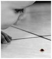
| 06/22/2004 05:17:09 AM |
Fascinatingby JackoComment: Wonderfully subtle. I almost missed it with my glasses off. |
 Photographer found comment helpful. Photographer found comment helpful. |
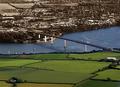
| 06/22/2004 12:42:27 AM |
The other sideby AndelainComment: Very cool. I think it might looks slightly better to have the color start at the bridge on the other side than in the middle.
But I like the concept here very much. 7. |
| Photographer found comment helpful. |
| 06/22/2004 12:38:57 AM |
|
| Photographer found comment helpful. |
| 06/22/2004 12:36:58 AM |
It's about the musicby koltrane75Comment: I don't think this quite works with the selective desaturation, but, I think it wold work either very well in color, or completely black and white. 5. |
| Photographer found comment helpful. |
| 06/22/2004 12:34:46 AM |
|
| Photographer found comment helpful. |
| 06/22/2004 12:33:20 AM |
Yellow Screwdriverby PoobaComment: Why not have the other screwdrivers in color? It doesn't look right with just one, IMO. A clean background would help out too. |
| Photographer found comment helpful. |
| 06/22/2004 12:32:07 AM |
I Love Petalsby RoosterComment: Wonderful colors. Nice focus.
I think I would prefer to have the heart on the shirt without color. It'd bring more focus to the petals, and make them stand out more.
The softness of the photo is really great too. Some of the shadows are sort of distracting too. But this is really beautiful. 8. |
| Photographer found comment helpful. |
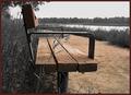
| 06/22/2004 12:28:38 AM |
A Selective Benchby ScantyNebulaComment: To me, brown is just about the most unattractive color. It's just so dull. I think I would have preferred to see the greens in this, and have the bench and path desaturated. |
| Photographer found comment helpful. |
| 06/22/2004 12:25:16 AM |
Oasis In Brickby wkoffelComment: Awesome colors. I think the greens are a little too saturated, but I love the red. I wonder if it's really that color, of if you changed the hue, or something like that. It looks awesome. And the picture itself, while not really being anything of that great an interest, has great composition and focus. Very nice. 8. |
| Photographer found comment helpful. |
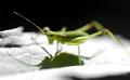
| 06/22/2004 12:23:56 AM |
Jimminy!by DiamondPeteComment: Too shallow of a DoF for my liking.
Would be cool to see the whole thing in focus, and a much stonger photo, I think. |
| Photographer found comment helpful. |
Home -
Challenges -
Community -
League -
Photos -
Cameras -
Lenses -
Learn -
Help -
Terms of Use -
Privacy -
Top ^
DPChallenge, and website content and design, Copyright © 2001-2025 Challenging Technologies, LLC.
All digital photo copyrights belong to the photographers and may not be used without permission.
Current Server Time: 09/03/2025 11:28:44 AM EDT.