Challenge:Nude II (Advanced Editing II) Camera:Canon EOS-10D Location: Ventura, CA Date: Aug 22, 2004 Aperture: 11 ISO: 200 Shutter: 8 Date Uploaded: Aug 22, 2004
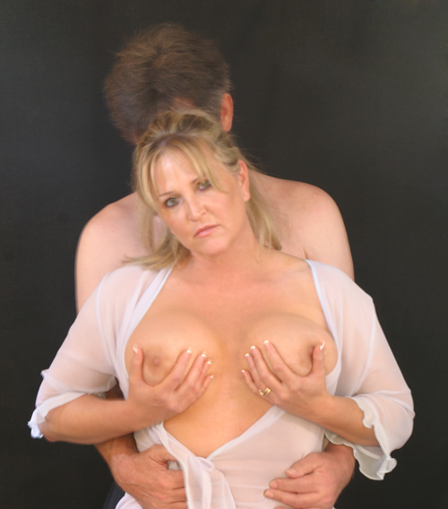
I knew this would not work, I agree with most everyones comments and knew it before I entered. The only reason I entered this was because the model kept after me to enter it. Anyway thanks to all to gave the helpful comments and to those who left the ones about porno and smut you have made sure that this model (my wife) will never pose again. And no she was not uncomfortable or angry.
She looks quite uncomfortable and unhappy in this. Lighting also appears quite flat and the focus is quite soft/ blurry but doesn't look intentionally so. Low score.
I know the intention was probably soft focus, but this image is out of focus. I would also suggest a tighter crop overall and maybe also the use of black and white.
out of focus,a toush washed out,the 2 heads together are distracting: doesn't look right,they seem to clash. But i have to say,those breasts are beautiful,maybe next time a simpler b&w shot of the model,naked,focused in on the top half would give a much better effect,why waste a sexy lady with such a half hearted shot?
focus is a little soft and I see some double lines on the males shoulders....maybe its not the focus maybe a little over processed not sure...nice clean background and good skin tones.
couple of things made this image not work for me: the look of disdain on the female model's face and the fact that we can't even see the male model's face..makes the whole image seem sordid in an emotionally painful way. As well, the focus being off makes it seem more like a one off shot. I hope this is helpful. I think the idea you were working with is wonderful.
This is a very strong idea. I love the thought process behind this image. This photo needs a little perfection in the exposure though. There is some blurriness that appears to be motion blur which is causing it to be unsharp. "Soft Focus" would be nice here as well, but the 'out of focus' is not quite the same thing. The dark background is a good choice for subject separation, but it could possibly stand to be a little darker as well.
A bit too much like a scene from an amateur porn home video to me.
The woman is beautiful and that sheer white shirt/robe is a great prop. I think I'd have turned the lights down a bit to get more shadow play on the skin from her curves and the folds of the soft shirt. I think you could get some great images with her modeling!
OK I see what your trying to do here, but it comes off as very tacky porn to me - sorry if that was not intended - if it was full marks :D
The woman is attractive, but her pose is more slutty than arty purely because she is grasping her own breasts which i see no real need for unless it's for the pure reason to draw attention to tits.
The male seems to be there for no reasons - his grasp on her waist isn't strong or convincing.
Exposure wise it's also a bit over done - maybe your screen is a bit too dark -I would recommend looking at the bar below every vote page and seeing if you can see the last 4 blacks on the left.
If not feel free to PM me and I will explain the calibration process.
Definitely one of my favorites of the challenge. The female's pose & expression are great. She doesn't look overly thrilled, more of a "are you done yet?" look. One thing keeps nagging at me though, why doesn't the male model show his face??? 9
I don't know why- I would have had the model cover the nipples. It may have added some sensuality and intrigue here. I mean- no complaints but it may have helped explain the shot to me.
beutifull model.
Pose not giveing me "together"... think it would work better if she was with her hands on to his.
Bit more postediting on the black background makeing it totaly black.
The background looks like it is immeadiately behind the models. Needs to be further away and more out of focus.
The Focus appears a little off.
Seems a little static,
The blurring of the image is a distraction for me. The woman's expression seems to unnatural, as is her pose. I'm just not getting the message this is intended to convey.






 Add photograph to your favorites
 Add photographer to your favorites


 Photographer found comment helpful.


