| Author | Thread |
|
|
12/22/2002 03:26:06 AM |
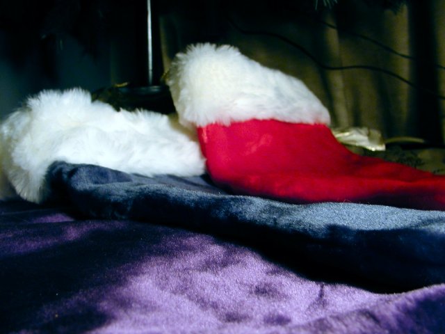
The colors are pretty and the material looks very soft but there is something missing. Maybe it needs something bright and shiny lying on top of the stockings or they need some other arrangement to create a lot of interest. I'm not sure what is going on in the background. I would prefer to either see more of it or less of it. It needs some specific area of interest. I keep thinking that the stockings with their softness and bright colors would actually provide a great background for something like a shiny ornament, toy, or something like that which would create a nice visual contrast. I do like the low angle and closeness to the foreground stocking. There is a feeling like you can reach out and feel the softness of the stockings. The color, exposure, sharpness, and DOF look appropriate. You have some great material to work with I just think it needs some more elements of interest.
Tim Jensen |
|
Comments Made During the Challenge  |
|
|
12/14/2002 08:52:06 AM |
|
I like the idea of this. However, when I look at the image, my eye doesn't know where to "rest". It seems, from my perspective, that there is a lack of focal point. I would love to see your outtakes of this challenge, and see if there is a photo that has more of a focal point. |
|
|
|
12/13/2002 01:07:40 AM |
|
Hmmm... nice colours, lovely soft textures, and a nice interplay of light and shade. Although there isn't really a subject to this photo, it's kind of nice in an atmospheric, aesthetic and tactile way. Interesting idea. |
|
|
|
12/12/2002 09:12:51 PM |
|
Even though I know all these are Christmas colors, perhaps its the particular shade of green in the background and the highlights on the purple that clash. I think this would have been improved with a light background and softer overall lighting. I also can't find a particular spot in the photo that really portrays sharp focus. If you worked really hard at this and I'm being too hard on it, I apologize :-) |
|
|
|
12/12/2002 04:38:11 PM |
|
You have captured the texture of these stockings well. For some reason, I think if the red was in the middle it would seem more balanced to me. The purple and blue kinda run together, it seems. |
|
|
|
12/12/2002 01:09:22 PM |
|
Nice colors, but where is your focal point? This might have worked better with more distance and a little zoom (distance increases your focal depth, too) A less obtuse angle might have helped this, too. (Straight on might be boring, but it will be fully in focus) 5 Swash |
|
|
|
12/12/2002 12:15:31 PM |
|
Good concept. The reflected light in the back and the curtain not being all the way across the back, breaks the continuity of the shot. I think the DOF is appropriate for this photo, but I feel some post processing sharpening could have brought out the texture in the stockings better. |
|
|
|
12/12/2002 11:22:30 AM |
|
Interesting color mix. Softish looking. very pleasing. |
|
|
|
12/11/2002 02:59:37 PM |
|
The colours in this shot are indeed very rich and Christmas-y, but there doesn't seem to be any main focal points, so I'm not really sure what the main subject of the shot it. The lighting picks up some of the surface details of the purple and blue fabrics, yet there are very few details in the red or white, which is a shame. I'm not quite sure what the background is, so Iit might have helped to crop it out more, or to shoot from a different angle. |
|
|
|
12/11/2002 11:57:49 AM |
|
i think this photo setup has some very nice potential, but the background color and objects are clashing a bit with the rest of the image... - setzler |
|
|
|
12/11/2002 11:08:29 AM |
|
Interesting concept, however the background is a bit distracting, and the colour could be more saturated. Just and opinion. |
|
|
|
12/11/2002 01:35:53 AM |
|
I seems as if your focus and lighting should be more on the tops of the stockings instead of the bottoms. DPz |
|
|
|
12/10/2002 10:28:05 PM |
|
i see red, navy blue, purple and a slight tint of green in the background. i dont see Christmas colors. it appears that there are two stockings with white tops on them. a more neutral background, other than purple, would make this photo look better. |
|
|
|
12/10/2002 07:54:20 AM |
|
Those are some interesting xmas colors. We usually have red and green :) Good luck - Inspzil |
|
|
|
12/09/2002 10:46:50 PM |
|
I don't care for the top background int his picture.Overall a bit on the boring side, the colors don't work together so great. May be a bit out of focus toward the tops of the stockings. |
|
|
|
12/09/2002 03:28:51 PM |
|
When did purple become a Christmas color? LOL. |
|
|
|
12/09/2002 02:37:40 PM |
|
Nice colors in the shot. A bit more lighting on the red would be nice. The background is also a bit distracting. I would have liked to see the stockings handing - it might have given a better picture of the Christmas theme. You could also try to take the shot from a bit more directly overhead - although then you run into the danger of it being too flat. |
|
|
|
12/09/2002 10:53:42 AM |
|
Pretty colors. I think the compositon here is weak. The background ?? on the upper right and we don't see all of the purple ?hat? or stocking. I do like the light, the idea, the color, and the focus. |
|
|
|
12/09/2002 12:19:50 AM |
|
The spot that seems to be in the best focus is the spot right below dead center of the photo. where the blue and purple stockings meet. That isn't really the most interesting part of the photo. I think I'd like to see more of the photo in focus. and with a different background. a very nice idea, but I think it lacks that something so make is scream 'wow' to me. I wonder how this would look with the red stocking in the middle seperating the 2 "similar" looking colors. I think that would make it more interesting. Otherwise though a nice shot. good luck in the challenge. |
|
Home -
Challenges -
Community -
League -
Photos -
Cameras -
Lenses -
Learn -
Help -
Terms of Use -
Privacy -
Top ^
DPChallenge, and website content and design, Copyright © 2001-2026 Challenging Technologies, LLC.
All digital photo copyrights belong to the photographers and may not be used without permission.
Current Server Time: 07/03/2026 09:19:26 PM EDT.