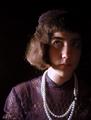
Don't you just love that song? I couldn't think of another title, and this song was on the radio, so we decided it would be the title by default. This is my husband. I talked him into posing for two or three pictures, but I liked this one best. I know it won't be able to stand up to the pros and will probably tank, but it did cause me to expand my horizons and try something I hadn't tried before. I appreciate that learning opportunity. I have my flame suit on, ready for criticism. I just hope it's all constructive and folks don't take things too seriously...it's not like I plan to become a portrait photographer! LOL Take care, and have a great day!
File: - C:\Documents and Settings\Owner\Desktop\DPChallenge Originals\27 portrait.JPG
Make - EASTMAN KODAK COMPANY
Model - KODAK DX6490 ZOOM DIGITAL CAMERA
Orientation - Top left
XResolution - 230
YResolution - 230
ResolutionUnit - Inch
YCbCrPositioning - Centered
ExifOffset - 506
ExposureTime - 1/30 seconds
FNumber - 3.20
ExposureProgram - Aperture priority
ExifVersion - 220
DateTimeOriginal - 2004:06:24 15:12:51
DateTimeDigitized - 2004:06:24 15:12:51
ComponentsConfiguration - YCbCr
ShutterSpeedValue - 1/32 seconds
ApertureValue - F 3.25
ExposureBiasValue - 0.00
MaxApertureValue - F 3.25
MeteringMode - Multi-segment
LightSource - Auto
Flash - Not fired, compulsory flash mode
FocalLength - 12.40 mm
FlashPixVersion - 010
ColorSpace - sRGB
ExifImageWidth - 2304
ExifImageHeight - 1536
InteroperabilityOffset - 2404
ExposureIndex - 100
SensingMethod - One-chip color area sensor
FileSource - Other
SceneType - Other
CustomRendered - Normal process
ExposureMode - Auto
WhiteBalance - Auto
DigitalZoomRatio - 0.00 x
FocalLengthIn35mmFilm - 75 mm
SceneCaptureType - Standard
GainControl - None
Contrast - Normal
Saturation - Normal
Sharpness - Normal
SubjectDistanceRange - Unknown
Statistics
Place: 58 out of 92 Avg (all users): 5.4025 Avg (commenters): 5.4474 Avg (participants): 4.8906 Avg (non-participants): 5.5930 Views since voting: 1939 Views during voting: 369 Votes: 236 Comments: 40 Favorites: 1 (view)
OK...the title was a song title (Big and Rich's "Save a Horse, Ride a Cowboy") so you don't think I'm a pervert. And yes, I did use NeatImage, but I had a really good reason...[begin long sob story] My husband is, and has been for two years, battling systemic lupus erythmatosus (SLE), which has taken a major toll on his kidneys, heart, and skin, along with all the medication he takes to combat this debilitating illness. He didn't want to do a portrait at all, because his skin has become very "rough" and, in his opinion, unphotogenic. I told him I would fix it up to his liking afterwards, so he agreed. So I applied the NeatImage and he liked it because it gave him back some of the youthfulness and brightness that he has missed in the past two years. Neither of us saw "plastic," but other eyes did, and that's OK. We were pleased with it, knowing that it wouldn't be a winner and that it was a first attempt at portraiture. [end long sob story] Thanks for those of you who were kind enough to vote and comment; we appreciate it! :O)
Lighting: The light is fairly even, but could be more so. The catchlight in the eyes is nice.
Pose: His expression could be better, but it is fine. The shallow DOF works well here. I would have preferred a little less processing on the skin, it is looking a bit plastic.
Background: The folds a bit distracting, but not overly so. I would have liked to see more separation on his right, however.
Great title! lol, Wonderful capture, the eyes are phenominal, you managed to capture the green in the eyes wonderfully. The lighting on the face is just a bit harsh, other than that this is a great shot, and I like the model too by the way :), I have a soft spot for cowboys. 8
I think maybe a square crop would reinforce/concentrate the intensity of your subject -- right now, I don't think the extra image on the sides adds that much, and you'll still be able to tell it's a hat.
A bit over-edited. Very plastic looking. (If you were to tell me this was a maniquin or wax statue, I wouldn't be surprised.) Generally, everything else looks good. A little negative space to the right might have strengthened the composition a bit though.
Great title, good exposure with great lighting. Only issue is the skin seems to have less texture than you would expect for someone this age, so I am guessing that you processed it out. If not, my apologies.
this has the appearance of being let down slightly be the over-use of neat-image or some such. a grainy shot is probably preferable, to be honest... i'm only guessing, but it would be that you also blurred the background - this is seemingly apparent from whats left around the ears and side of face. third and final point is that the lighting seems harsh - i'm completely no expert, but it might help if your model didn't look into the light source, becuase it makes the eyes contract and appear not quite natural. the pose and ocmposition is very good though, and cropping out half the hat is a good move (it's weird how many would want all the hat in the shot).
I'm not sure what post processing you did here (perhaps a smart-blur?), but I think that's what I don't like about the shot. His face seems to have had all of it's texture removed. I'm assuming you were going for a soft focus here, but I personally don't think the technique you used worked out well.
Expressive eye. Nice lighting and composition. Selection of colors works well to highlight the eyes. The face looks a but too much like putty or plastic on his right cheek especially.
Great portrait! I like the composition and subdued colors. I do however think that the hat could have gotten more light to bring it out, and it appears that a noise reducing program was used to excess. Still, a compelling picture, imo.
Interesting composition, but his skin looks way too smooth, as if he were a wax statue. I'm not sure how you achieved this through photo editing, but it takes some masculinity away from this shot. The bridge of the nose between the eyes is also a bit to pale and could have been burned slightly.
Very interesting lighting and composition, but doesn't look anything like human skin. Is this NeatImage gone amok? (Being a Mac user, I'm blissfully insured against making that mistake!)







 Add photograph to your favorites
 Add photographer to your favorites

 Photographer found comment helpful.


