| Author | Thread |
Comments Made During the Challenge  |
|
|
04/14/2002 10:05:00 PM |
|
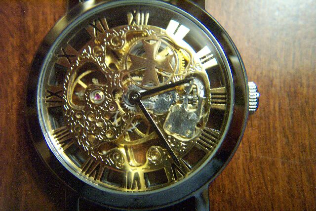
A beautiful watch but the glare is distracting. |
|
|
|
04/14/2002 03:21:00 PM |
|
Watch your framing ... you cut off the top of the watch, plus your light source is a bit hot on the upper right. |
|
|
|
04/12/2002 07:37:00 PM |
|
Your flash created a hot spot in teh upper right hand cornere. Perhaps a stnad, tripod, or something and a longer shutter speed would have helped here. |
|
|
|
04/12/2002 02:55:00 PM |
|
good detail, but a little bright on the right side |
|
|
|
04/10/2002 06:21:00 PM |
|
|
|
04/10/2002 02:17:00 PM |
|
Other than the watch case, there really are hardly any obvious curves here. You've managed to avoid reflections to a great degree, but the lighting is still too directional for such a finely detailed subject -- try more indirect lighting for this, IMHO. |
|
|
|
04/10/2002 12:45:00 PM |
|
Soft focus and blown out hilights take a a lot away from this. Did you sharpen it? It's also cropped more on the top than on the bottom. |
|
|
|
04/09/2002 04:22:00 PM |
|
|
|
04/09/2002 01:09:00 PM |
|
Interesting. Clever idea. |
|
|
|
04/09/2002 12:42:00 PM |
|
Would have looked nicer centerred I think. Lighting is a bit harsh, but is necessary to make the watch shine. Overally a good photo. |
|
|
|
04/09/2002 11:31:00 AM |
|
great watch, focus is hard for macros. i would have focussed a little better. |
|
|
|
04/09/2002 07:28:00 AM |
|
nice idea. i would've preferred a uniformly dark background, though. the patch of white in the upper right doesn't work for me. |
|
|
|
04/09/2002 07:24:00 AM |
|
Nice, would have like to see it even closer with less background area. |
|
|
|
04/08/2002 04:30:00 PM |
|
nice closeup - soft focus? |
|
|
|
04/08/2002 04:27:00 PM |
|
To much light. Maybe if you shut the flash off and had the watch in a well lit room, the light would have been more evenly distributed on the watch. I like your idea. :) |
|
|
|
04/08/2002 04:12:00 PM |
|
Flash flare just ruins it. |
|
|
|
04/08/2002 03:23:00 PM |
|
If the light more central, the detail would appear more balanced. |
|
|
|
04/08/2002 12:52:00 PM |
|
This is very similar to another photo in the challenge. I like the subject but this photo has the same distracting feature as the other one like it... the glare is a little rough.... |
|
|
|
04/08/2002 09:53:00 AM |
|
Need to work on the focus/ sharpness |
|
|
|
04/08/2002 08:50:00 AM |
|
somewhat blurry. lackluster composition. |
|
|
|
04/08/2002 12:28:00 AM |
|
A better surface/backdrop for the watch would make this much nicer. |
|
Home -
Challenges -
Community -
League -
Photos -
Cameras -
Lenses -
Learn -
Help -
Terms of Use -
Privacy -
Top ^
DPChallenge, and website content and design, Copyright © 2001-2026 Challenging Technologies, LLC.
All digital photo copyrights belong to the photographers and may not be used without permission.
Current Server Time: 06/27/2026 09:07:34 PM EDT.