| Author | Thread |
Comments Made During the Challenge  |
|
|
04/13/2002 11:13:00 AM |
|
The image is cool, but as for summing up curves, it seems like you just picked out a picture youd' taken with a curve in it. |
|
|
|
04/12/2002 07:12:00 PM |
|
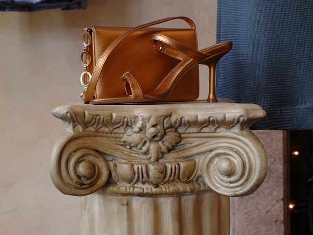
Good idea! I would have used another color shoe for contrasst and cropped the distractions out. |
|
|
|
04/12/2002 02:02:00 PM |
|
Sorry, I guess I dont get it. |
|
|
|
04/11/2002 02:59:00 PM |
|
different look. You captured the object well. :) |
|
|
|
04/11/2002 12:36:00 PM |
|
The focus of the picture seems split between the column and the purse, I'd try to focus on the purse more, maybe by framing the picture a little higher. The lighting is nice and soft, perfect for this sort of subject! |
|
|
|
04/10/2002 02:02:00 PM |
|
Doesn't seem to be a clear idea of what curves you're trying to portray; a simpler composition might have worked better. |
|
|
|
04/10/2002 12:35:00 PM |
|
Somehow this image seems to tell a story of sorts. On one hand it looks like a mere handbag ad, on the other, it seems to speak of a lady going out of a house...for an unknwon reason. |
|
|
|
04/09/2002 07:44:00 PM |
|
Interesting. You don't realize what it is until you read the title, and then you make the distinction between the shoe and bag. |
|
|
|
04/09/2002 01:14:00 PM |
|
Simple, but nice. Doesn't really catch my attention, sorry. |
|
|
|
04/09/2002 01:00:00 PM |
|
|
|
04/09/2002 11:44:00 AM |
|
I like the idea, though I think it would have been a lot better if you ditched the purse. |
|
|
|
04/09/2002 11:22:00 AM |
|
nice photo. get closer , maybe frame vertically. leave out the stuiff on the right. and the blue curtain upper left. |
|
|
|
04/09/2002 09:09:00 AM |
|
I think I'd liek this a bit more if you'd step a bit to the right for this shot so the black portion on the right is gone. Also, sweppijng the curtain back out of teh shot. It is in too sharp a focus in the background, and is pulling me away from the fine composition that otherwise exists here. Great abstract thinking and creativity! |
|
|
|
04/09/2002 07:06:00 AM |
|
I like the idea and the props, but the background is distracting. A plainer background would have really made it stand out. |
|
|
|
04/08/2002 08:58:00 PM |
|
nice presentation of the subject but your background (the blue fabric) needs to go |
|
|
|
04/08/2002 04:08:00 PM |
|
I *REALLY* like this. Such a classy elegant picture. It not only shows the curve in the pillar..but the shoe really says it. It makes me imagine the curve of a ankle as well...the unseen so to speak. Very nice shot ! |
|
|
|
04/08/2002 03:47:00 PM |
|
Interesting use of faux-classical art and modern fashion art, each with their own curves. |
|
|
|
04/08/2002 12:53:00 PM |
|
I like the composition and the lighting on this photo. The curtain and the edge of the wall on the right side of the frame are a little out of place... |
|
|
|
04/08/2002 12:31:00 PM |
|
Nice color! Kind of boring, though, overall. |
|
|
|
04/08/2002 08:46:00 AM |
|
the background is too busy for this to really work. I think the bag behind it hides the strong curves of the shoe as well. good effort. |
|
|
|
04/08/2002 01:21:00 AM |
|
I don't know why I like this, but the whole shot is very well put together. |
|
Home -
Challenges -
Community -
League -
Photos -
Cameras -
Lenses -
Learn -
Help -
Terms of Use -
Privacy -
Top ^
DPChallenge, and website content and design, Copyright © 2001-2026 Challenging Technologies, LLC.
All digital photo copyrights belong to the photographers and may not be used without permission.
Current Server Time: 06/27/2026 06:04:05 PM EDT.