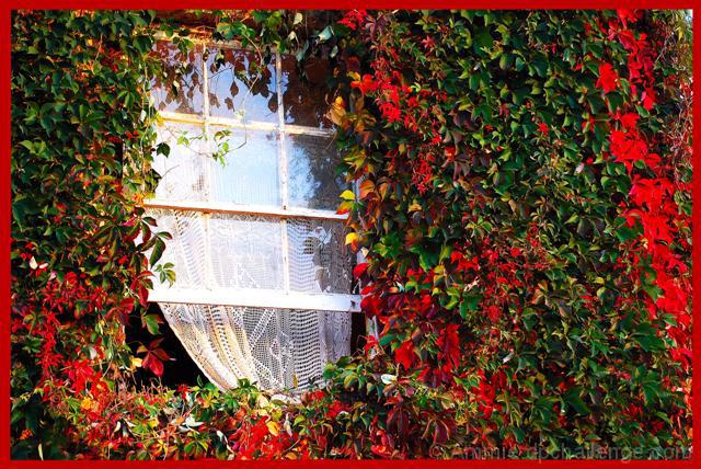
An interesting image. You are always going to have people that like, and others that don't like the border. I personally would not have put a border on this, but that comes to choice. I don't use many borders on my photos.
For this, i would have used a more narrow (ie higher) appature. Instead of f5, I would have been shooting this more towards the F10+ area. I think the photo suffers from a depth of field issue, with some areas a little soft. This also might have been due to the slow (1/45) shutter speed used. I don't know what the light was, but that tells me it was a bit dark. The photo for me just could have been sharper. On that, did you sharper after you resized, as resizing the photo often can make it look a little soft anyway, so sharpening slightly can restore that back.
Someone mentioned Contrast, not sure as that would then blow out the window and that would be a problem. :)
Very nice abstract, and the red border adds to the vibrance in this case. However, be careful with colored borders in challenges, people are picky about them on DPC.
I think this would have worked much better with a half window crop and sharper focus and aperature control to reduce the difference between the whites, reds and greens.
Composition is nice, I think the small spot of blue in the upper right corner is distracting but so small it's not really noticeable. I think the contrast could use to go up a bit and I'm not a fan of the border.







 Add photograph to your favorites
 Add photographer to your favorites

 Photographer found comment helpful.


