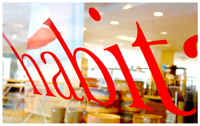
nice back ground blur great sharpness on the words .. you got a little glare on the glass over part of the word that is a little distracting . but over all a good shot
There isn't enough visual appeal to the sign on the window for it to be the main focus. Cropping the edge of what I assume is the letter "a" for habitat would have made this a little more effective.
absolutely brilliant. My favourite of the comp.......just wish I'd thought of this...damn you.! ;-) If I were the sole judge this would win...congratulations on the Tallbloke ribbon. 10
Now this is much more interesting and creative than I would have expected from this site. The background lighting is a little hot but it's not really a point of distraction.





 Add photograph to your favorites
 Add photographer to your favorites


 Photographer found comment helpful.


