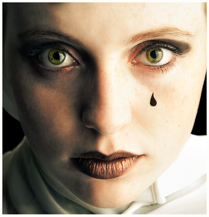
I like the green and bronze tones in this. The light in her eyes is very distracting, though, as it creates a line that cuts her pupils in half. It takes away from their impact a lot.
Bonus point for not overprocessing the eyes and skin. So many bad portraits on this site recently that I'm compelled to rate the good ones higher. Well done.
• Composition: good
• Originality a little different from the run of the mill portraits.
• Meets the challenge: n/a
• Wow Factor no
• Technical:
• Exposure a pity that the shadows have come out black alsothere i a rather strange colour cast over the image. maybe the lighting?
• Focus sharp maybe to sharp a bit of softness might give more impact.
• Overall Score: 5





 Add photograph to your favorites
 Add photographer to your favorites


 Photographer found comment helpful.


