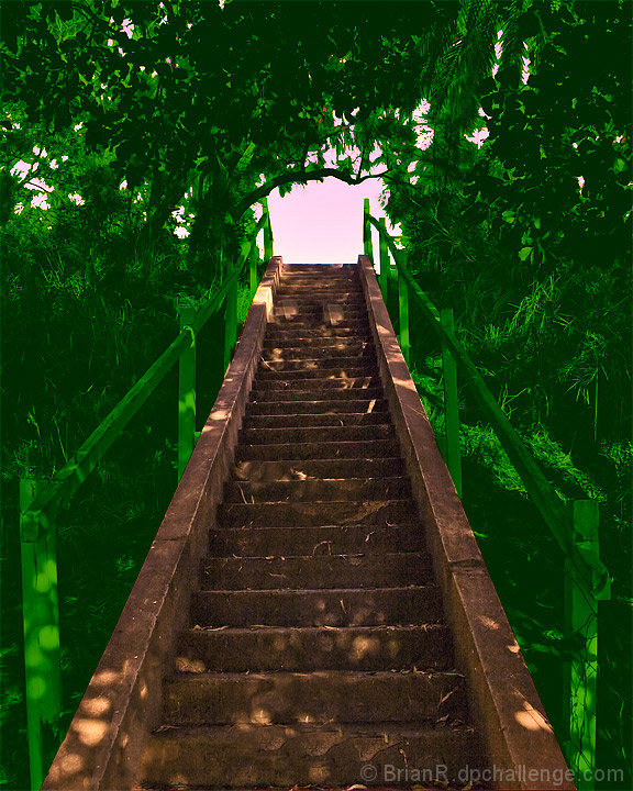
Whoa, strange, but I kind of like it. There's some orange splotches in the green bits that are a little distracting, but overall I quite like this, though I couldn't tell you why specifically. It's certainly eye-catching and different from all the other entries!
Sorry but the color treatment in this shot is, pardon me for saying so, horrible. The green looks awfully "neon" like and not natural at all. Usually when I color something in post processing, I use a seperate layer for that, go nuts like you did here and then bring the opacity down on that layer to mute the effects, it usually comes out much better. Put a 3 on it and at least thought I´d tell you why.
I think the green processing you used here has potential, but not in this photo. Perhaps if the stairs were similarly processed the photo would be more appealing to me. 5





 Add photograph to your favorites
 Add photographer to your favorites


 Photographer found comment helpful.


