| Author | Thread |
|
|
10/24/2002 09:19:00 AM |
|
thanks. i did a better exposure the next day, but i could never quite duplicate the composition on this one, so i went with this one. |
|
Comments Made During the Challenge  |
|
|
10/20/2002 10:22:00 PM |
|
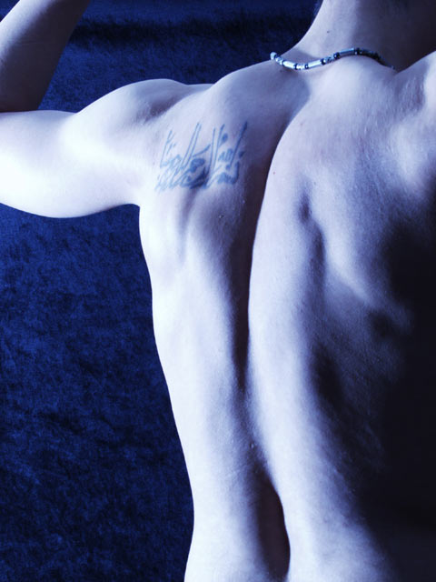
I like the tones and the shadows.. nice work! |
|
 Photographer found comment helpful. Photographer found comment helpful. |
|
|
10/20/2002 09:43:00 PM |
|
Exposure is a bit hot on the left arm - good interpretation of the challenge |
|
| Photographer found comment helpful. |
|
|
10/18/2002 03:38:00 PM |
|
I like the "curves" this presents, and the overall presentation. While I like that theh bluish/purple gives it a "seductive/nighttime" feel, at the same time it makes me feel like his circulation is bad! haha. karmat |
|
| Photographer found comment helpful. |
|
|
10/18/2002 08:49:00 AM |
Composition: Subject Placement, Cropping, Background7,
Technical: Focus, Exposure, Lighting, Processing7,
Appeal: Is it Interesting, Motivating, Etc.? 6,
Total Averaged Rating7. Autool
|
|
| Photographer found comment helpful. |
|
|
10/17/2002 08:51:00 PM |
|
Great shot..strong composition..love the light and shadows (7) |
|
| Photographer found comment helpful. |
|
|
10/17/2002 03:07:00 PM |
|
well at least he has something worth being proud of! |
|
| Photographer found comment helpful. |
|
|
10/17/2002 05:08:00 AM |
|
Very Nice, both the subject and the technique :-) |
|
| Photographer found comment helpful. |
|
|
10/17/2002 01:34:00 AM |
|
interesting portrayal of pride. well done, though. nice tone to the photo as well. I can't make up my mind if its in full color or just toned. either way its a neat effect. ~mcmurma |
|
|
|
10/16/2002 11:50:00 PM |
|
a bit too bright on the back, and I wish the tattoo was on the other side...otherwise it's an awsome photo...great contrast :) 9 |
|
|
|
10/16/2002 06:05:00 PM |
|
excellent job with the lighting... the shadows cast in this image do a great job of highlighting the form... - setzler |
|
|
|
10/16/2002 05:53:00 PM |
|
this is really nice work. i love the comp. and framing and the lighting really sets off the mood and makes for some really nice shadows. i have been going back and forth on the background but have finally decided that i dig it--the texture compliments the smoothness of the the skin very well! 9--alecia |
|
|
|
10/16/2002 05:47:00 PM |
|
Very nice - I love the use of light and shadows. I would have asked the model to take of that necklace though - the nature of it degrades the mood of the photo. 9 mcrael |
|
|
|
10/16/2002 05:27:00 PM |
|
I like the hues in this shot. it has some nice lighting and shadow effects working for it too. |
|
|
|
10/15/2002 03:43:00 PM |
|
ever tried a lil more creativity or originality, effort, composition..???? |
|
|
|
10/15/2002 03:10:00 PM |
|
nice tones and curves ;) 7-photosbyayme |
|
|
|
10/15/2002 01:56:00 PM |
|
I do not like the purple color in this photo. I feel that a more natural color would have been more effective. - 5 |
|
|
|
10/15/2002 12:22:00 PM |
|
I like it...says it all without showing all |
|
|
|
10/15/2002 02:39:00 AM |
|
nice composition and lighting. I like it. 8 |
|
|
|
10/14/2002 11:23:00 PM |
|
wow, not revolting. Nice choice of lighting/color |
|
|
|
10/14/2002 11:20:00 PM |
Composition 10
Technique 10
Challenge 10
Apeal 10 |
|
|
|
10/14/2002 10:24:00 PM |
|
Nice hubris (yes, i mean hubris :P) and composition :) I like the lighting but wonder if it couldn't be tweaked a little to smooth out the skin...maybe a little oil..just enough to reflect...not enough to look like greasy chicken. The form speaks for itself without the distracting textures. Is that horizontal shadow across the top from a barbell? 8 Lisa (de-crypticated) |
|
|
|
10/14/2002 10:13:00 PM |
|
interesting. and nice lighting. |
|
|
|
10/14/2002 08:56:00 PM |
|
Composition: Subject Placement, Cropping, Background 9 , Technical: Focus, Exposure, Lighting, Processing 6, Appeal: Is it Interesting, Motivating, Etc.? 8 , Total Averaged Rating 8 . smshats |
|
|
|
10/14/2002 07:42:00 PM |
|
well composed, interesting lighting. I think a levels adjustment would improve the image. 8 Zeiss |
|
|
|
10/14/2002 07:22:00 PM |
|
stronger coloring management would have given the image a greater impact. |
|
|
|
10/14/2002 07:13:00 PM |
|
Qwll lighted. I personally would have liked it better in B&W. BUT, I understand its a personal taste... 7/10 |
|
|
|
10/14/2002 05:50:00 PM |
|
Very nice. Is the over exposure on the left edge of the body intentional? I like it. :-) 8 kathleenm |
|
|
|
10/14/2002 08:31:00 AM |
|
|
|
10/14/2002 05:46:00 AM |
|
I would like to have seen sharper focus, but I like the composition and lighting, and feel that the shot does convey self pride. You also have an actual person in your shot, which, based on what I have seen so far, makes me want to automatically rate you much higher! lhall |
|
|
|
10/14/2002 05:12:00 AM |
|
Strange crop, color and light. I don't dislike it. Good luck. |
|
|
|
10/14/2002 03:09:00 AM |
|
Great tones, I like the blueish color treatment. Nice composition and great lighting. Top ten for me. |
|
|
|
10/14/2002 01:57:00 AM |
|
WOOHOO!! Lookin a little smurfy, but I like the pose! ~indigo |
|
|
|
10/14/2002 01:33:00 AM |
|
This rocks !!!!! Shiiizzzam |
|
|
|
10/14/2002 12:19:00 AM |
|
Very good tones, and I like your decision to go with the blue composition. |
|
Home -
Challenges -
Community -
League -
Photos -
Cameras -
Lenses -
Learn -
Help -
Terms of Use -
Privacy -
Top ^
DPChallenge, and website content and design, Copyright © 2001-2026 Challenging Technologies, LLC.
All digital photo copyrights belong to the photographers and may not be used without permission.
Current Server Time: 06/28/2026 08:43:19 AM EDT.