Good rule of thumb: If you ask for an in depth critique, you should be willing to include your own comments with your photo when you submit it. Does this photo not have any meaning or interest to you personally? If not, it's not worth asking for an in depth critique. You have to care about it before you should ask someone else to do the same :)
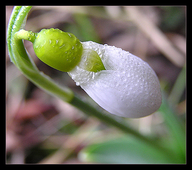
I think you have a nice angle and composition on this flower bud. The water droplets look very pleasing and the diagonal orientation works well here.
The image is displaying a lot of noise in the background. Based on your exposure information, it's probably not from a bad exposure. It may be cropped out of a larger image or something... maybe sharpening artifacts?
A very pretty shot, but magazines are almost universally vertical, and should have a space where the logo and list of top stories could go without covering anything essential to the picture.
Very nice shot, good use of top-left to bottom-right diagonal. Very effective use of limited depth of field. However, the shot is very noisy, I would have cleaned this up with NeatImage. IMO the flower needs much more sharpening in PS. I think your thick black border detracts from your photo. Your camera needs a bit of help in PS with colours and saturation... the colours seem a bit dull and lifeless.
(I'm writing this to everyone who submitted a landscape shot) The challenge was to produce a shot worthy of a magazine cover but to me a shot like this is not suitable to be put on a "portrait" format magazine.
Nice capture of the dew though
---ADDITIONAL---
Due to forum discussions and accusations that marking landscapes down is nitpicking, I'm going through them and remarking. I still think some of the landscapes would not make good covers because of their orientation but I am no longer marking down because of that.
I still think landscape is inapropriate for the majority of magazines but I'll give the benefit of the doubt to the photographers.






 Add photograph to your favorites
 Add photographer to your favorites

 Photographer found comment helpful.


