| Author | Thread |
|
|
01/03/2008 10:03:09 AM |
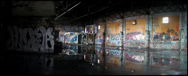
One of my favorites for the challenge, really does meet the hidden city theme as well as any in the challenge. I noticed a lot of the comments did not like the darker left side but I kinda like the hidden detail, not sure I would change anything except maybe level it out a bit. Under rated in the voting in my opinion.
Message edited by author 2008-01-03 10:06:06. |
|
Comments Made During the Challenge  |
|
|
01/01/2008 08:31:03 AM |
|
The reflection and the colors really make this image! It doesn't appear quite straight though. |
|
|
|
12/31/2007 07:56:26 PM |
|
This just screams to be bigger. I will be so glad when the size we can enter increases. I would love to look at this again, in a bigger size. the details are just teasing me. |
|
|
|
12/31/2007 02:50:27 PM |
|
|
|
12/31/2007 09:07:53 AM |
|
A little too dark on the left. And very busy, I can't seem to settle on any area as to what the real subject is. |
|
|
|
12/30/2007 05:04:44 PM |
|
This looks like a place that I wouldn't want to hang out in very long. Glad you got the picture. Hope you got away ok. |
|
|
|
12/28/2007 05:25:54 PM |
|
It looks like the horizon is a bit tilted. Not sure though, could be the perspective. As the pic is so horizontally stretched, I think left/right should be more balanced. |
|
|
|
12/28/2007 01:30:54 PM |
|
I'll bet there are some great macros to be had in here as well. Love the use of reflection, though I think the darkened left side of the picture detracts (a bit) from the absolutely stunning right side. |
|
|
|
12/28/2007 08:22:53 AM |
|
Nice, perhaps a bit tilted. I'd like to see it in full size. |
|
|
|
12/28/2007 08:07:19 AM |
|
|
|
12/27/2007 10:41:45 PM |
|
|
|
12/27/2007 07:50:16 PM |
|
The entire left side is too dark. It's also difficult to determine a perspective, but I believe it is inside the factory. |
|
|
|
12/26/2007 08:02:11 PM |
|
Great image, love graff art. Could do to be bigger though. |
|
|
|
12/26/2007 07:11:28 PM |
|
Nice, but a little small... |
|
|
|
12/26/2007 12:31:09 PM |
|
I wish I could see the graffiti a bit closer |
|
|
|
12/26/2007 11:23:59 AM |
|
needs a little straightening |
|
|
|
12/26/2007 03:36:21 AM |
|
A little dark and it doesn't look straight. I do like the idea though. |
|
Home -
Challenges -
Community -
League -
Photos -
Cameras -
Lenses -
Learn -
Help -
Terms of Use -
Privacy -
Top ^
DPChallenge, and website content and design, Copyright © 2001-2026 Challenging Technologies, LLC.
All digital photo copyrights belong to the photographers and may not be used without permission.
Current Server Time: 06/30/2026 06:04:40 AM EDT.