| Author | Thread |
Comments Made During the Challenge  |
|
|
02/24/2004 09:36:26 PM |
|
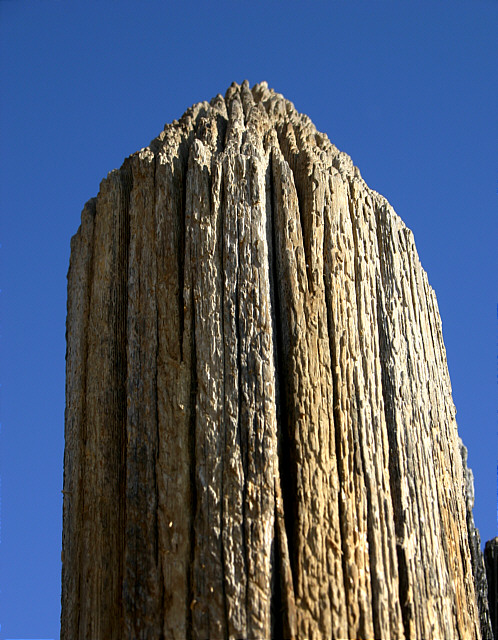
What great texture! And wonderful lighting! |
|
|
|
02/24/2004 04:19:38 PM |
|
Sharper and closer woudl have given a better result but it's still a fine image |
|
|
|
02/24/2004 12:13:35 PM |
|
i think i would like it better if the entire pole was in focus.. it seems almost in focus but not quite. interestingtexture..... |
|
|
|
02/23/2004 09:44:50 AM |
|
Lots of character in that post. Good choice for 'Texture'. |
|
|
|
02/21/2004 02:16:21 PM |
|
Really meets challenge and what a beautiful sky. |
|
|
|
02/20/2004 08:39:03 PM |
Looks like a rock pinnacle more than a fence post.
I like it but for the lack of overall focus 7 from me |
|
|
|
02/20/2004 04:03:07 PM |
LOL... I looked at the shot before looking at the title... Thought it was a large rock or mountain!
It's a great shot, good lighting and great background. Seems a little out of focus at the bottom though. Nice! |
|
|
|
02/20/2004 12:21:35 PM |
|
very straightforward presentation of a pretty simple idea: not necessarily a bad thing, but it is lacking a touch of inspiration i think. Perhaps it might have been a touch more successful with some sense of location, though you have attained some degree of a sense of texture with the shot. |
|
|
|
02/20/2004 06:47:32 AM |
|
quite dull sorry - do like the pure blue sky - nice deep blue. But the wood is slightly soft on the lower side. perhaps a closer crop |
|
|
|
02/19/2004 11:21:25 PM |
|
Great sky background. Nice detail and texture. |
|
|
|
02/19/2004 10:26:46 PM |
|
|
|
02/19/2004 12:44:16 PM |
|
The texture is here. The subject and composition lack interest to me. |
|
|
|
02/19/2004 11:50:09 AM |
Texture is very clear.
Focus & colour great.
Composition seems a little static. |
|
|
|
02/19/2004 12:41:16 AM |
|
Oh, I love the texture in this fence post. It may be that you sharpened it a bit much (or maybe not); it's a good example of the play of lights and darks against a good complementary background. |
|
|
|
02/18/2004 07:37:26 PM |
|
It's sure stood the test of time. Might crop the bottom inch to remove the post on the right. Neat shot, good entry. |
|
|
|
02/18/2004 09:57:19 AM |
|
This was an idea I was going to go with but I found it to be a little to plain for me. I like the way you used the sky as your background but IMHO I think the sun is a little to much on the right side. |
|
Home -
Challenges -
Community -
League -
Photos -
Cameras -
Lenses -
Learn -
Help -
Terms of Use -
Privacy -
Top ^
DPChallenge, and website content and design, Copyright © 2001-2026 Challenging Technologies, LLC.
All digital photo copyrights belong to the photographers and may not be used without permission.
Current Server Time: 06/28/2026 04:35:56 PM EDT.