| Author | Thread |
Comments Made During the Challenge  |
|
|
09/14/2002 08:59:00 PM |
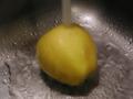
Composition: Subject Placement, Cropping, Background6,
Technical: Focus, Exposure, Lighting, Processing7,
Appeal: Is it Interesting, Motivating, Etc.? 4,
Total Averaged Rating6. Autool
|
|
|
|
09/14/2002 01:40:00 PM |
|
|
|
09/14/2002 11:30:00 AM |
Good coloring!
Good luck in the callenge. Gracious aka Grayce |
|
|
|
09/14/2002 02:37:00 AM |
|
superb texture and lighting andrewm |
|
|
|
09/13/2002 02:22:00 PM |
|
Cute title, but the stem/title combo isn't a good match, IMO. (But you might have needed the stem to ensure people "got" the fruit. (I say, to heck with them!, but I don't score well....) Great idea, good color, focus works well enough. 7 Swash |
|
|
|
09/13/2002 06:01:00 AM |
Colour slightly too saturated.
7, Kavey |
|
|
|
09/12/2002 01:30:00 PM |
|
Very nice idea but too out of focus to appeal to me. |
|
|
|
09/11/2002 11:23:00 AM |
|
|
|
09/11/2002 11:21:00 AM |
|
this is a nice attempt... I htink the post processing may have washed out some of the detail.... since this is a closeup and some of the detail is visible, i believe it needs to be sharper overall... good idea :) - jmsetzler |
|
|
|
09/11/2002 12:21:00 AM |
|
Nice use of negative space! ~indigo997 |
|
|
|
09/10/2002 07:15:00 PM |
|
Contrast and saturation levels seem to be over adjusted. At least for my taste they are... |
|
|
|
09/10/2002 06:20:00 PM |
|
Very well focused, perhaps a bit too much lighting. Using the rule of thirds and placing the stem there may have added some visual appeal to this image. |
|
|
|
09/10/2002 01:37:00 PM |
|
A touch out of focus. Strong, sharp focus is essential for close-up macros. I am left wanting more texture here. The composition is good. |
|
|
|
09/10/2002 11:50:00 AM |
|
focus is off, but good idea. |
|
|
|
09/09/2002 10:43:00 PM |
|
looks like this fotografia was over sharpened or something |
|
|
|
09/09/2002 08:40:00 PM |
|
is it meant to be slightly out of focus? weird. |
|
|
|
09/09/2002 03:54:00 PM |
|
A little too much contrast, and the image is lacking clarity. Is this a low end camera? Nice lighting and composition |
|
|
|
09/09/2002 03:03:00 PM |
|
love the texture. a bit overexposed? different color background would have added something? |
|
|
|
09/09/2002 11:38:00 AM |
|
Excellent idea, but the photo quality could be better. |
|
|
|
09/09/2002 10:59:00 AM |
|
Nice picture and colors, but seems out of focus. |
|
|
|
09/09/2002 09:02:00 AM |
|
Home -
Challenges -
Community -
League -
Photos -
Cameras -
Lenses -
Learn -
Help -
Terms of Use -
Privacy -
Top ^
DPChallenge, and website content and design, Copyright © 2001-2026 Challenging Technologies, LLC.
All digital photo copyrights belong to the photographers and may not be used without permission.
Current Server Time: 06/27/2026 07:07:39 PM EDT.