Picking a couple from the "favs" listed on your profile page. Hope you don't mind?
One thing that is standing out is your approach to high contrast and extreme lighting situations; you're not afraid to use this type of lighting to good effect in your compositions. Very nice!
I've also just noticed that you use Minolta glass with your Olympus. That's interesting. I'd like to know what you use to convert this fine old glass over to your new DSLR.
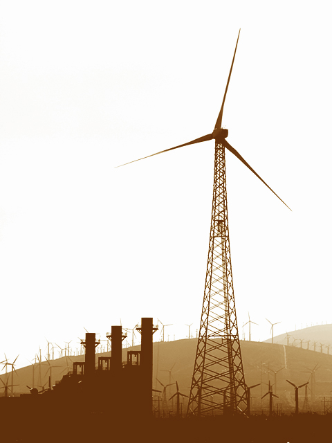
First let me say I'm so happy I got to see this! I missed it during voting. This is truely a wonderful image - I agree with posthumous, best windmill shot to come along in a long time; also one of the most powerful landscapes I've seen in some time.
Pros:
Composition is great; a perfect example of the power of the rule of thirds; great technicals, nice sharp lines with a high contrast background without any significant sharpening artifacts. I personally really like the sepia tone. The three layers give great depth and contribute a lot; very reminicent of your blue ribbon shot:
but flatter, which works better for this image.
Cons:
Not many I can see. I think cloning out the white line that abranton mentioned would improve it, but that's pretty nit picky. And while I understand alexjack's comment on the smokestack thingy I don't agree - I think it balances the windmill nicely and provides an anchoring mass. There are a couple of little white dots in the bottom that could also be cloned out.
So why didn't it do better? Probably because it's a fairly subtle image, and those often aren't appreciated at DPC. The cluster of votes at 5-7 shows people recognized it as a very good image, but in the throes of voting didn't take time to appreciate it. I love it. Roz loves it. I hope you do too.
Challenge:
Well, it's a free study, so pretty much anything meets the challenge. ;) So much for my default comment form!
Anyway, congrats again on a great image, and thanks for letting me critique it. I think it's tremendous.
OMG .. this is incredible .. actually its more than incredible .. but i dont have the words !!! .. totally excellent silhouettes and brown tone .. love the repeated shapes ... just love that blown out sky!!!!!! .. :):) .. =10
too bad about that gizmo (is that the right term?) in the front lower l - it really takes away from the repeating lines and wind turbine shapes. great processing and I like the bright sky
interesting choice of colours for this photo. I normally associate sepia tones with the old-fashioned, but it seems to work quite well here. very graphic.





 Add photograph to your favorites
 Add photographer to your favorites

 Photographer found comment helpful.


