| Author | Thread |
Comments Made During the Challenge  |
|
|
04/07/2002 08:29:00 PM |
|
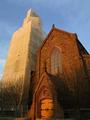
Very nice picture -- great use of lighting. |
|
|
|
04/07/2002 02:38:00 PM |
|
One of my top 3. Light, angle and subject come together flawlessly. Great Job! Good Luck! |
|
|
|
04/07/2002 08:30:00 AM |
|
Very dramatic. Everything just grows out of the shadows, and all the lines lead to the light. Nice work. |
|
|
|
04/06/2002 07:46:00 PM |
|
Interesting and fine detail. I would have cropped the bottom part out though. |
|
|
|
04/03/2002 03:05:00 PM |
|
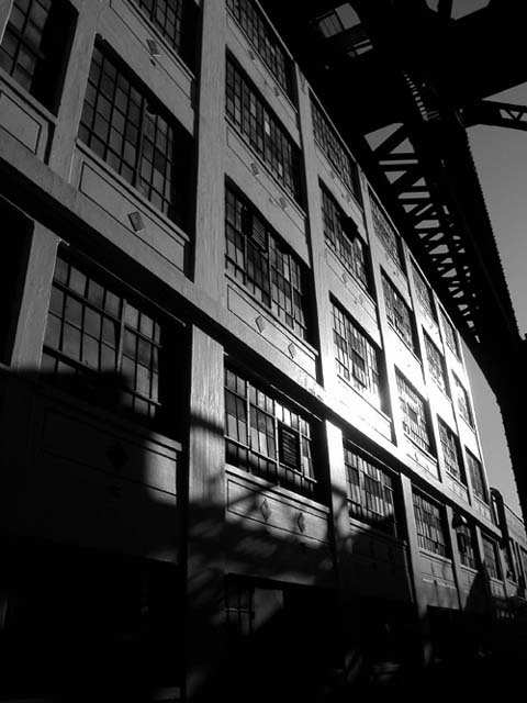
I particularly like the depth perception and offset horizon in this photo... not to mention that i love black and white... Kudos to the photographer! |
|
|
|
04/03/2002 12:43:00 PM |
|
A little too dark for my tastes, yet stirringly effective. |
|
|
|
04/03/2002 11:59:00 AM |
|
|
|
04/03/2002 09:30:00 AM |
|
I would have tried to crop off more at the bottom. There isn't much going on there. |
|
|
|
04/03/2002 09:15:00 AM |
|
nice, perhaps a little too dark tho |
|
|
|
04/03/2002 06:28:00 AM |
|
I love it - there is an eerieness and yet serenity to the picture |
|
|
|
04/02/2002 03:48:00 PM |
|
Amazing shot! great use of monochrome here, along with the play of shadows. |
|
|
|
04/02/2002 01:39:00 PM |
|
classic black and white/ industrial shot. Great converging lines. Seems tilted slightly though. |
|
|
|
04/02/2002 08:05:00 AM |
|
love the lighting and the shadows and the use of black and white. All good choices. And the angle is dynamic. |
|
|
|
04/02/2002 07:38:00 AM |
|
Can't tell you why, but I find it has a strong mood. |
|
|
|
04/01/2002 07:30:00 PM |
|
Nice composition I like your use of light |
|
|
|
04/01/2002 05:36:00 PM |
|
Very nice. Love the b&w.....cold looking. |
|
|
|
04/01/2002 03:26:00 PM |
|
I like this picture. Maby a bit more contrast would make it perfect. I think it looks better if you flip it horizontal. |
|
|
|
04/01/2002 02:36:00 PM |
|
|
|
04/01/2002 11:53:00 AM |
|
good shot - shadows at base detract. |
|
|
|
04/01/2002 11:05:00 AM |
|
i really like the shadows and angle on this photo. seems a tad underexposed in areas, but i think you'd risk blowing out the right side of the building with more exposure. |
|
|
|
04/01/2002 07:43:00 AM |
|
i like theq industrial film noir look to this |
|
|
|
04/01/2002 07:12:00 AM |
|
Very nicely done. Initially looking at it, I thought it was inside, maybe in a library, but after staring at it for awhile, I think it's outside. All the same, it's a great how. |
|
|
|
04/01/2002 01:47:00 AM |
|
|
|
04/01/2002 01:46:00 AM |
|
Lovely shadows, great perspective. |
|
|
|
04/01/2002 01:32:00 AM |
|
just a touch too blown-out, if it were just the windows it'd look better, but too much of the wall's detail is lost. |
|
|
|
04/01/2002 01:22:00 AM |
|
a great composition, but the glare on the building is too much; girders above are quite rich; I want this image to be sharper |
|
|
|
04/01/2002 12:34:00 AM |
|
Nice! I'm wondering if a polarizing filter would have made the harsh reflections on the right a little less harsh. |
|
Home -
Challenges -
Community -
League -
Photos -
Cameras -
Lenses -
Learn -
Help -
Terms of Use -
Privacy -
Top ^
DPChallenge, and website content and design, Copyright © 2001-2026 Challenging Technologies, LLC.
All digital photo copyrights belong to the photographers and may not be used without permission.
Current Server Time: 06/28/2026 07:55:39 PM EDT.