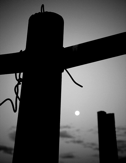
I like the idea of the "solitude" that one could feel from this shot as well as the idea that the viewer can see in this shot what they want to see from it.
Roz, positives here: interesting shapes, decent composition, interesting allegory. What I think would really help this pop - details in the moon. Feels a little bit flat.
Shots like this... when seen in person will blow you away. However, even I have been guilty of coming back and finding out I didn't get exactly what I was seeing. I like and don't like the post in the front, what I don't like is the position it is in, but I do like the large object there. And unless you could move the cross post, not much you can do about that. I like the down angle on the cross post, but would have liked to see the main post vertical. The fade of the sky is just unreal I really enjoy this setup... but, I really also wish the moon wasn't just a bright spot. Personally I might have just cloned out the moon and left the sky it is fantastic.
I think that as a B/W conversion it is nice, the image shows nice grays, the vignette adds interest. As a picture, I'm not sure it's the best choice of picture to convert to B/W. I sort of imagine that this kind of picture could rely heavily on colour for its impact, a dark cross like silhouette in front of a moody ink blue sky with touches of red, white moon in the distance.
As a composition, I don't know, the moon is very small, the back post is somewhat out of focus, and overall the image doesn't have that much interest. I think it's a great idea to work off.
I'm wondering - you converted to B/W in RAW? Your options are more limited converting to B/W in RAW than in PS. You may want to try converting in PS - you probably already have, so what am I talking about :)
I like the silhouette here. The moon is interesting, but I'm having a hard time with the tilt in of the subject. Perhaps straighten a bit, or shoot without the second post (if possible). I like the concept of the cross and the moonlit sky. Perhaps make the clouds 'pop' a bit more? It's a nice shot!
amazing perspective
i like being forced to look at something in a different way
really cool exposure as well
the crop seems a little bit tight to me, but thats it!
great work!
Is this from Roz the mediocre photographer??? Mediocre - NOT lol woman still laughing at you. I love the vignette - adds drama to the centerpiece. I think it is cool that you did this in moonlight! I will say tho - I find the little dot of the moon a distraction to the piece. I think because it is just this little tiny dot kind of out there. Lol mess with nature and clone out the moon!
I like the contrast. I think with the background so blurred, what if you backed up a bit and made the silhouette of the cross in its entirety?? Don't be so hard on yourself.
Oh no, not me, Roz! I wouldn't give this a 5! I'd rate it much higher. The moon adds so much interest and drama, and the silhouetted cross draws me in to the photo. I really like it alot!!! I like the composition. The clean crisp lines. But most of all the MOON! (I'm a moon freak in case you couldn't tell :)
I like the silhouettes, the B&W treatment is very good, not dull or washed out. Not sure if the moon actually adds anything to the photo, I think the photo would be just as strong without it.
I like the shape of the cross and he second upright, but i'd have like a looser crop - and maybe without the moon, although this would cause titling problems.
Not bad, I think it needs to lose the ropes or whatever they are but I like it for the silhouette and the vignetting sort of frames it. I'd give it a 6.
roz - good effort - nice use of the moon to bring in some good contrast - the perspective and composition are pretty solid as well - especially the squiggly thing (rope). On the critique side- it seems a little dark to me - would have liked a little more detail in the image to emphasize the great tones you can get in b/w
Roz, well it would have got a six from me, so I think you are being harsh. Great application of rule of thrid with the 'arm' of the cross
Strangely I feel the moon actually slightly distracts as it seems a touch incongrous with the image (possibly worse because of its position in the image)
All this is in the opinion of someone who is very new to this game (and it appears to run contrary to what others have said), so please take it with a pinch of salt
This dark to my taste, or my monitors ad if it were in a challenge it would suffer variable-monitor-calibration-syndrome. Its probalby exactly how you wanted it however. You could increase the tonal range and see how it looks. What does the histogram look like? Are there any truw whites? The fence post in the shape of a cross makes a dramatic silouette and the (perhaps) barbed wire makes reference to the crown of thorns. I like the way the "cross" divides the image into four unequal parts, the junction on the rule of thirds point. This is a powerful image.
touch of contre jour in this.. I think you were right, it would get a 5 from me too not because of the B&W conversion but the subject matter is boring IMHO if you use this same technique on a town shot or street shot or even a portrait then it would be excellent..




 Add photograph to your favorites
 Add photographer to your favorites

 Photographer found comment helpful.


