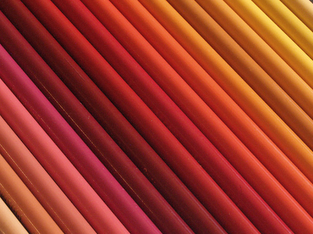
I like this photo! Very nice colours. Good composition (diagonal lines). I know it's stupid but somehow it looks a bit "hazy". As of the lightness was punched up a tad too much. A bit more contrast would be better for my taste. Anyway, still a very good photo. -stephan
Visually attractive, stunning in fact. There is something about the angle of the pencils that creates a distortion causing the rectangle to appear unsymmetrical. Sort of parallelogram-ish. This is just odd and causes my eyes to do some quirky things but, it's not actually distracting from the photo. It's a bit griainy and soft (I found that to be a problem for me too this week) and some of the reflection on the pencils to the lower left is distracting. I like this =7 syamjonimi ;'-D
That is really cool. And it doesn't even matter that there isn't any ONE pencil sticking out because the pattern of pencils and colours speaks for itself. Great job!
Very pretty. There was one thing that bothered me. Peach and pink aren't in the "prism". However, I looked it up and Prismacolors online and found out that that is the physical name of the colored pencils, so all is good. Very pretty colors, and attractive display of them. you did a nice job keeping glare to a minimum and there are no distracting shadows. It's pretty simple, but very nice. Good luck in the challenge.






 Add photograph to your favorites
 Add photographer to your favorites


