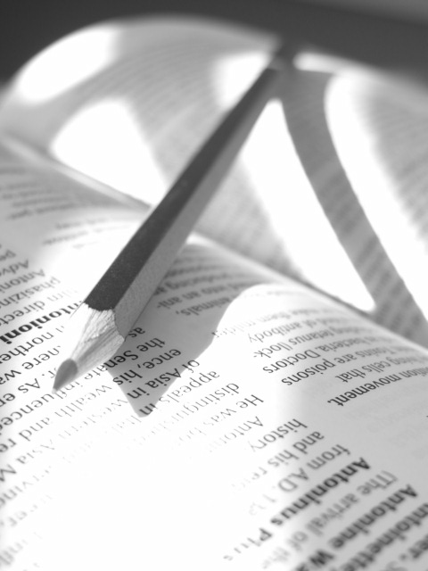
Nice work! Very brave to submit this here when voters typically dont like shallow DoF and overblown highlights. This seems intentional, though and I like it. 9 from me.
This is a really neat idea and I realize you were also trying to get the "light" into the photo too, but the washed out part on the book is a bit too light for my taste. This definately works with black and white. Aelith did a very similar angle of a book in the transparency challenge (only with glasses instead of a pencil). She got both compliments and criticism on having the book upside down. Personally, I like it because she made the good point, that if the book were right side up, our focus would have been drawn to the words, instead of the subject. The soft focus works well in the background like that. Good job and good luck in the challenge.
I like very much things in this picture (deep of field, composition, B&W used...). You have got a excellent 'pencilist' ambient (particularly because there is nothing distracting). I give it 9 because the overexposed left down corner. manolo
Perphaps the best picture of the challenge -my opinion, of course-. I can't give it 10 because there is a small zone overexposed where is impossible to see anything. (9).jcof
nice shot. The focus seems a little short. The composition is great and I love the light although it seems a little over exposed in the foreground. Nice job though.
It's probably just me but, it seems a little too much of both.....light & shadow. It's not unattractive just a little harsh. I'm not sure what to suggest and hesitate to suggest anything. I have a feeling this is exactly what you were trying to achieve. =6 syamjonimi ;'-D
The shadow play on this image is fantastic. However, it also results in that big white washed out area in the foreground. Would have also liked to see just a tad more sharpness at the tip of the pencil but I think the softness is also caused of the excessive light. Nice try though and will revisit this lateron this week. 6 Journey
I like this picture, very nice B&W. I think the head of the pencil should have been in focus and maybe the 'white' area at the bottom is too white and too big. overall 6
The focus appears to be centered on the words on the page instead of the pencil. I think Iwould have preferred the focus to be on the pencil. Wonderful use of shadows and black and white.






 Add photograph to your favorites
 Add photographer to your favorites


