| Author | Thread |
Comments Made During the Challenge  |
|
|
11/09/2003 05:58:07 PM |
|
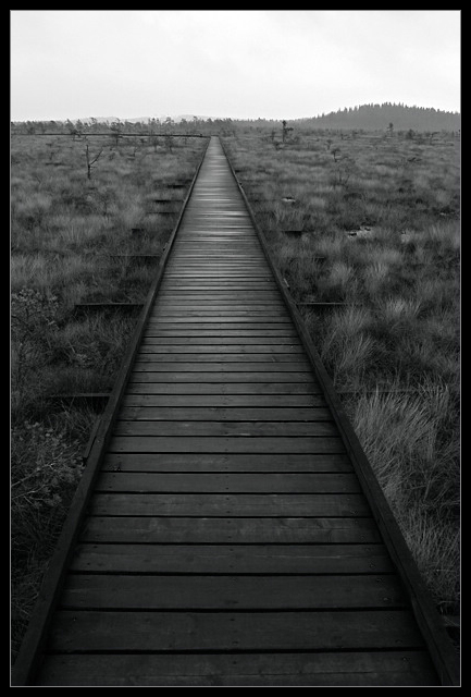
The change in the direction of the wood deck is a little distracting to the infinite subject. The deck is also a little on the dark side. |
|
 Photographer found comment helpful. Photographer found comment helpful. |
|
|
11/09/2003 02:39:48 AM |
|
Do you think, it'd be better if the picture is symmetry? Anyway, nice composition!!! |
|
| Photographer found comment helpful. |
|
|
11/08/2003 11:13:10 AM |
|
Nice composition- needs more contrast for my liking, a bit grayed out. I do, however, dig the grass on the right of the path. |
|
| Photographer found comment helpful. |
|
|
11/06/2003 11:07:56 PM |
|
nice shot. black and white makes it. |
|
| Photographer found comment helpful. |
|
|
11/05/2003 11:59:16 PM |
|
| Photographer found comment helpful. |
|
|
11/05/2003 10:46:08 PM |
|
I like your shot, it appears to be a boardwalk in the middle of a field, in the middle of nowhere, I am certainly curious about this location. Well done. |
|
| Photographer found comment helpful. |
|
|
11/05/2003 10:15:49 AM |
|
| Photographer found comment helpful. |
|
|
11/05/2003 12:10:17 AM |
|
Nice lines and they definitely convey a sense of an infinite path. |
|
| Photographer found comment helpful. |
|
|
11/04/2003 08:29:04 PM |
|
This is one of the best photographs I have ever seen---ARC024 |
|
| Photographer found comment helpful. |
|
|
11/04/2003 08:21:02 AM |
|
Great shot, 8. Comment - the symmetry is not quite right here - there is more land on the right side than on the left. |
|
| Photographer found comment helpful. |
|
|
11/04/2003 01:51:57 AM |
this is a gorgeous perspective
|
|
| Photographer found comment helpful. |
|
|
11/03/2003 08:43:23 PM |
|
phenomenal black and white... great work :) = 10 |
|
| Photographer found comment helpful. |
|
|
11/03/2003 05:28:18 PM |
|
black and white makes this aesthetically pleasing, well framed, i like how its not perfectly centered and how it draws your eye as it veers to the left. 9 |
|
| Photographer found comment helpful. |
|
|
11/03/2003 02:55:28 PM |
|
How obscure? I think without the jadedness of reviewing good photos, I would vote this higher. |
|
| Photographer found comment helpful. |
|
|
11/03/2003 11:35:31 AM |
Wow, I like this. The foreground is so amazing, it resembles a charcoal drawing. To me, the walkway would look infinite if it ended at the top of the frame, rather than curving off to the left. I don't feel that the horizon/landscape helps this image very much. If it were something amazing like mountains, then I could see keeping it. The foreground is so simple and straight forward that it leaves me wanting the top 1/3rd of the image cropped off.
I hope this helps, and congratulations on a very stunning image!
Quadrajet |
|
| Photographer found comment helpful. |
|
|
11/03/2003 11:07:48 AM |
|
seems to beg for a lower angle (camera closer to the ground to show a less abrupt end to the board walk) and more lightness (to have more detail at the bottom) |
|
| Photographer found comment helpful. |
|
|
11/03/2003 02:51:12 AM |
|
Excellent shot. Perfect lighitng and angle, IMO. 10 |
|
| Photographer found comment helpful. |
|
|
11/03/2003 02:13:31 AM |
|
i wish this lead into a more centered point in the horizon. |
|
| Photographer found comment helpful. |
|
|
11/03/2003 12:53:25 AM |
|
Very pretty. Not entirely sure what I'm looking at, but it's a neat combination of textures. 7 |
|
| Photographer found comment helpful. |
|
|
11/03/2003 12:41:08 AM |
|
I like the use of black and white with this shot...but I feel it would be better without the border...or maybe a thinner border. 6 |
|
| Photographer found comment helpful. |
Home -
Challenges -
Community -
League -
Photos -
Cameras -
Lenses -
Learn -
Help -
Terms of Use -
Privacy -
Top ^
DPChallenge, and website content and design, Copyright © 2001-2026 Challenging Technologies, LLC.
All digital photo copyrights belong to the photographers and may not be used without permission.
Current Server Time: 06/28/2026 08:28:55 PM EDT.