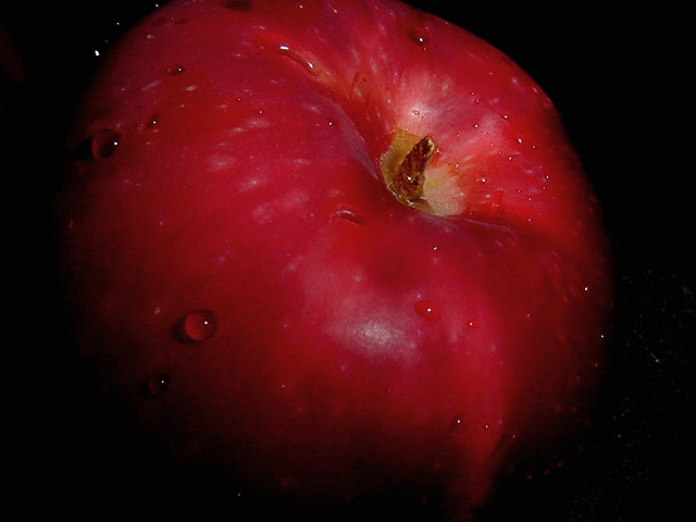
This is a decent attempt at a popular theme with the apple. I believe there is a bit of room for improvement overall though. It appears to be just a tad underexposed. I would like to see that red color pop out with a bit more strength. The color, overall, is just a tad dull because of this. You may also want to work on some alternative compositions to help enhance this theme as well. This is one of the drawbacks I have when viewing photography... I have seen so much stuff that, when I come across an image like this that I have seen many variations of, it makes me compare them mentally with those from the past.
If I were you, I would work on this particular theme until you feel you have mastered your own vision of what you want it to be. Try some variations in the direction of the lighting... sidelighting usually works well with a theme like this.
Welcome to DPChallenge :) I look forward to seeing more of your work in the future :)
That apple fills the frame so much it almost looks like a planet. It does look juicy - nice choice to put water drops on it. Wish the roundness of the apple wasn't cropped at the top.
nice macro, water is a nice touch. I find this photo just doesn't have enough character. The crop is a little "too" close I think .. a pull back would be nice. ligthing is nice
The water droplets are a nice touch, but I'm not sold on the composition. The cropping just doesn't look good. Either include all the apple or focus in on just one small detail. Right now, you are including "most" of the apple, and it doesn't really work for me. It is a still life though. :-) 5.






 Add photograph to your favorites
 Add photographer to your favorites

 Photographer found comment helpful.


