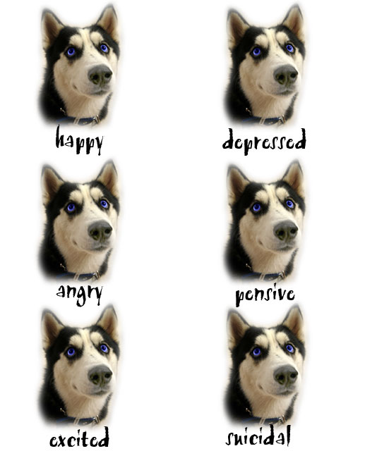
Thoughts from Ecce, with his critique club hat on Hi Rodney and congratulations on your highest scoring image (thus far), it will take some work to keep your average above 5.8 but I'm sure you'll do it ;) To be fair I can't really critique this as a photograpgh (the picture of the dog is just too small)so I will give my thoughts as a challenge entry.
Composition You said it was last minute but just a little more time to position the dog more evenly would have improved this greatly imo.
Technical Once again, difficult to comment as there are no real technical things to comment on (other than positioning of copies)
Aesthetics, Challenge effectiveness To be honest although I've seen his cartoons before I never realised they were Gary Larson cartoons and I must admit this entire challenge was fun to view. Yes, it fits the challenge well and yes, I had a good chuckle (you could easily replace the dog with all manner of subjects). Overall its a fun 'poster' that closely follows the remit and worthy of its top 20 finish (probably would have been higher if it was better positioned).
Well done and looking at you have a great subject to shoot :) I'd call this one menacing!
With something like this, symmetricalness is key, and the unbalance of left and right is really distracting. But I do like the cutout look and I just love the eye color. The dog really does look like it could be thinking anything, too!





 Add photograph to your favorites
 Add photographer to your favorites


 Photographer found comment helpful.


