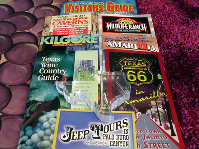
This does not grab my attention. Even with the glass/plastic Texas in the middle, the photo seems a little flat - I'm not sure if I'm explaining this right. The carpet on the right seems off. I can see the different aspects of 'texture', that part is apparent. Sorry, just not that interesting to me - focus and lighting are pretty good though. Ruthann
This is all lined up too neatly to make it interest. The brochures are also dead center. Can't figure out what those discs on the left are and they distract.
The cut out of the state of texas isn't really noticeable when placed on top of those magazines. Maybe find some way to contrast it a little more. Nice idea!
I am not sure what to do with this - I like the original idea and play on words - but I wish that the shot had included more of the actual "texture" of some of the items so that it wasn't such a flat picture - real grapes for the wine, maybe some rocks for the caverns... I will give it a 4
This is a decent alternative interpretation of the challenge. I'm assuming that was your intention with the title... I personally prefer a strong interpretation of the challenge on it's own definition rather than creating an alternate that is off base. = 4 - jmsetzler
hehehe, someone HAD to do it... I give you a few points for humor, but I can't give you more than 4. If you had laid the tour guides out on a desert floor or other high textured place, the humor would have been that much better :) Thanks for the laugh Revised comment ~ If you could have found a 'cowboy' or farmhand at work and called it Tex Chores, that might have gotten higher :)





 Add photograph to your favorites
 Add photographer to your favorites


